TWG Tea
A proposed redesign of an ecommerce website to improve the information architecture and the purchasing experience for target users.
In a nutshell
Project Summary
A proposed redesign of the e-commerce platform of specialty tea retailer TWG to improve the information architecture and purchasing experience for target users.
Role
Product Designer
UX Researcher
UX Methodologies
Affinity Mapping
Heuristic Evaluation
Card Sorting & Tree Testing
User Journey Map
Wireframing & Prototyping
Usability Testing
Timeline
2 Week Design Sprint
July 2023
General Assembly Coursework
Problem & Context
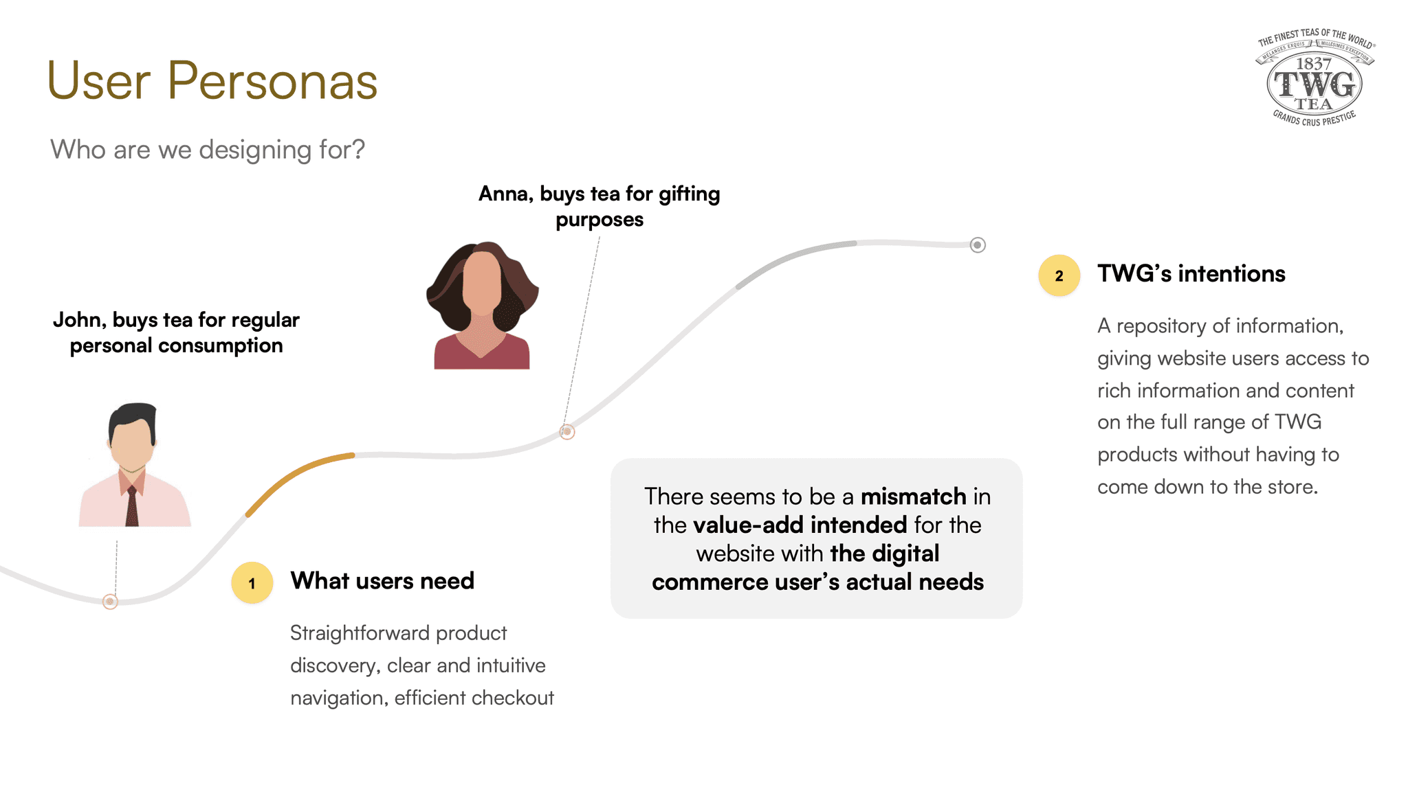
User research pointed to a mismatch in the value intended for the TWG website with the user’s actual needs.
Intentions for the TWG website
A repository of information, giving website users access to rich content on the full range of TWG products without having to come down to the store.
What users actually need
Straightforward product discovery, clear and intuitive navigation, efficient checkout processes
Methodology
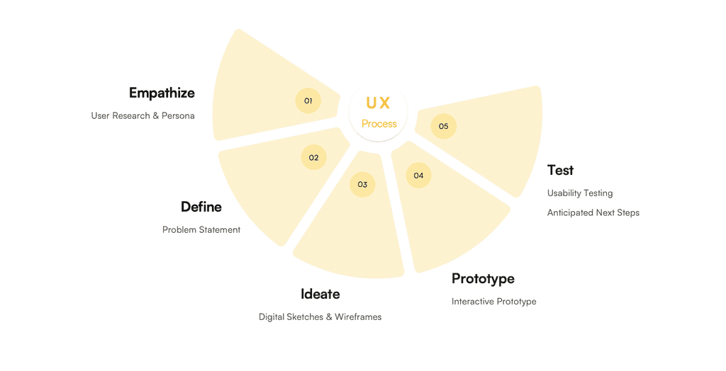
Phase 1: Empathize
The project kicked off with the problem discovery stage, where the intention was to distill a problem space that we could meaningfully design a solution for. In doing so, we considered the need to balance two objectives - the business interests (TWG's perspective) and the value to the user, or TWG's potential customers and website users.
TWG's Perspective
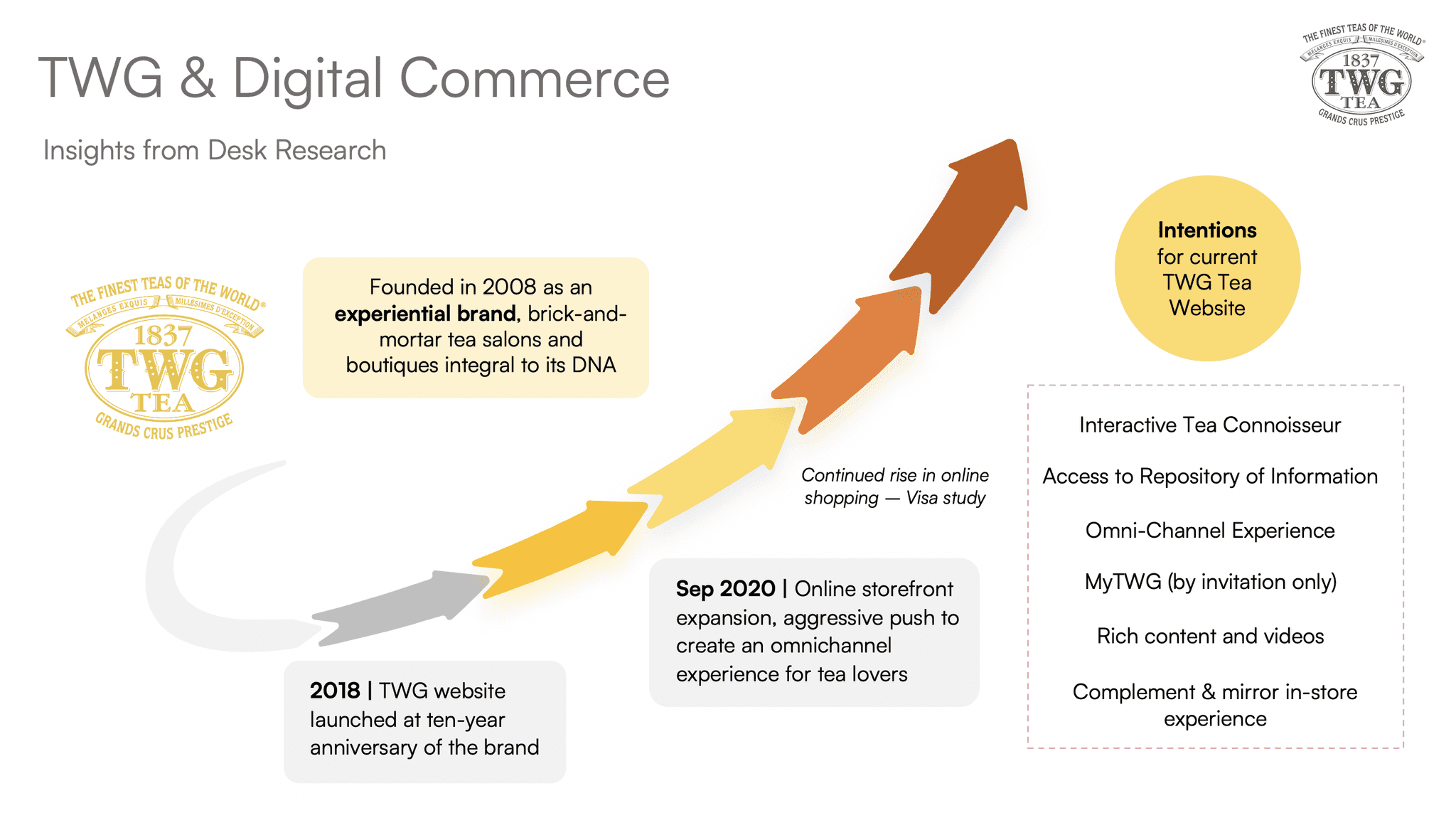
Before seeking our users' opinions, we first wanted to objectively understand the context and goals driving the launch of TWG's existing website. From our desk research, we learnt that apart from being a platform for online sales, the TWG website was meant to be an extension of its premium brand and experience. For instance, the website was intended to be an "interactive tea connoisseur", such that users would have access to rich content on TWG's tea blends and harvests without needing to visit an outlet physically.
With the website launched in 2018, TWG was able to reap the benefits of its digital presence when the COVID-19 pandemic disrupted physical sales. Looking ahead, a strong e-commerce presence continues to be beneficial as more Singaporeans shop online more frequently in the post-pandemic world.
Users' Perspective
To gain insight into our user's needs and perspective, we conducted a combination of face-to-face user interviews, initial testing using the existing TWG website as well as virtual card sorting conducted with a total of seven users.
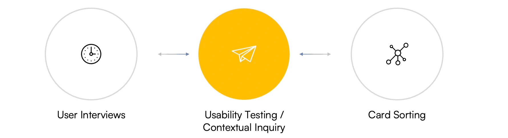
User Interviews
We conducted user interviews with the primary goal of understanding users' motivations, needs and behaviours when it came to purchasing tea products online, particularly on the TWG website. In recruiting our users, we ensured they were 1) at least occasional tea drinkers who had experienced the TWG brand's products or services at least once, and 2) were familiar with making purchases online.
I find it so much better to go down to the physical outlet for recommendations.
I view TWG as a "date idea" or "cafe" concept, better suited for dining out than home use.
I like to buy tea from platforms like Shopee or Lazada when there are sales.
I prefer to buy tea offline due to the sensory experience, like being able to smell the tea.
I don't know much about tea so I prefer to have descriptions that tell me about the tones of the tea.
I rely a lot on recommendations to decide what is good to buy.
I prefer to gift tea bags or packaged teas instead of loose leaves.
The price and packaging are the factors I look out for the most when shopping for teas.
I was once interested in the origin of tea, but it doesn't influence my current choices.
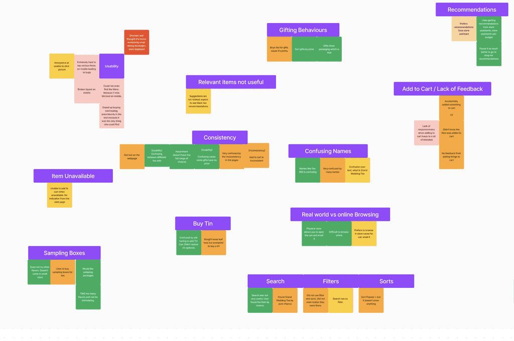
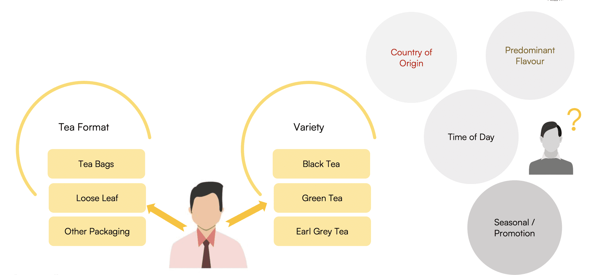
Card Sorting Insights
We also conducted open card sorting with our users to understand how they would naturally organise the variety of products available on TWG's website. This was extremely useful in revealing to us any disparities between the the way the website presented its categories with our users' mental models.
An important finding was that most users were only able to identify tea in terms of their 1) format, such as how it was packaged during purchase 2) variety, such as whether it was black tea / green tea etc.
Swipe to see an example of our card sorting conducted on FigJam
Initial Contextual Inquiry
We observed firsthand how our users interacted with the TWG website and noted that most of our users outrightly expressed that it was challenging or frustrating to use the website. We also found that the main points of friction along the user journey were during the awareness and consideration stage, while the purchase and checkout stages were comparatively smooth.
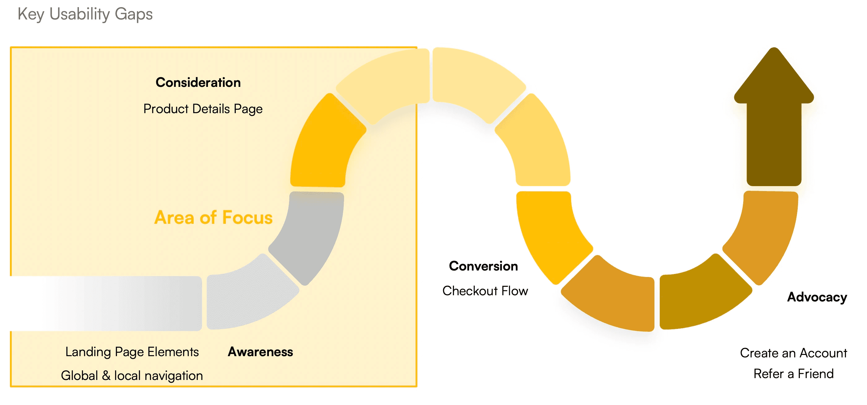
This ties in well with available data on the existing TWG website's performance that indicates a high bounce rate (50%) and short average visitor duration (less than 2 minutes). Altogether, it would not be surprising if majority of website visitors would not stay on the website long enough to complete any online purchases.
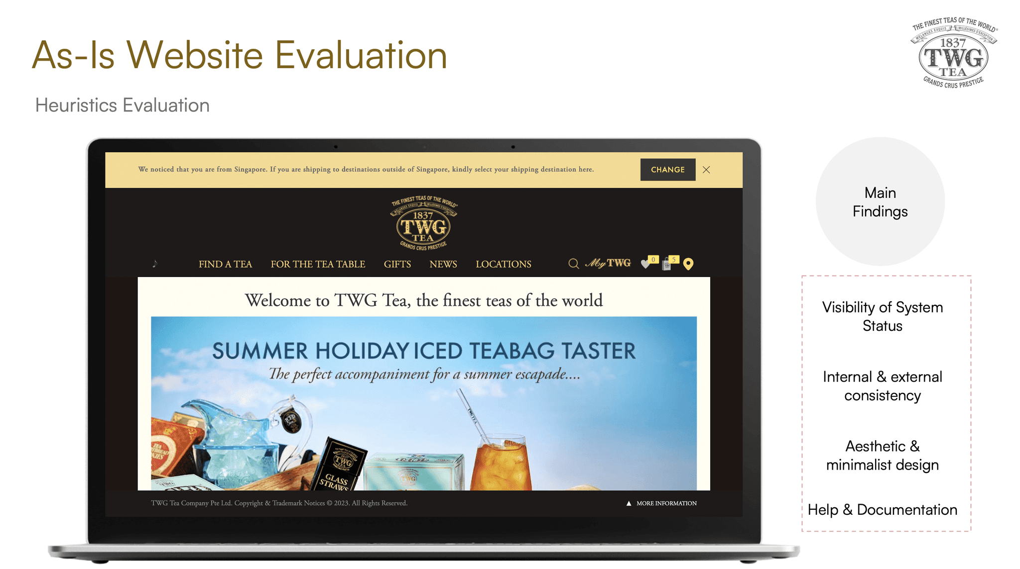
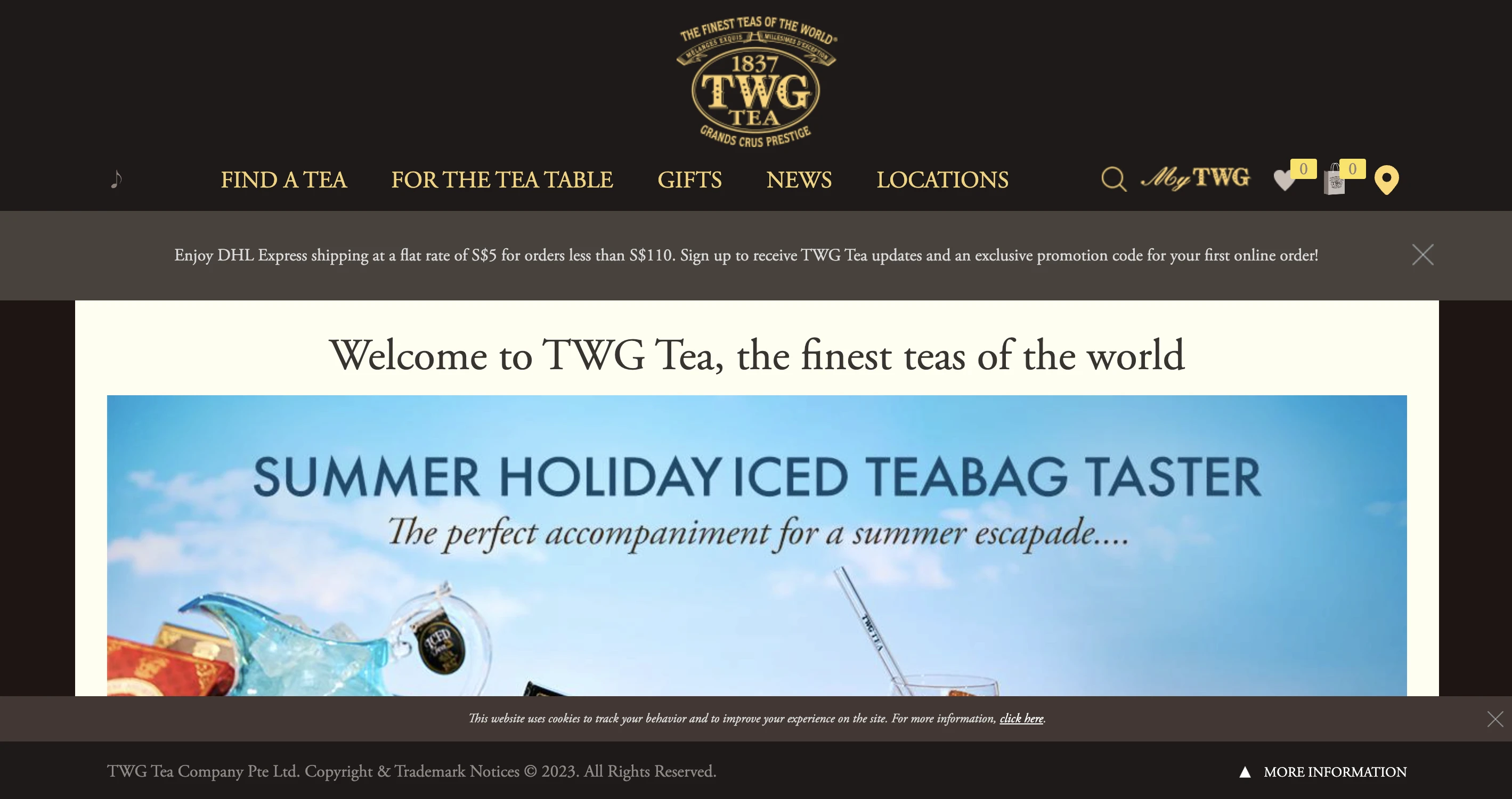
As-Is Website Evaluation
Apart from user sentiments on the existing TWG website, we also did a heuristics evaluation of the current website. The main violations were on the aspects of 1) visibility of system status 2) internal & external consistency 3) aesthetic and minimalist design 4) help and documentation.
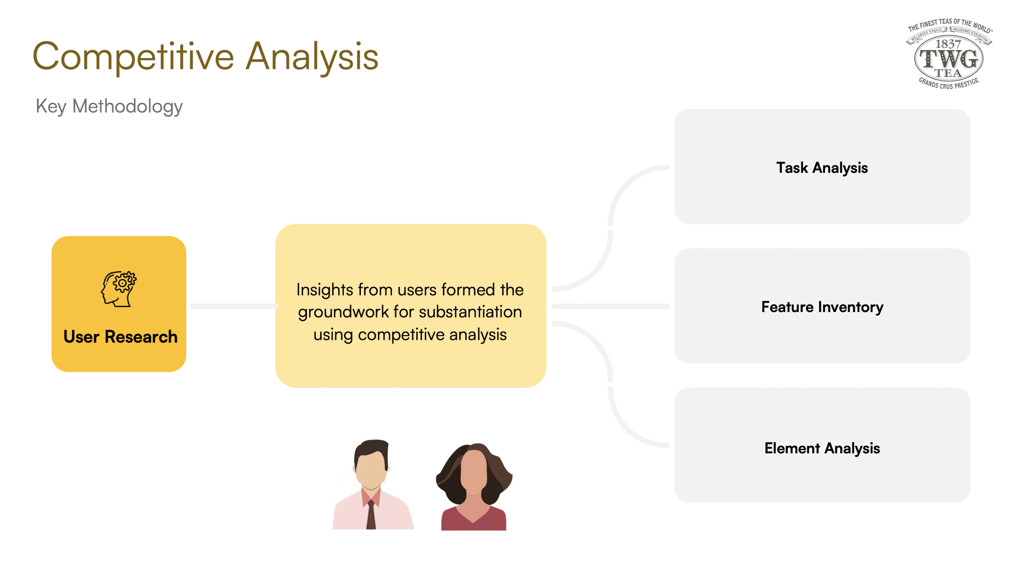
Benchmarking against TWG's competitors
A comparative analysis of TWG with key competitors such as Fortnum & Mason, Gryphon Tea, 1827 Clipper Tea showed that navigating TWG's website was more challenging and less functional.
A Summary of Key Insights
Our user research revealed a lot about user habits regarding tea purchases, particularly the limited knowledge of various tea aspects and the tendency to purchase tea for gifting purposes. We also learnt about their online shopping habits, such as how some were drawn to third party sites such as Shopee and Lazada due to the attractive sales. Interestingly despite the rise of mobile-first, some users also expressed that they still preferred to use desktop for some of their online purchases.
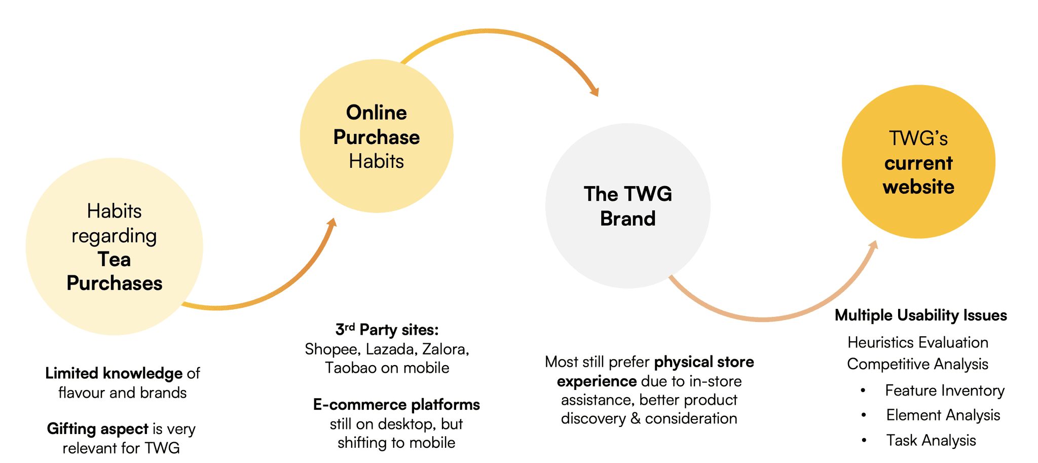
On TWG in particular, users mentioned they still preferred shopping for tea in store due to the tactile purchase experience, such as being able to smell the tea leaves, and the presence of staff to guide them with recommendations. On the TWG website, users generally felt the website was frustrating to use. We then sought to substantiate this with further study through a heuristic evaluation as well as a comparison with key competitors.
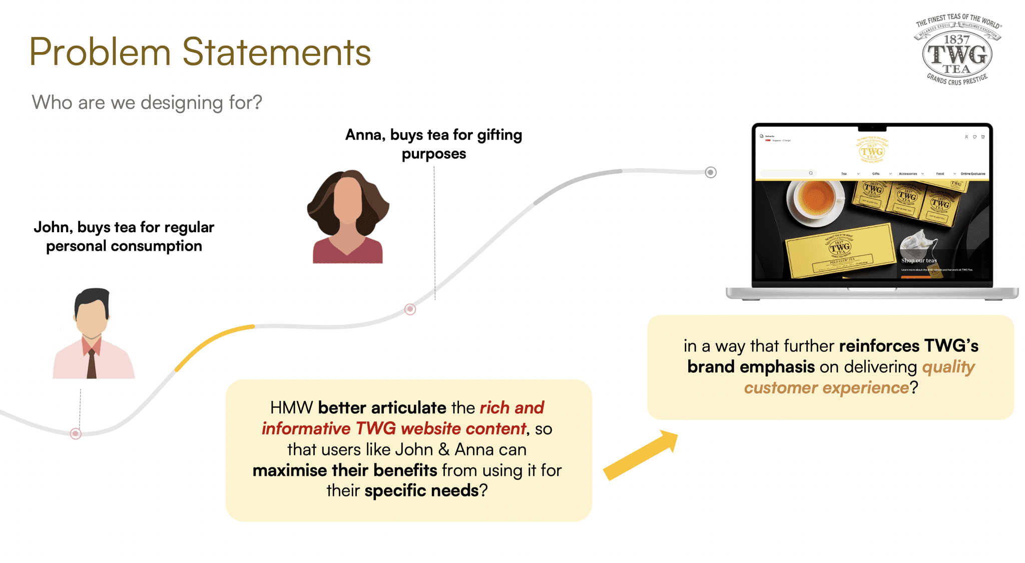
User Personas
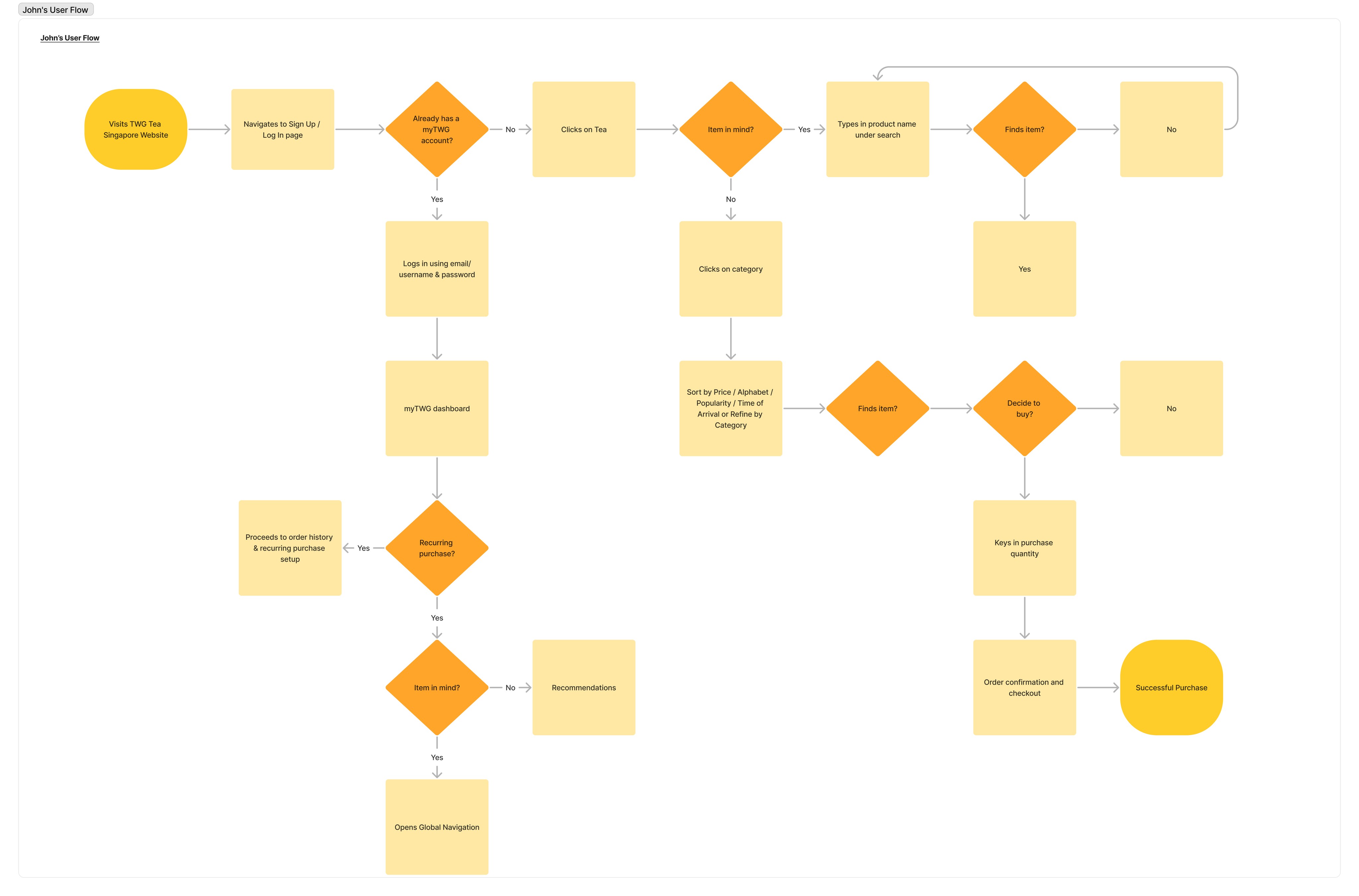
From our user research, we were able to derive two distinct user personas, 1) John who primarily purchases TWG Tea products for personal consumption on a regular basis and 2) Anna who purchases TWG Tea products for gifting purposes.
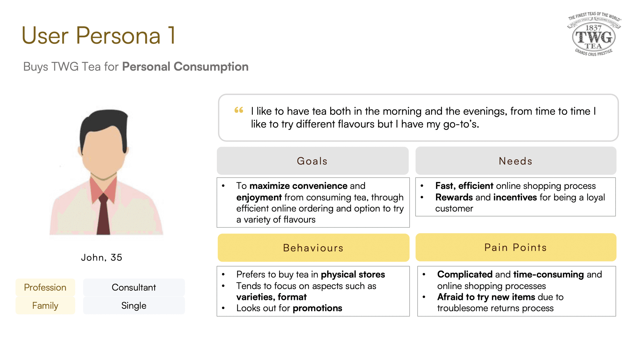
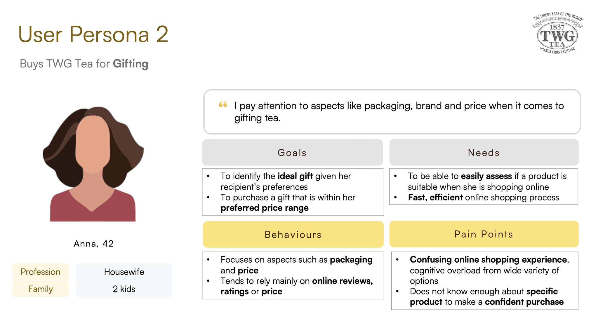
Swipe to see both user personas.
Phase 2: Define
After conducting our research processes, the focus now shifted to narrowing down an appropriate problem space. After synthesising our insights and taking into consideration TWG's business context, an key takeaway was that there was the website simply did not address any of our user's primary needs.
Ultimately, while our personas had different goals when it came to visiting the TWG website, they had the similar needs of needing straightforward product discovery, clear and intuitive navigation and efficient checkout.
Problem Statement
While TWG's current website was designed to provide value to users through the form of rich content and information on the full range of TWG's products, this was not what our users came to the website for. In other words, there was a mismatch between the value-add intended for the website with the user's actual tasks and requirements.
HMW Statement
How might we better articulate the rich & informative TWG website content, so that users like John and Anna can maximise their benefits from using it for their specific needs, in a way that further reinforces TWG's brand emphasis on delivering quality customer experience?
Phase 3: Ideation
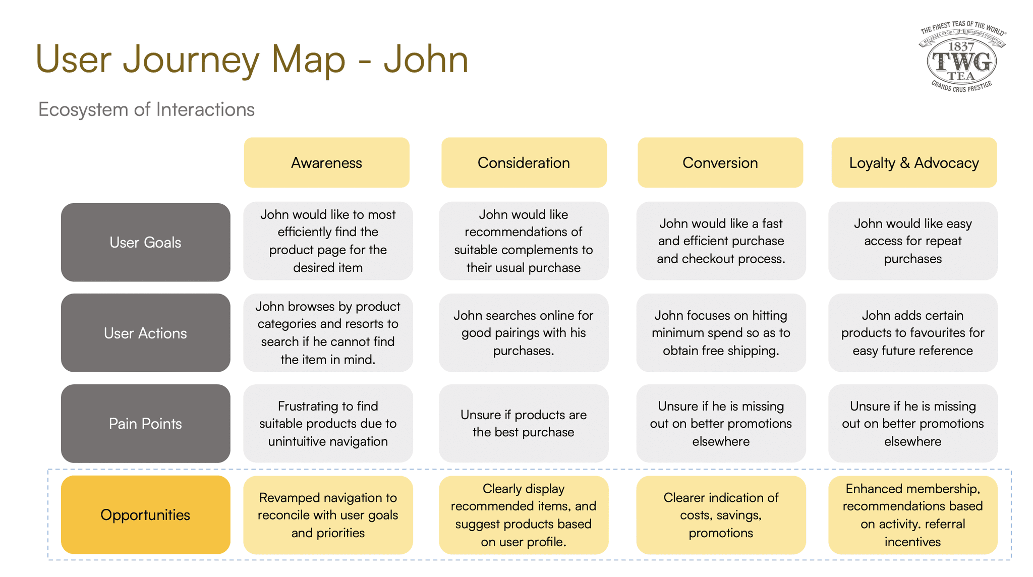
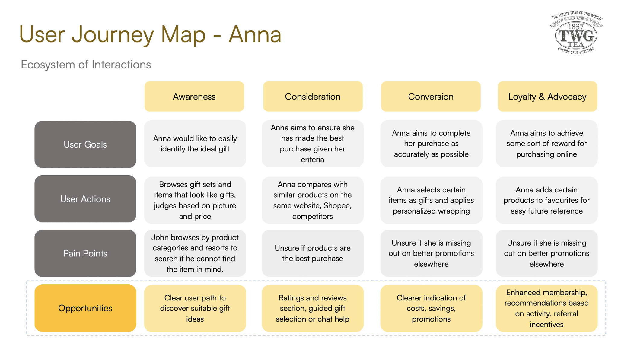
After identifying the problem space, I constructed a user journey map for both personas to identify opportunities for improvement along the entire journey of engagement with TWG Tea. Each stage of their interactions with the brand revealed specific pain points that had corresponding opportunities for design solutions.
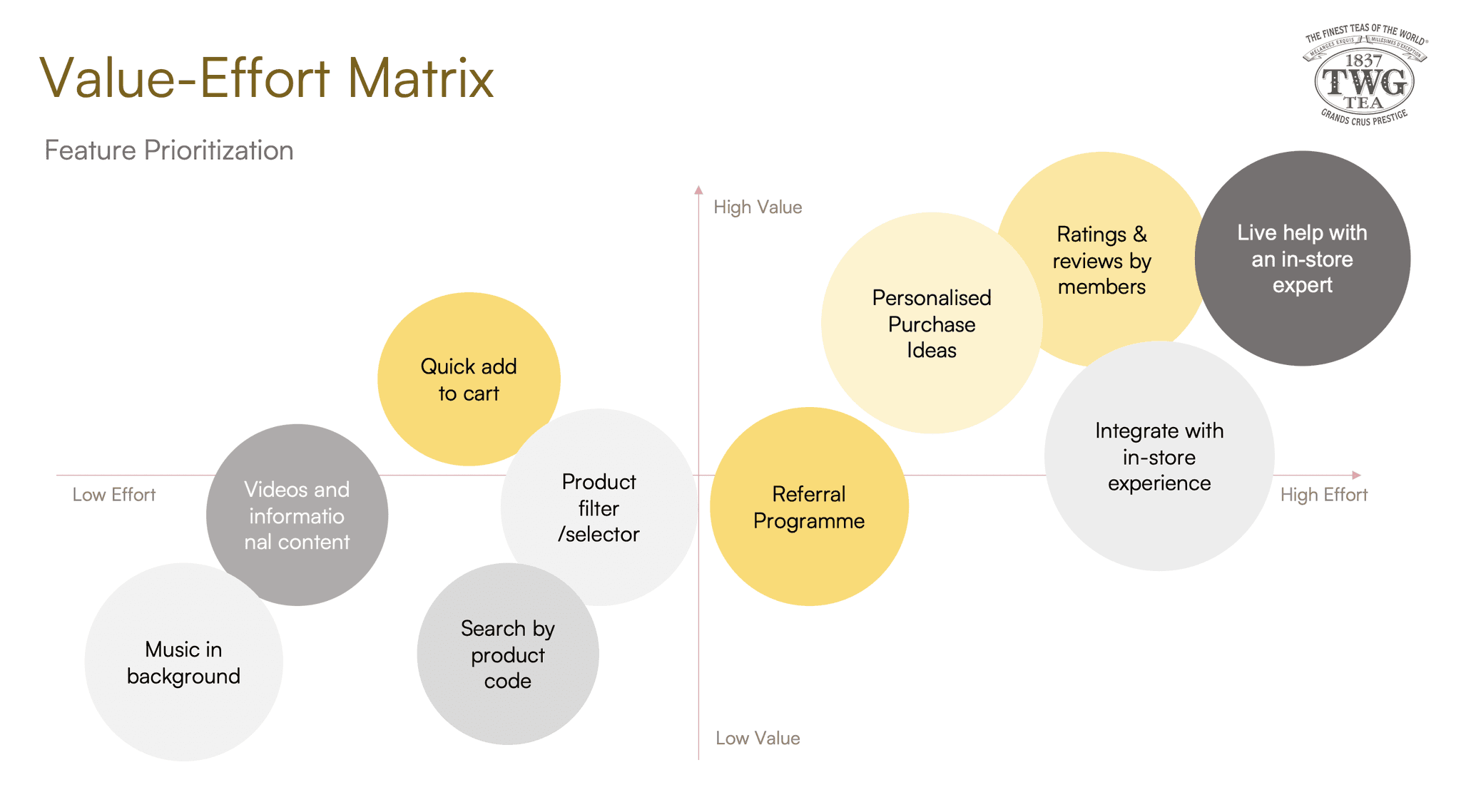
Feature Prioritization
Sketches & Wireframes

Proposed Solutions
Following my ideation process, I arrived at a three-pronged solution set to address the problem space. This involved first solving the critical issue of poor findability by delivering a thorough revamp of the current website's navigation (Solution 1).
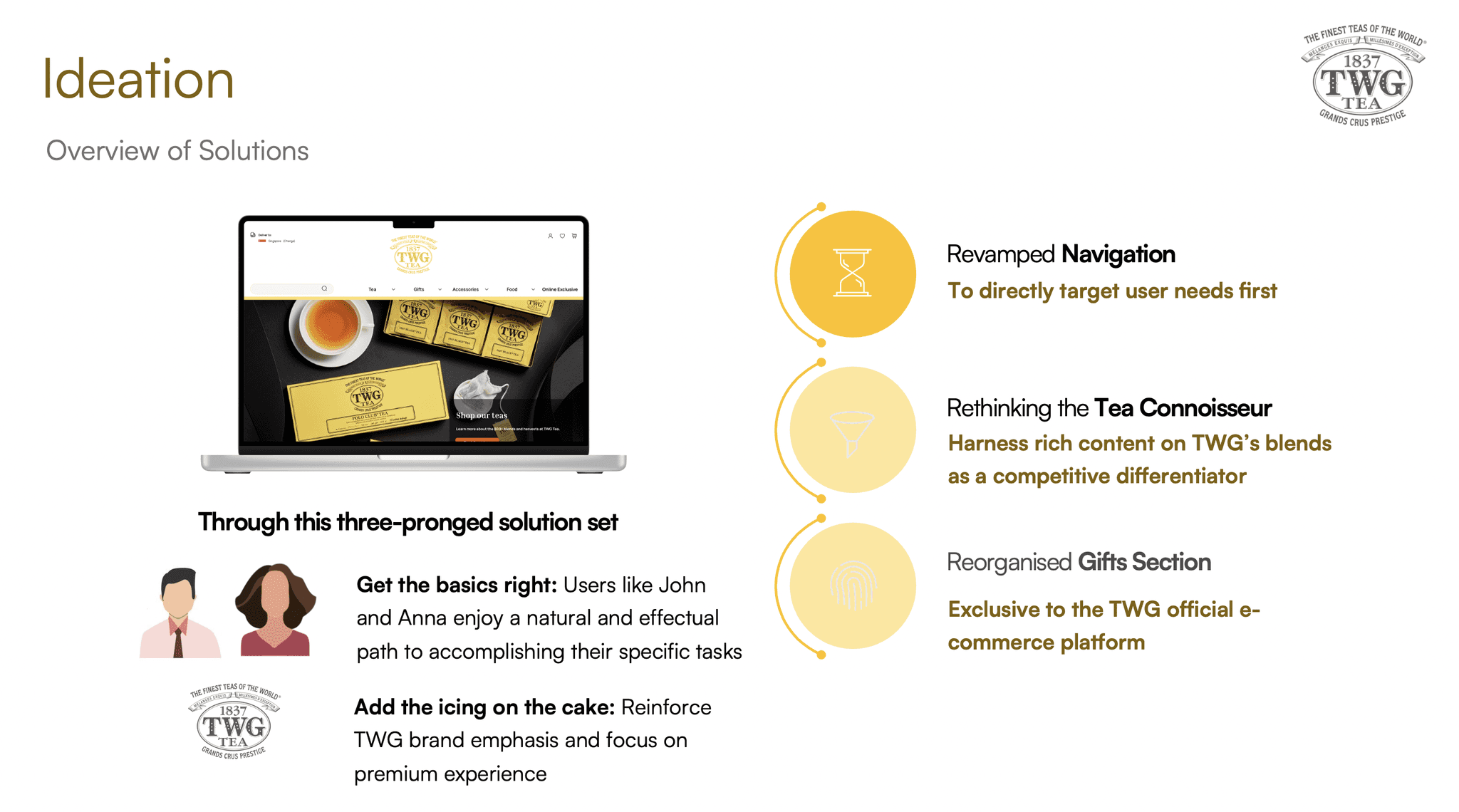
Once this was done, more feature-rich solutions to cater to secondary needs could then be implemented. Namely, better articulation of the wealth of information on TWG's products (Solution 2) as well as improving the user flows for gift purchases (Solution 3).
Phase 4: Prototype
An overview of the proposed solutions as follows:

Solution 1: Revamped Navigation

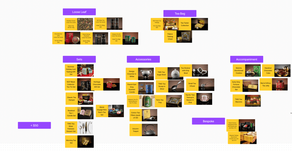
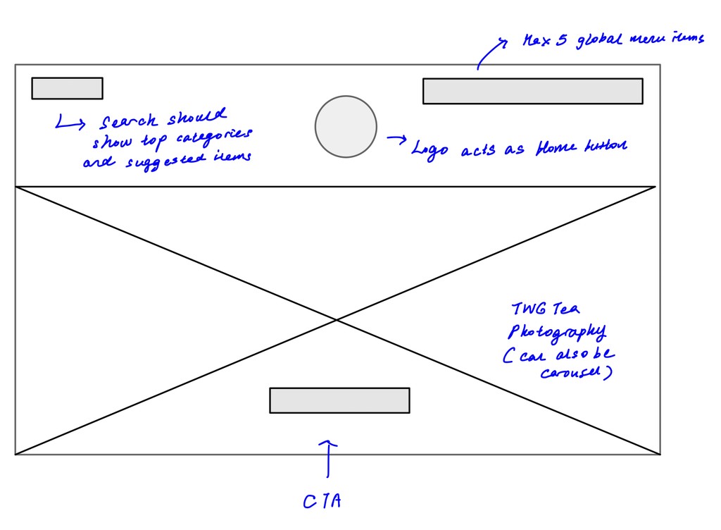
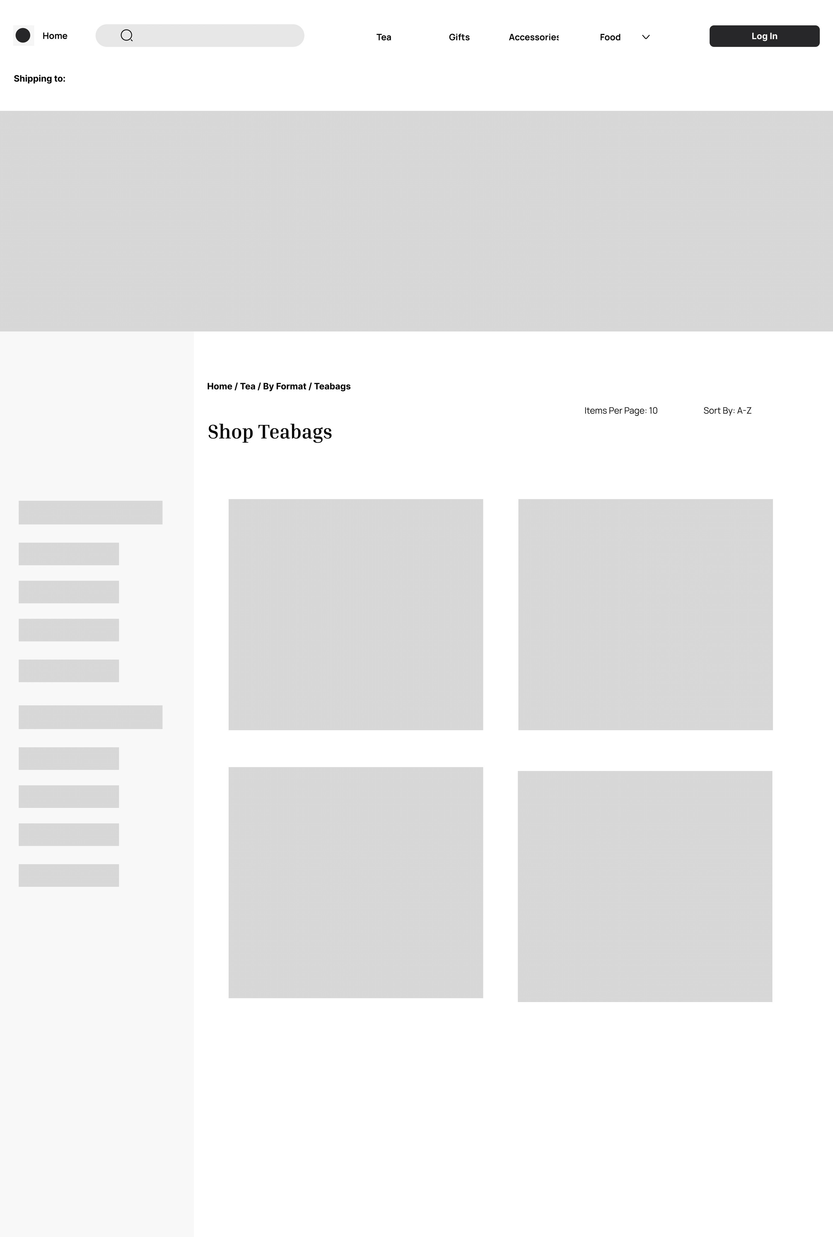
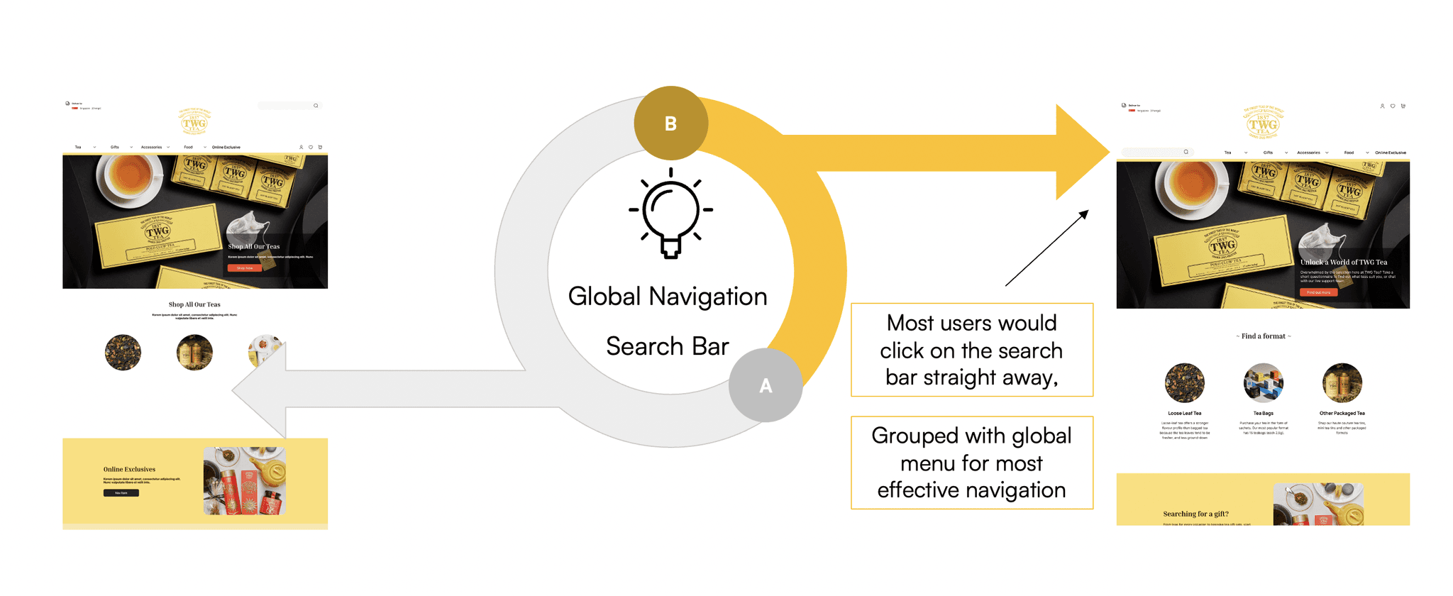
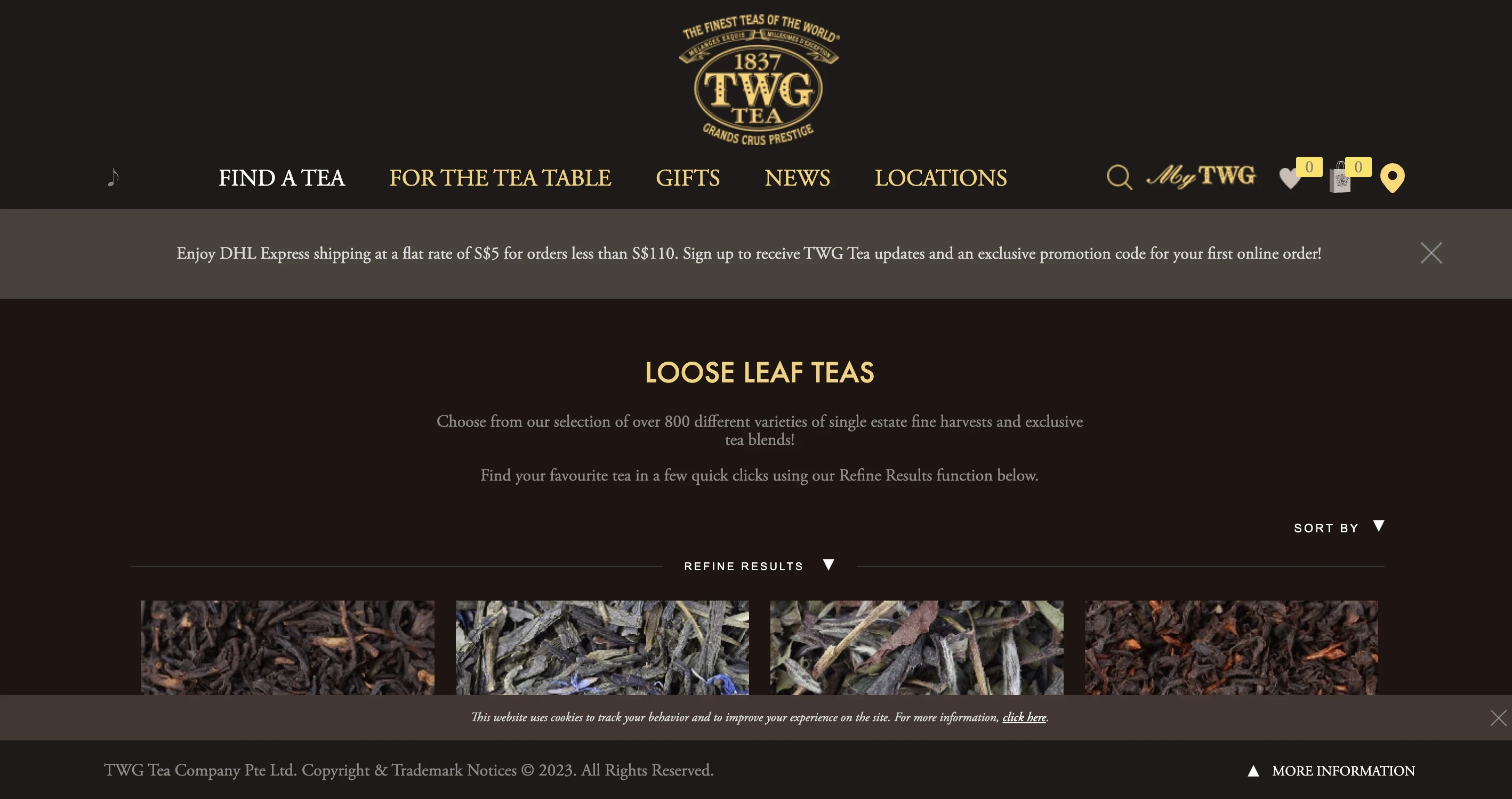
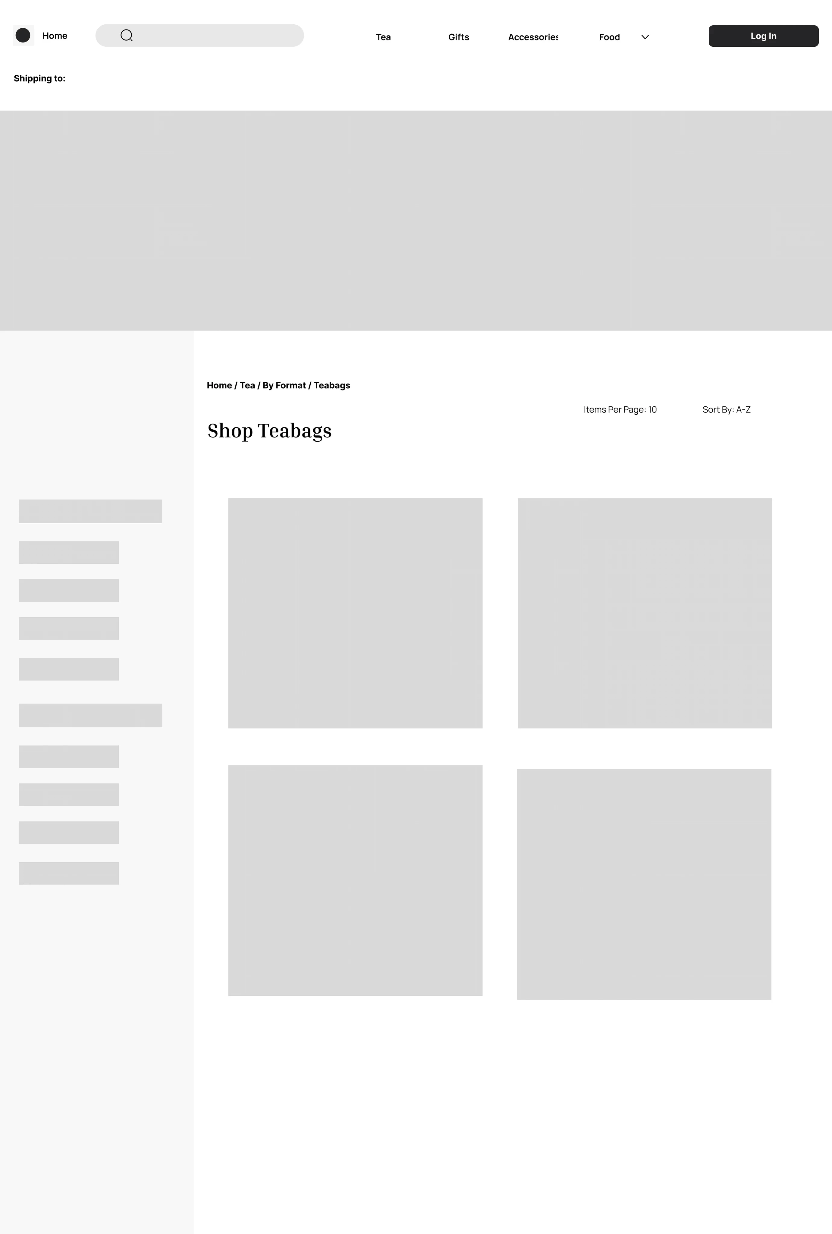
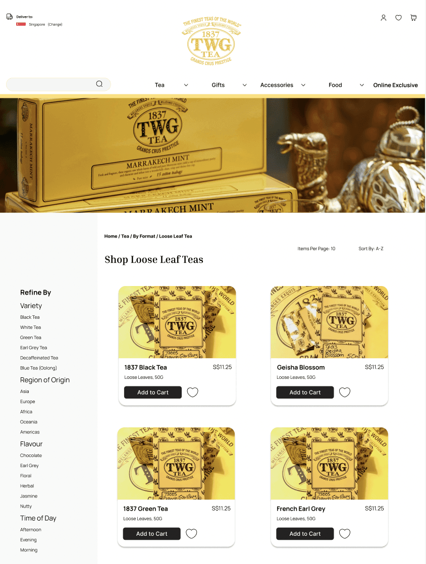
Having established findability and ease of navigation as the top priority, this solution proposes an overhaul of the global and local navigation to better align with user mental models on tea products. The revamped global navigation consists of these distinct categories: 1) Tea 2) Gifts 3) Accessories 4) Food 5) Online Exclusive.
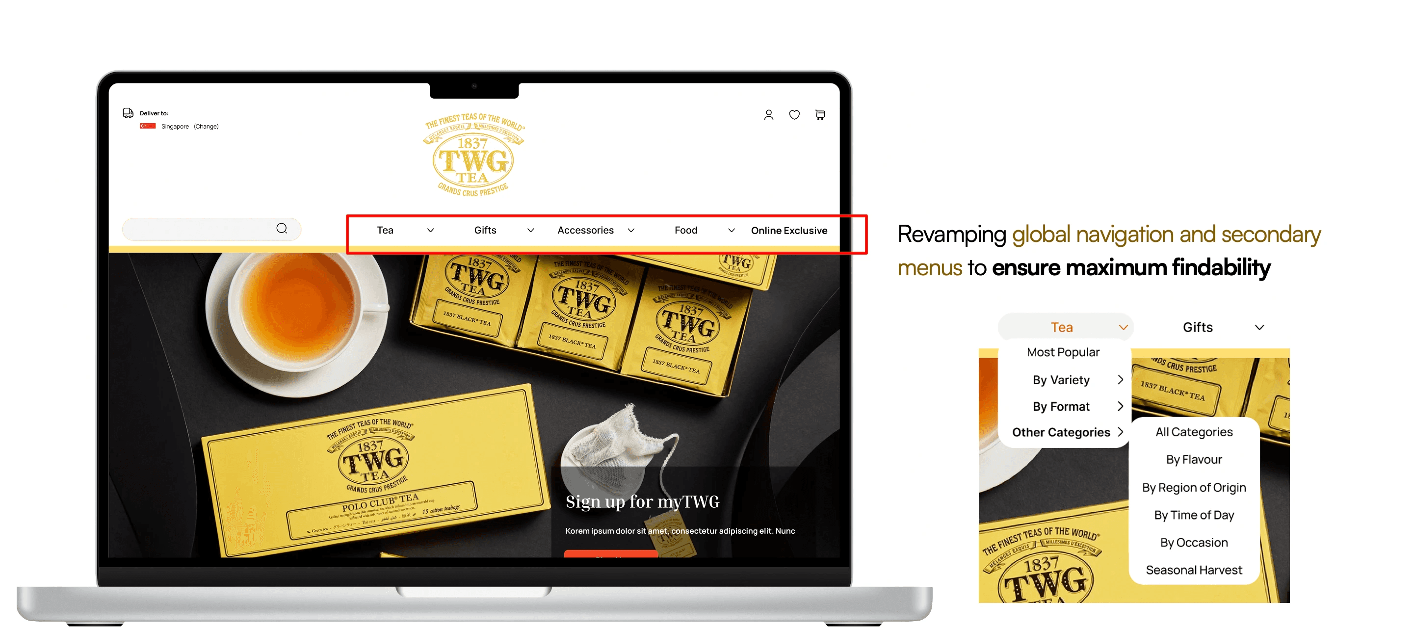
The local navigation for the tea category would be streamlined to include only the following subcategories: 1) Most Popular 2) By Variety 3) By Format 4) Other Categories. To avoid cognitive overload, less well-understood categories such as Region of Origin, Flavour, Time of Day and Occasion would be grouped under "Other Categories".
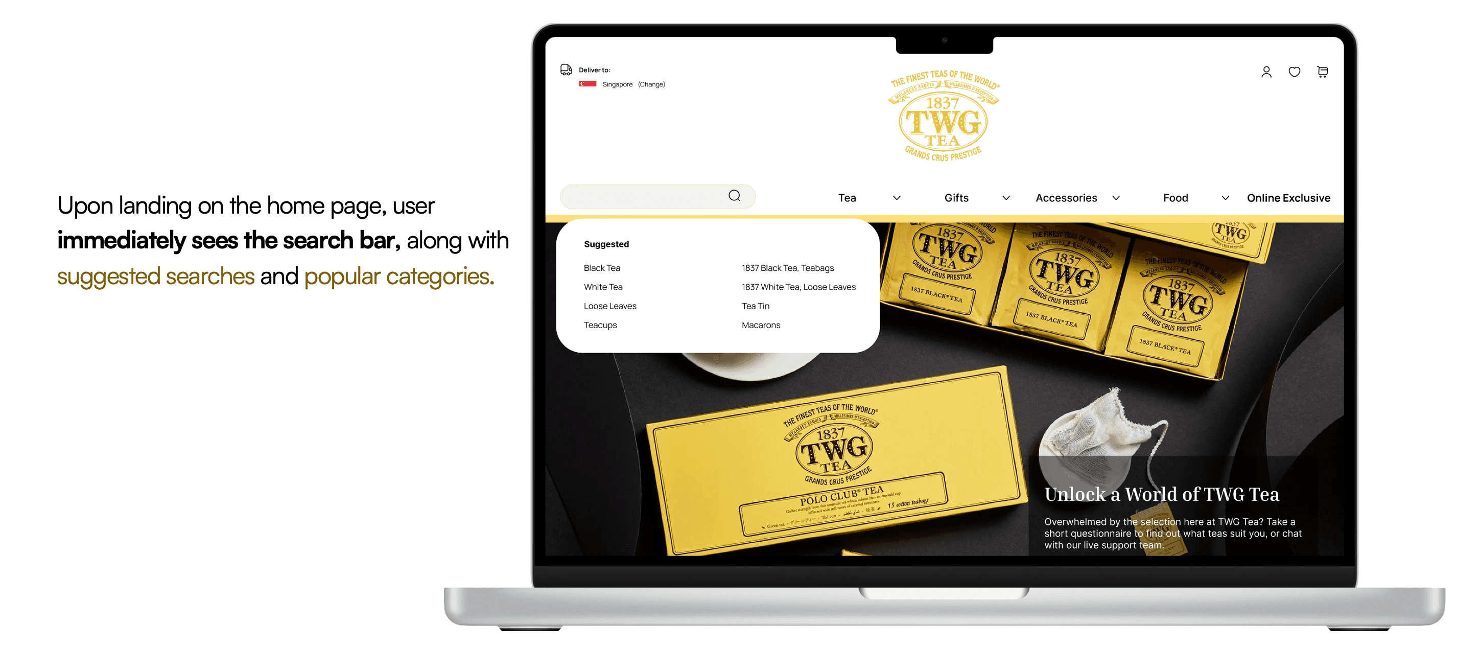
To further facilitate product discovery, the search bar would display suggested searches and popular categories when clicked. Placement of the search bar per the mockup, would be strategic such that users would easily notice it upon landing on the TWG website. This is consistent with the F-pattern for viewing, and was also validated through user testing.
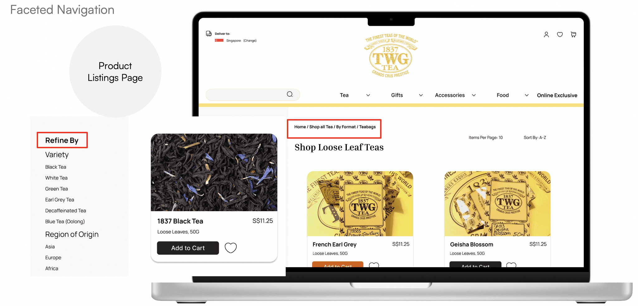
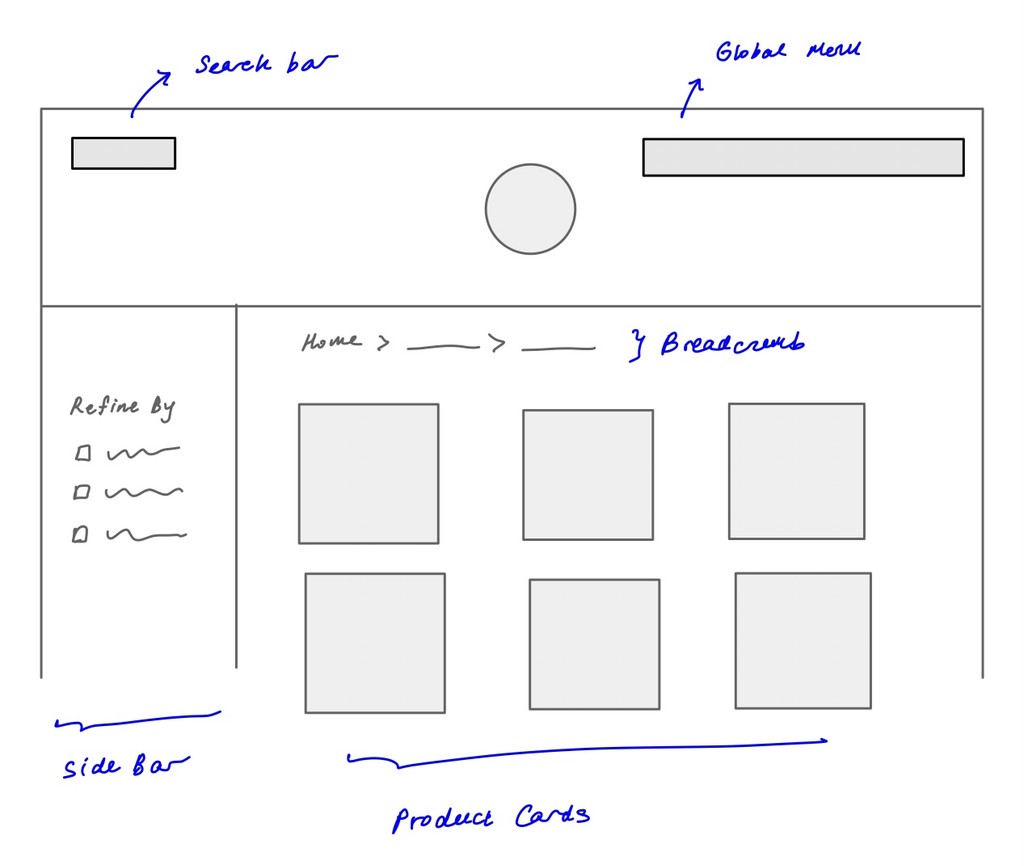
On the product listings page, contextual and faceted navigation were also enhanced using insights from competitive analysis. For instance, the solution proposes a permanent side bar where the user can toggle settings to further refine the search results, similar to practices by other players in the industry, while breadcrumbs at the top of each page enable the user to keep track of where they are within the website.
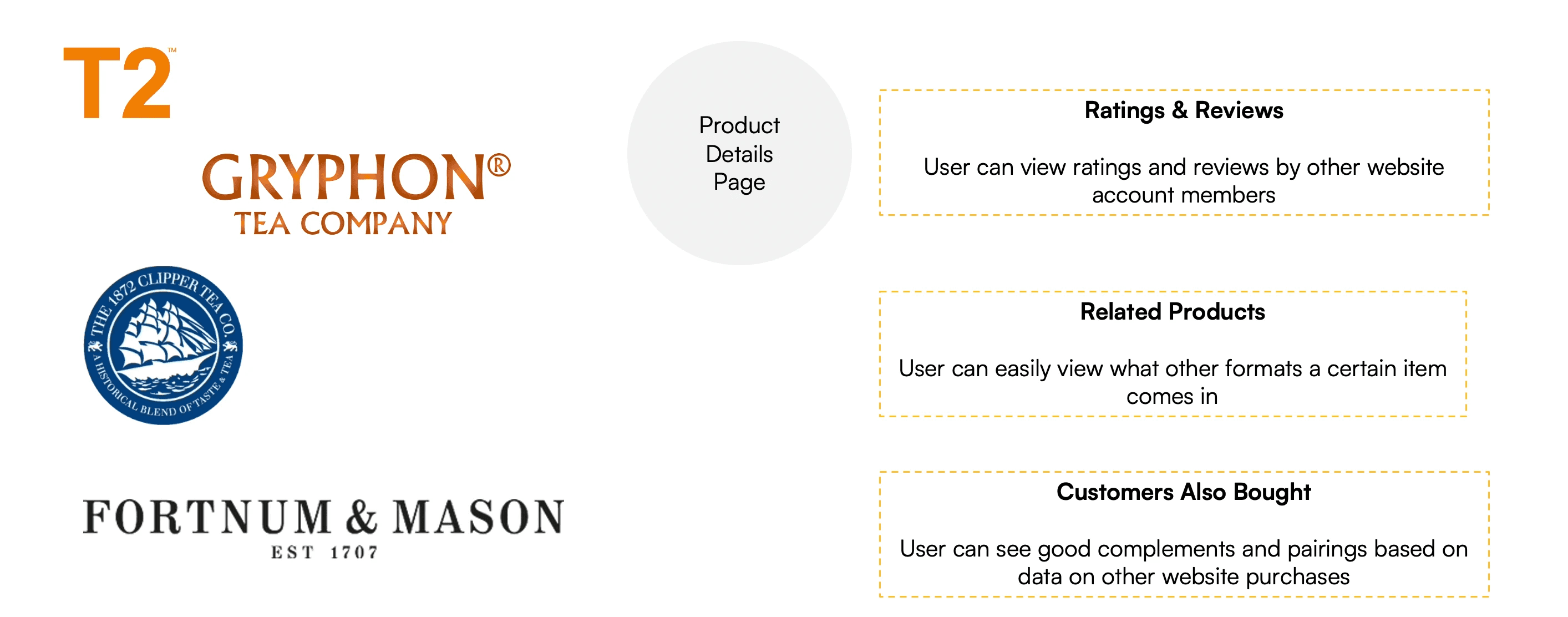
Similarly, using common practices among competitors as a benchmark and inspiration, the product details page was also redesigned to include sections such as 1) ratings and reviews 2) related products, to display variations of the same tea type 3) products bought by other customers, for the user to find good complements and pairings. Altogether, these aim to further enhance the product discovery process.
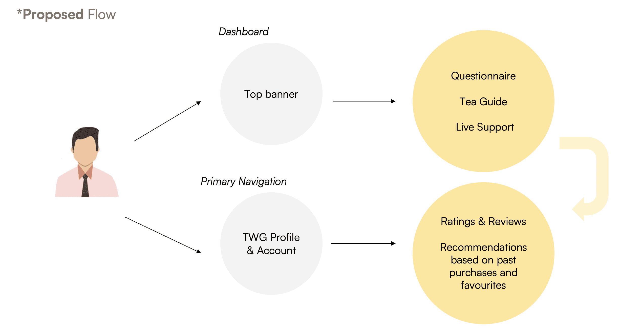
Solution 2: Rethinking the Tea Connoisseur
In the current website, we found that the supposed "Interactive Tea Connoisseur" feature had very low discoverability because the old flow only had one entry point that was easily missed. The original website also only had a questionnaire consisting of two questions before the user would be led to what appeared to be a search results page with certain filters applied. In the proposed flow, we produced two new entry points to tapping the "Interactive Tea Connoisseur" functionality.
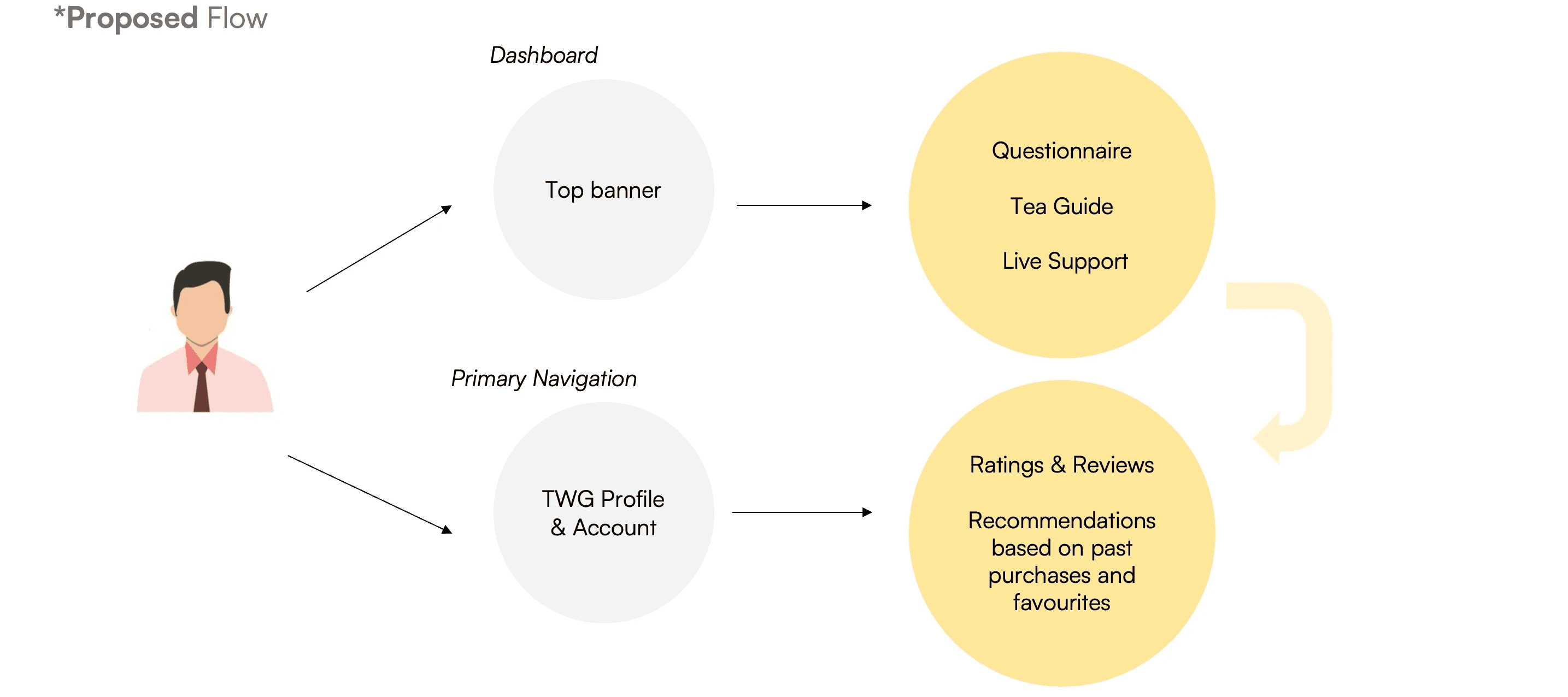
A user would be able to get generic recommendations right upon clicking the top banner CTA on the home page, which would lead him to resources such as the questionnaire, tea guide and live support. Alternatively, the user could login to his TWG profile and get more targeted recommendations given his purchase history and past interactions on the website.
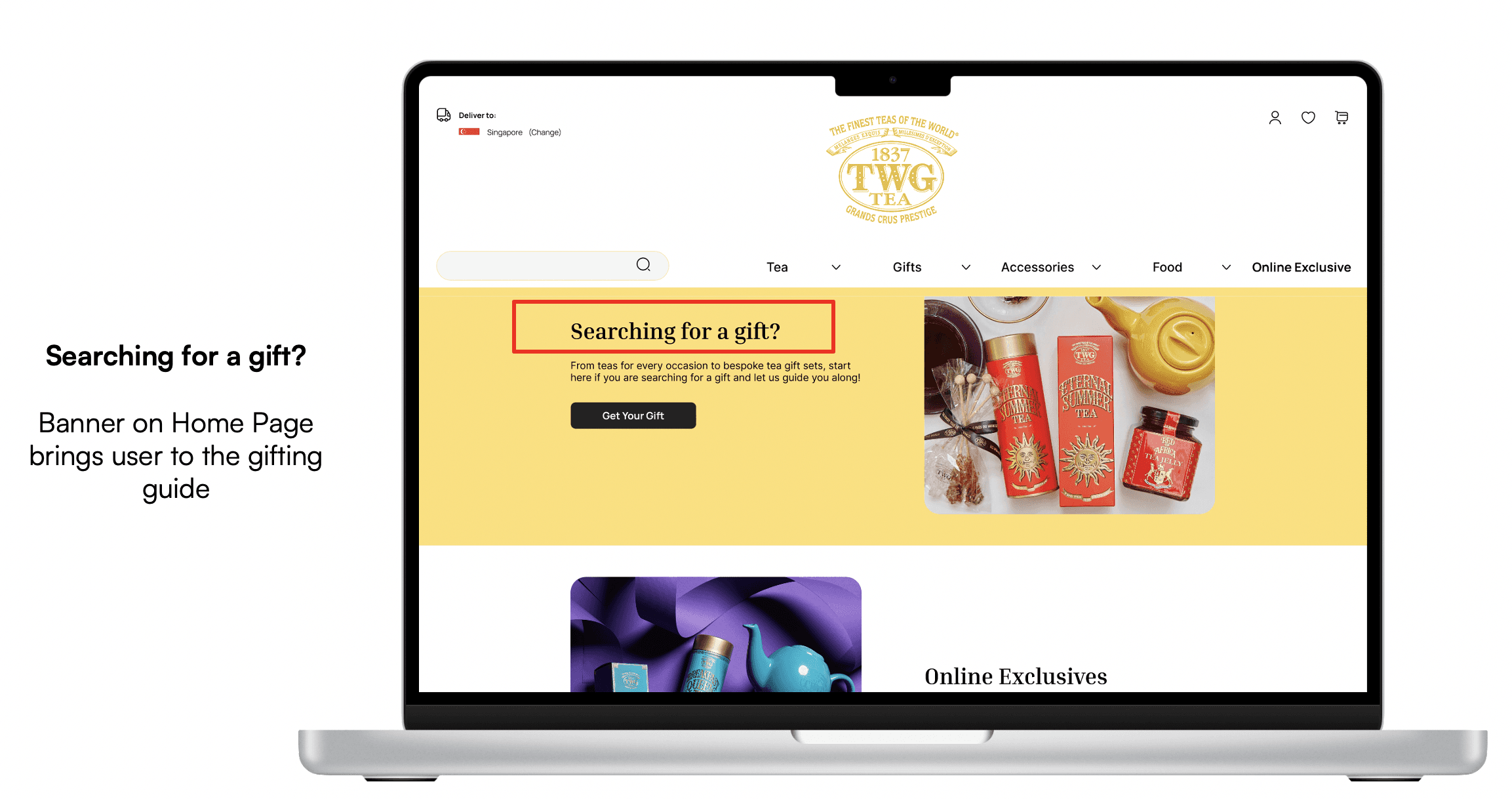
Solution 3: Repackaging the Gifting User Flow
In the current website, most of TWG's regular items tend to already be bought as gifts and as such can appear in multiple categories. In other words, a website user could find a product such as Silver Moon Tea under both "Find a Tea" and "Gifts".
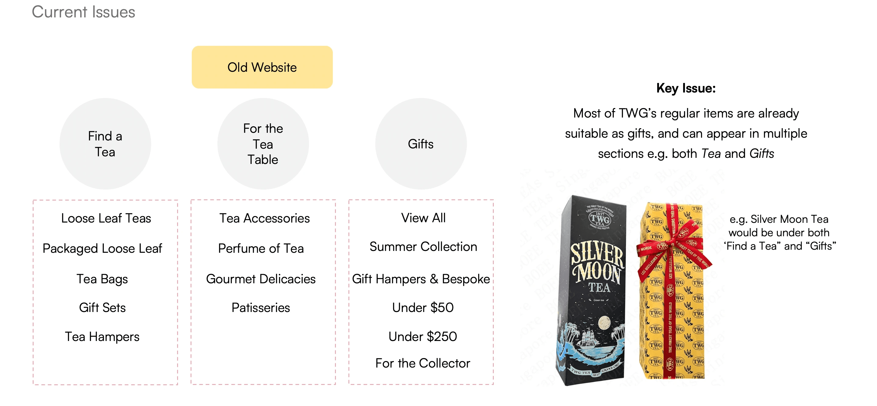
Our research also indicated that users who purchased tea products mainly for gifting were more conscious of aspects such as price, packaging and personalisation. While there was some degree of categorisation by price on the existing website ("Under $50" and "Under $200"), users were often confused by the number of subcategories under the Gifts section, such as "For the Collector" and "Summer Collection".
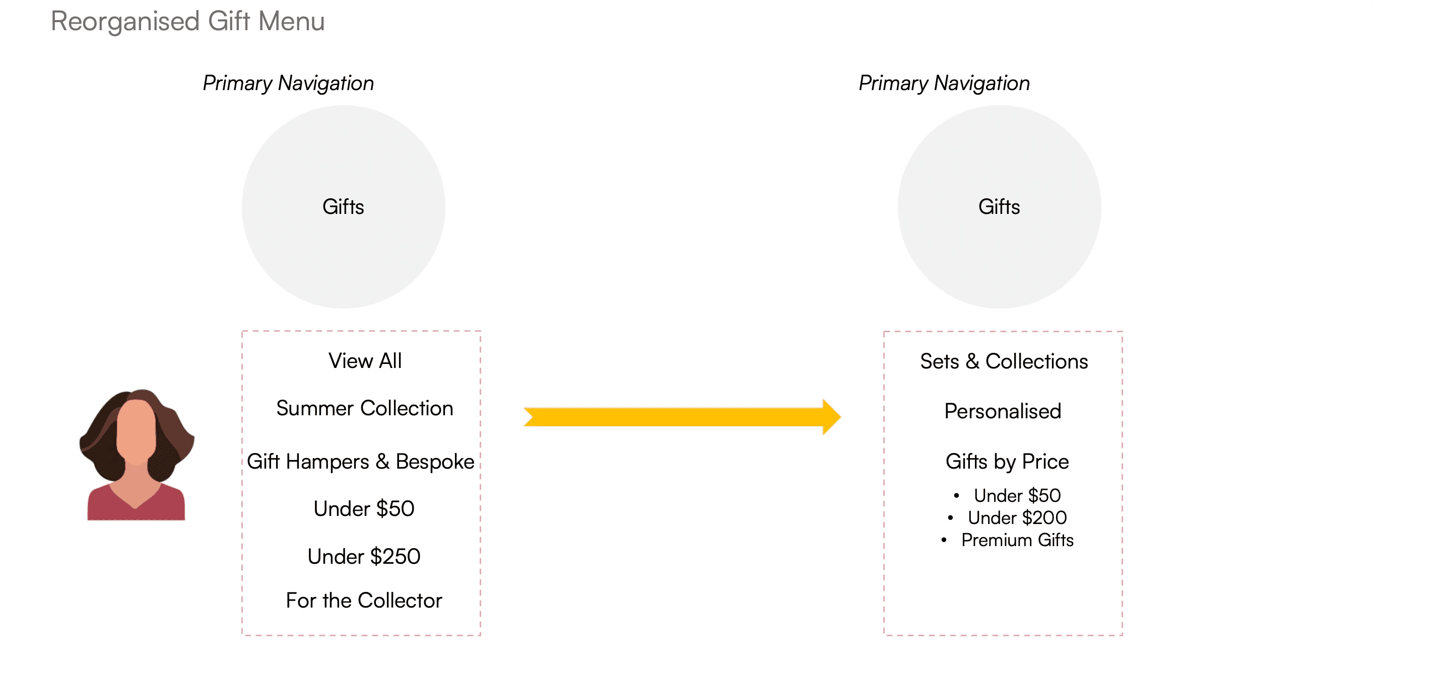
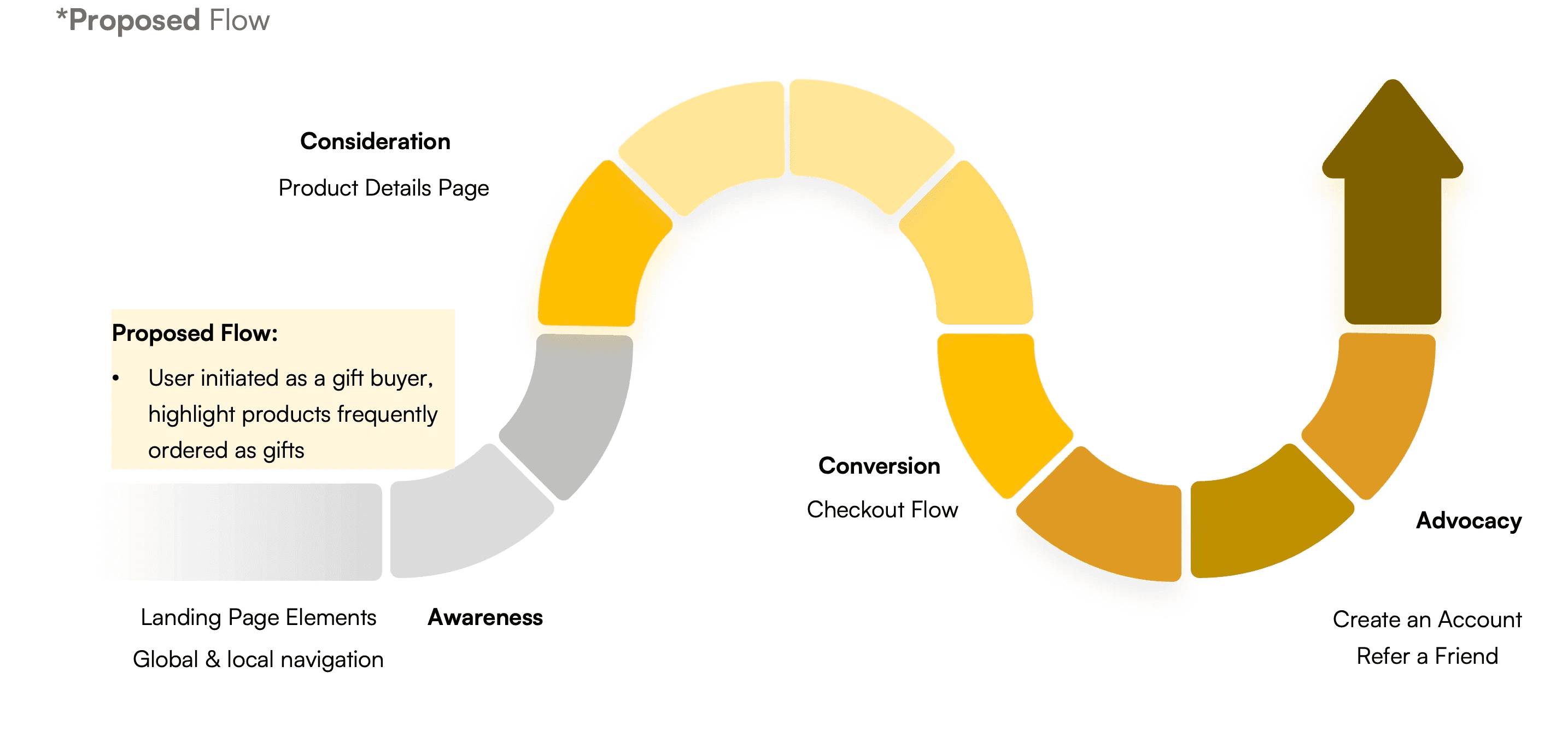
An easy way to optimise the gifting user flow would be to bring user's entry point forward. In the current user flow, it is only during the checkout process that the user can indicate a particular item as a gift and add a personalised message.
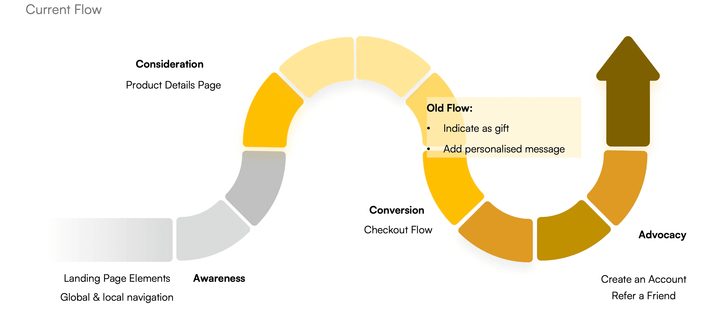
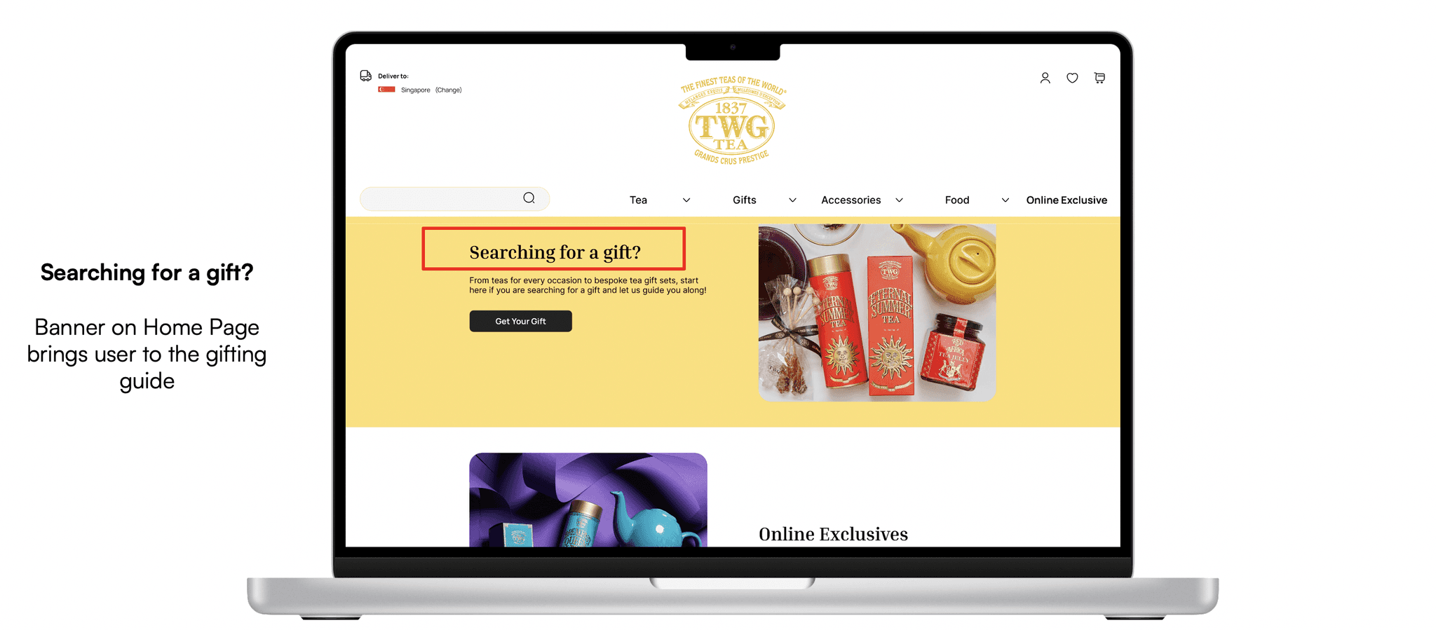
Swipe to see the proposed entry point for the new gifting flow.
In the proposed user flow, a gift shopper is inducted into gift-shopping journey right from the start at the awareness stage, by having a gifting guide and questionnaire for the user to fill in for easier product discovery.
Phase 5: Testing
Usability testing was imperative to validate the design decisions, and insights from users were incorporate at various stages of the prototyping process.
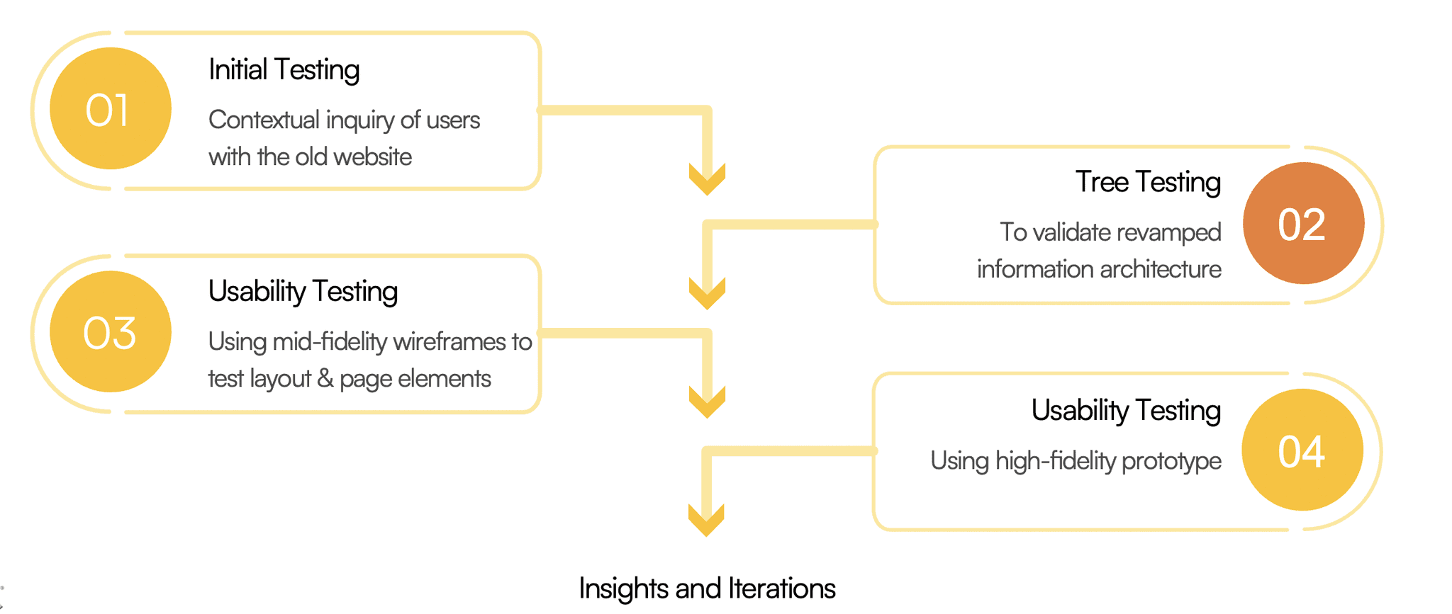
Tree testing was done at the lowest fidelity after the new sitemap was created, to validate that the new information architecture was indeed more intuitive for users.
Usability testing with the mid-fidelity wireframe was done mainly to test the logical flow, page layout and position of key elements.
Usability testing with the high-fidelity prototype was done to test more specific UI elements, including animations and micro-interactions.
Tree Testing
After initial testing with the original website, tree testing was done with five users using Optimal Workshop to test the findability of products given the new information architecture. This was done prior to any prototyping with the main purpose of testing the new organisation of website categories.
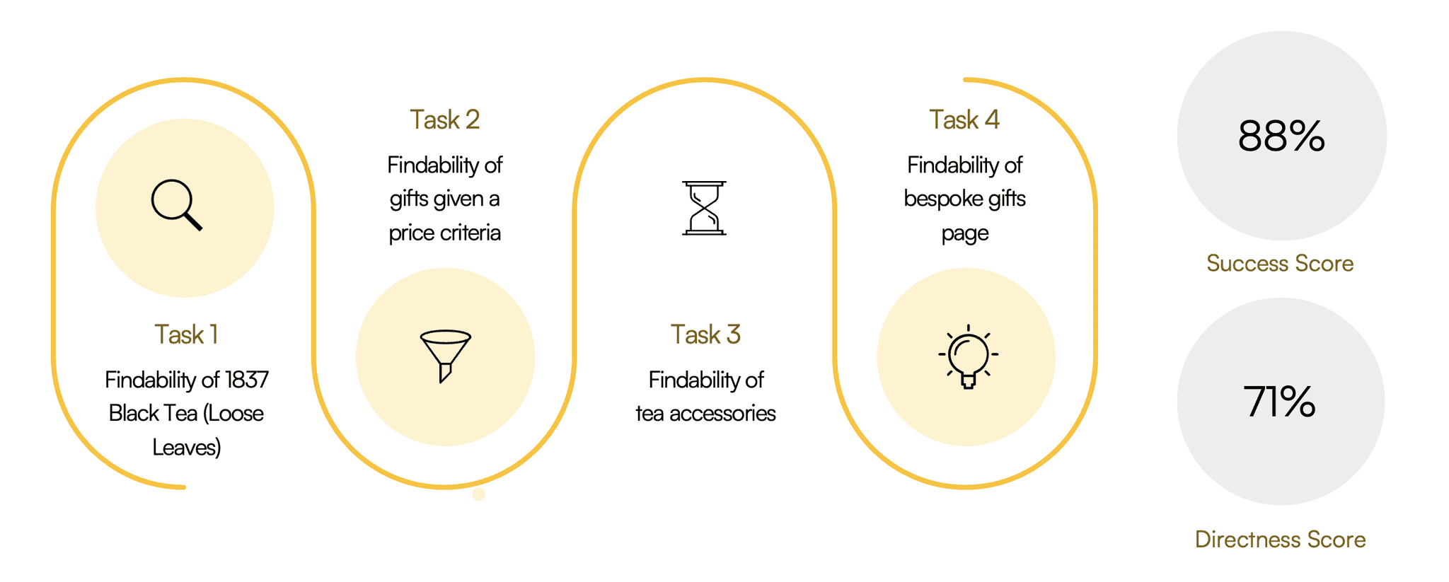
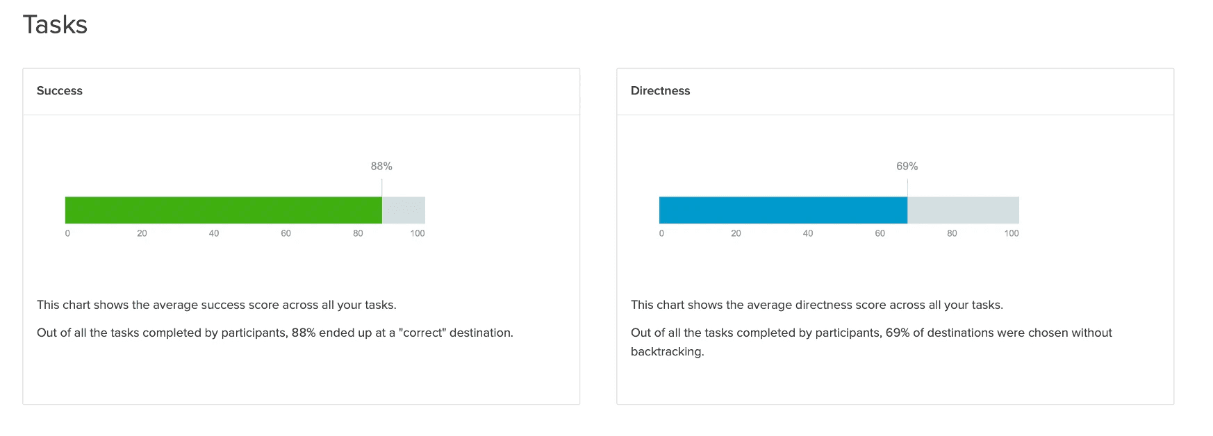
Swipe to see a summary of insights from Optimal Workshop on the tree testing conducted.
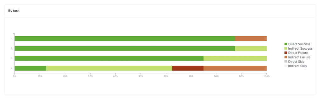
Usability Testing with Prototype
With the high fidelity prototype, I was able to test 3 user flows identified as critical tasks which were problematic in the original website.
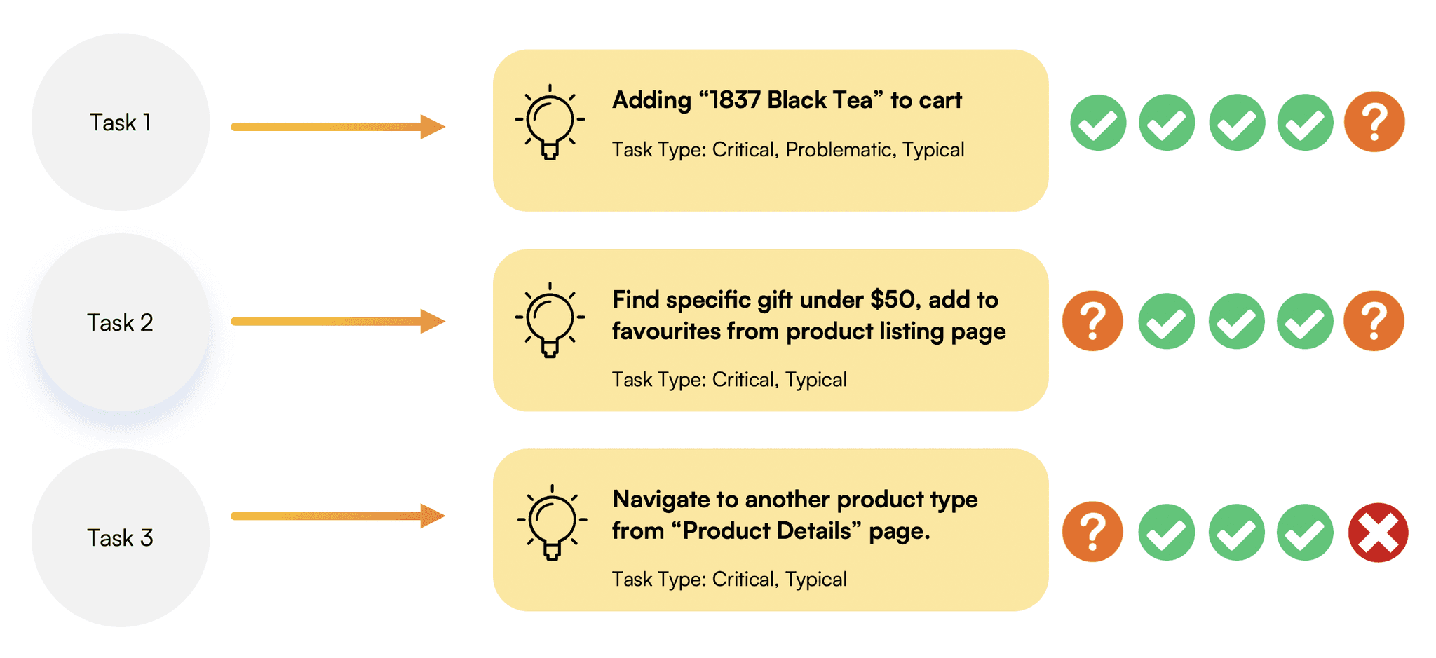
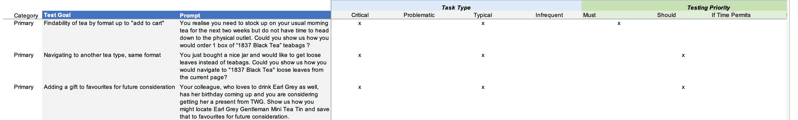
Swipe to see more details of the primary tasks used for testing.
Preference Testing
Additionally, I also conducted a quick preference test for important pages such as the Home Page, to gain an understanding of how to optimally position key page elements.
Ship sites with style.
Go from design to site with Framer, the web builder for creative pros.
Get Started
Learn More
Selected Iterations
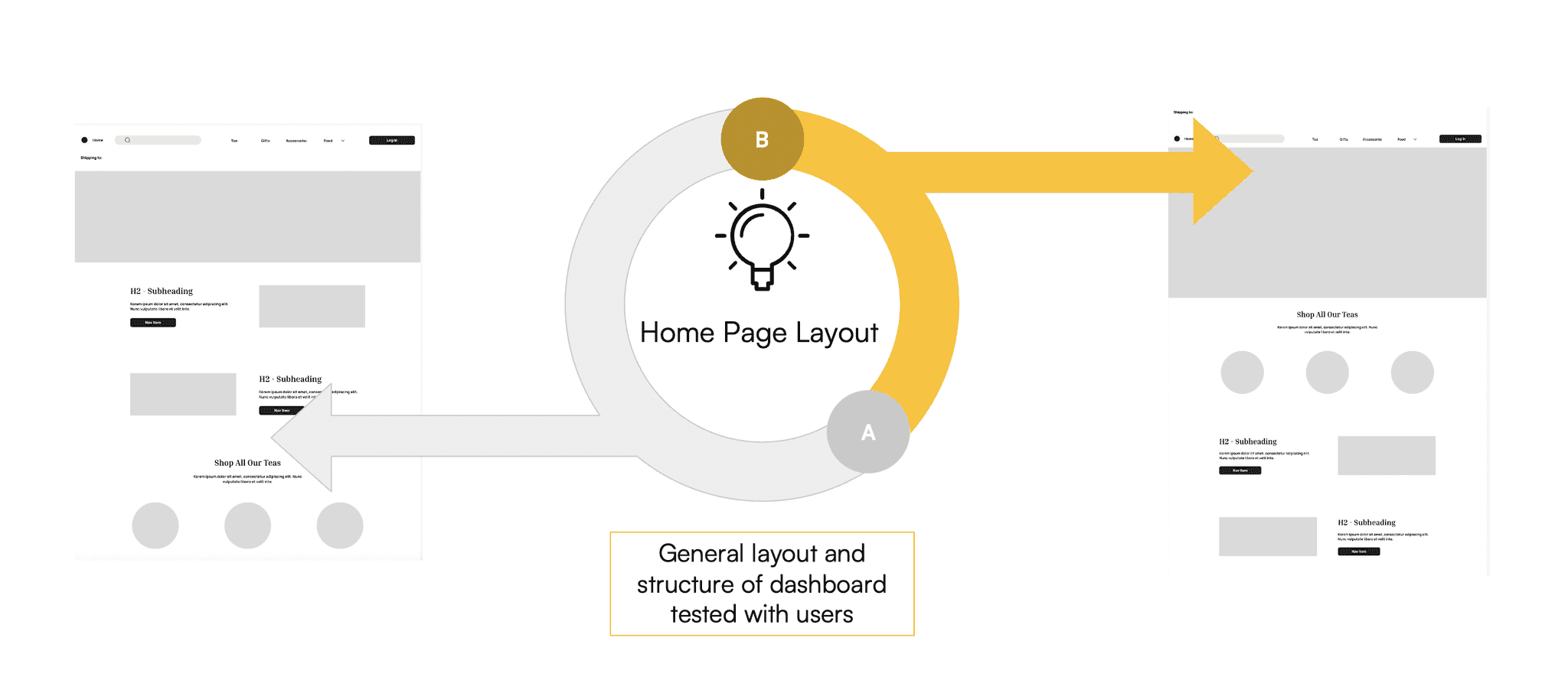
Home Page
As-Is
Original website with 5 categories on the global menu.
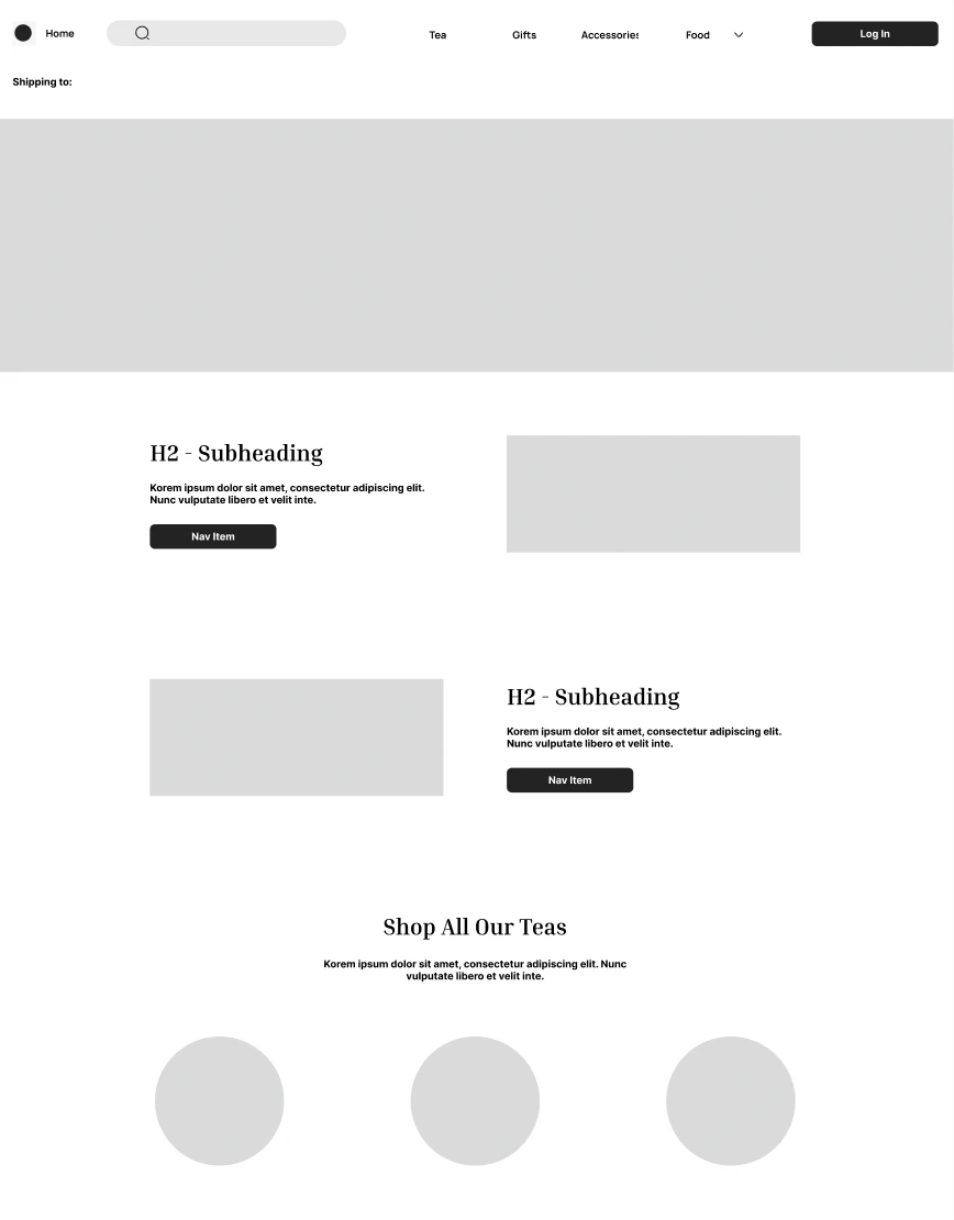
Mid-Fidelity Prototype
Content structure, navigation and layout tested with users.
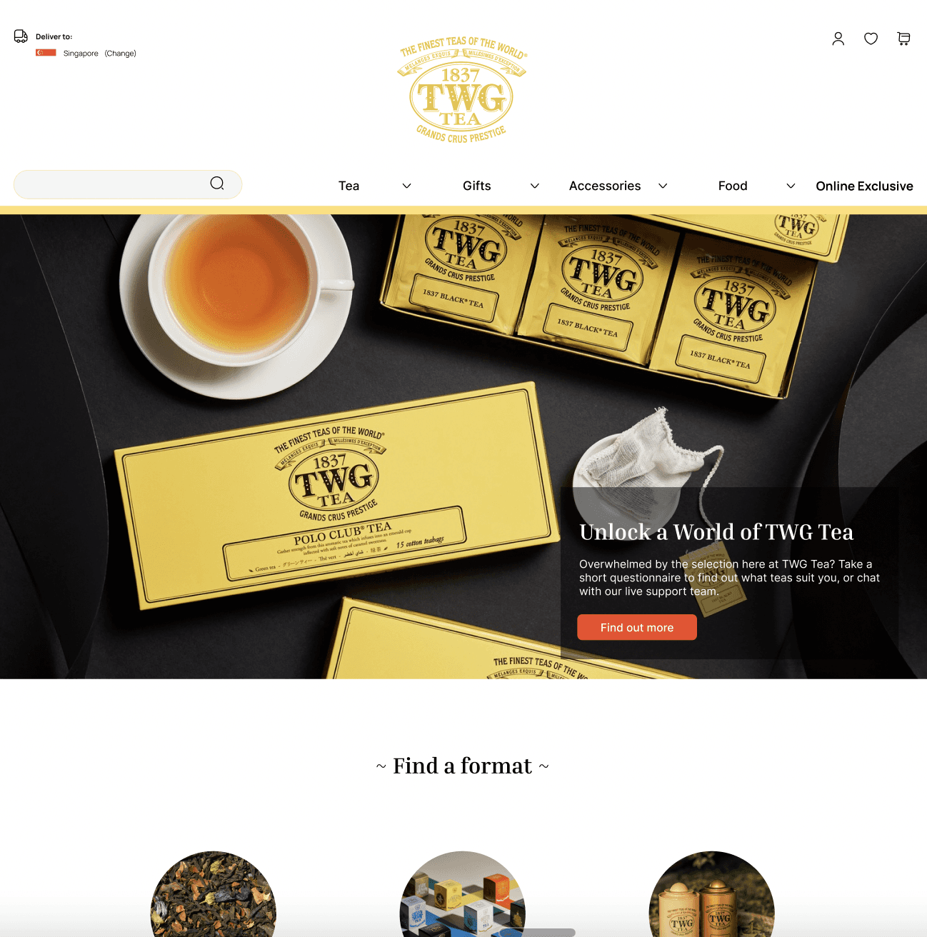
High-Fidelity Prototype
Specific UI elements tested with users.
Product Listings Page
Competitor screens and user inputs helped to arrive at the final iteration of the product listings page, particularly the inclusion of the sidebar with the faceted navigation (refined categories and sort features), the use of breadcrumbs, as well as the number of products to display per page and row.
As-Is
Original product listings page layout.
Mid-Fidelity Prototype
Content structure, navigation and layout tested with users.
High-Fidelity Prototype
Specific UI elements tested with users.
Product Details Card
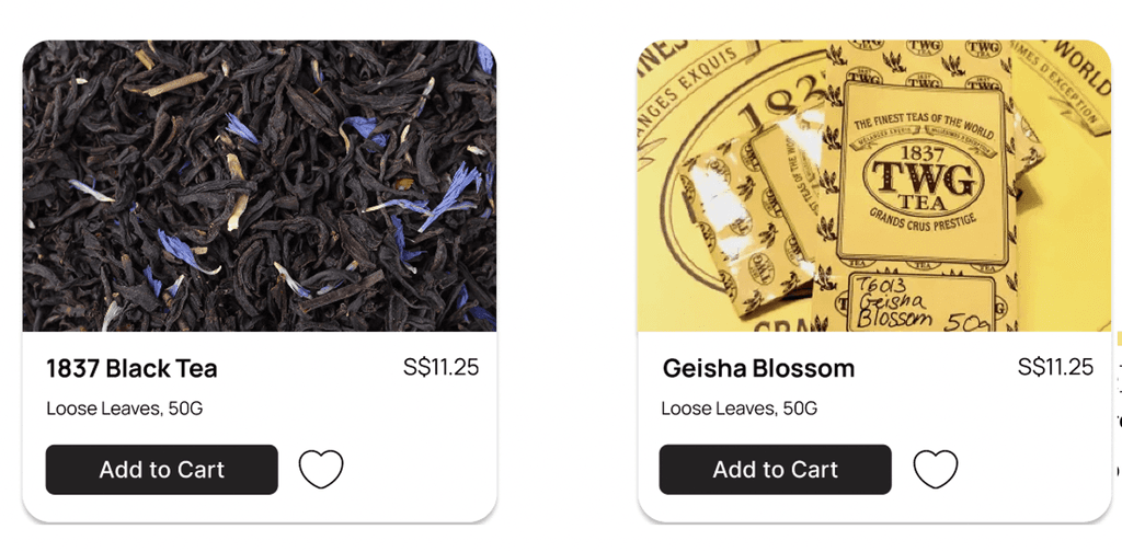
One of the main iterations for the product details card included adding a hover effect where a user could view the loose leaves (left image) but also the default packaging for the item (right image).
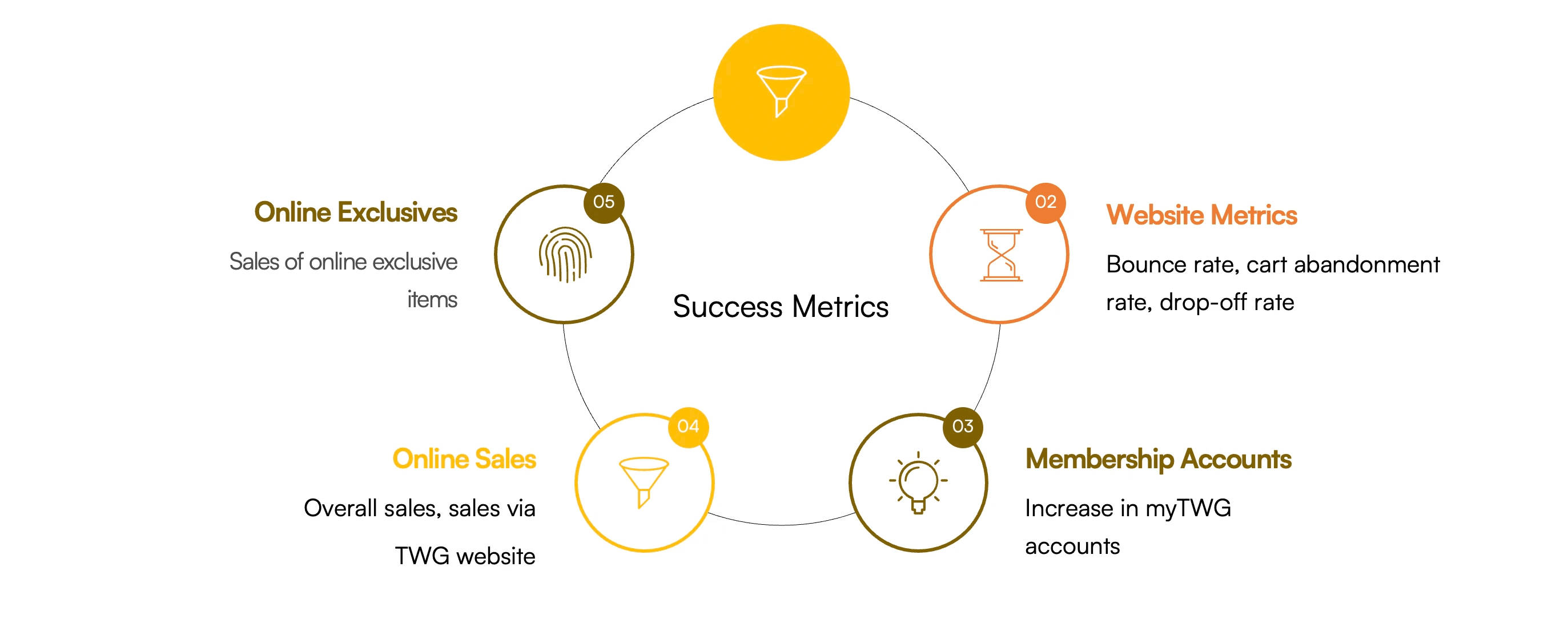
How will we know if we deliver value?
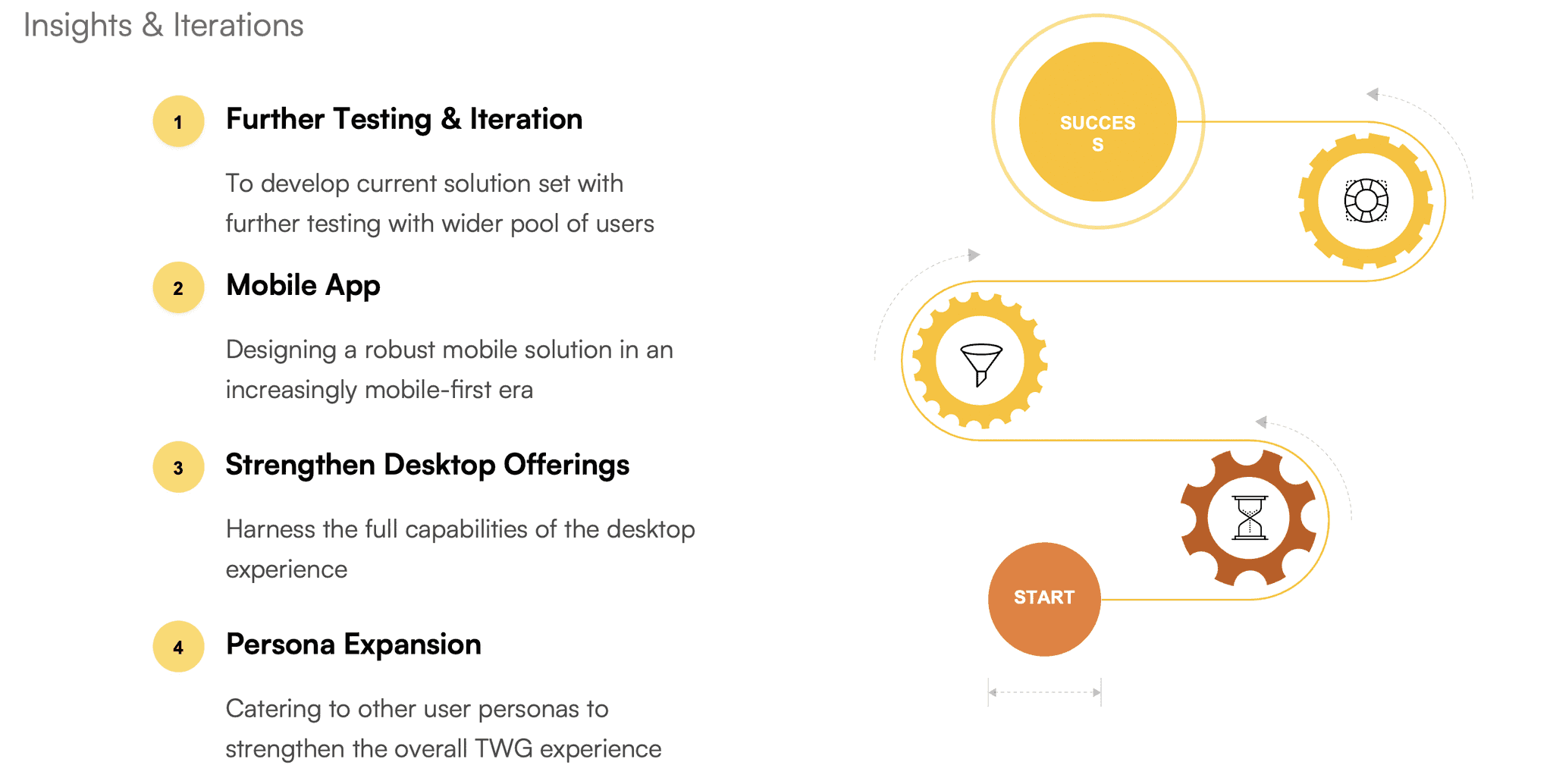
Next Steps