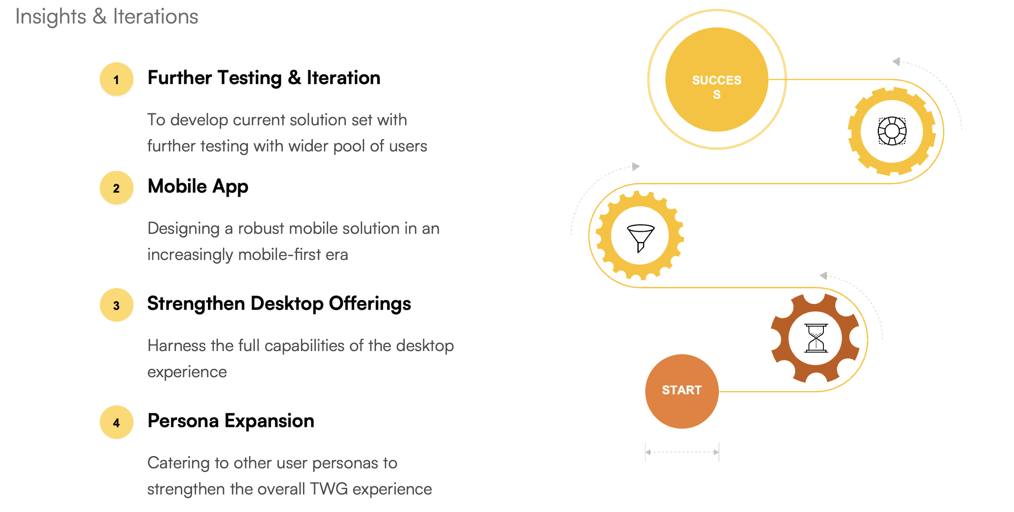
Phase 1: Empathize
Phase 2: Define
Phase 3: Ideate
Phase 4: Prototype
Phase 5: Test
Problem & Context
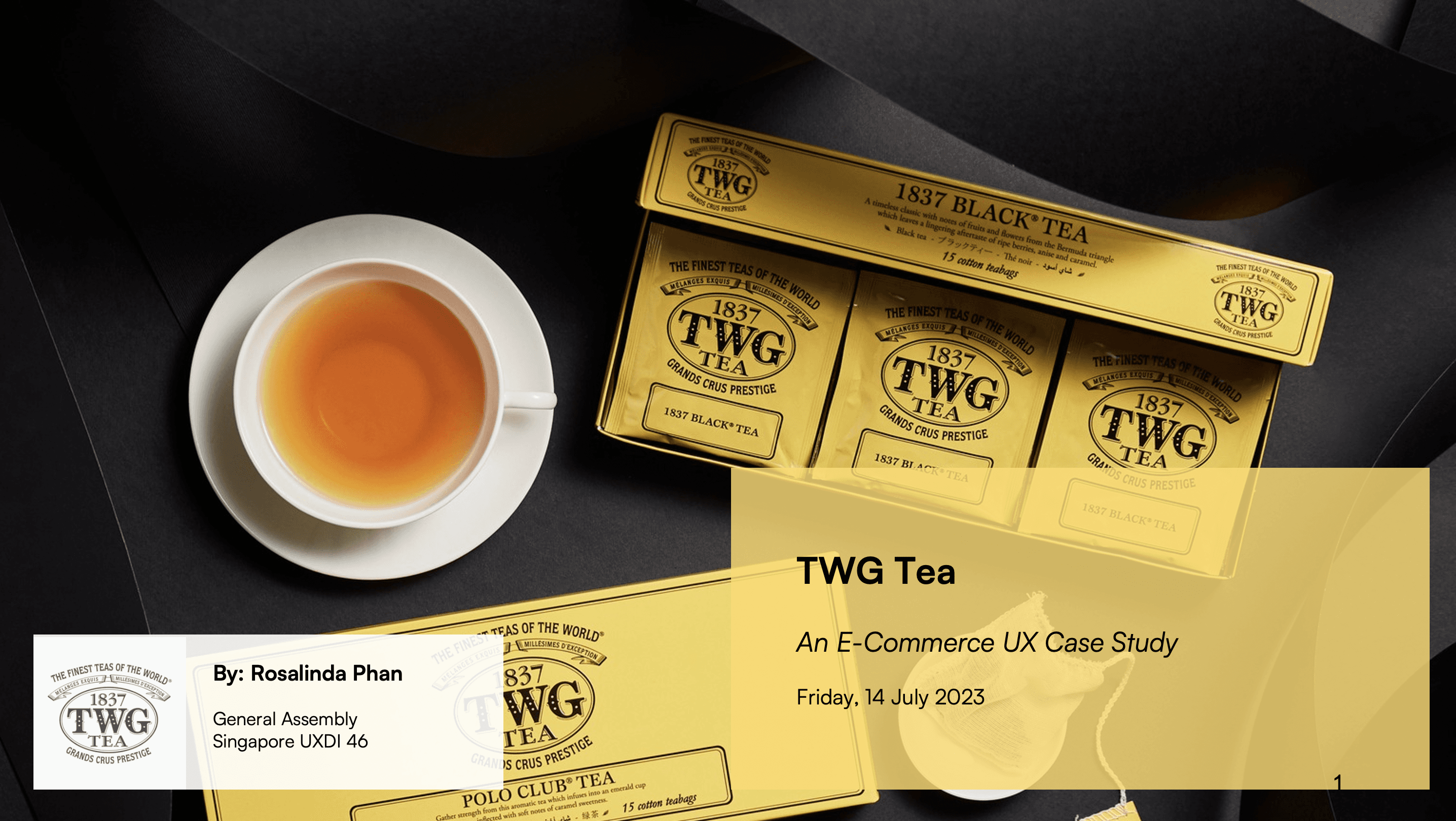
TWG Tea
A proposed redesign of an ecommerce website to improve the information architecture and the purchasing experience for target users.
In a nutshell
Key Themes
E-Commerce, Information Architecture, Hi-Fidelity Desktop Prototype
Project Summary
A proposed redesign of the e-commerce platform of specialty tea retailer TWG to improve the information architecture and purchasing experience for target users.
Role
UX Researcher
UI Designer
UX Methodologies
Affinity Mapping
Heuristic Evaluation
Card Sorting & Tree Testing
User Journey Map
Wireframing & Prototyping
Usability Testing
Timeline
2 Week Design Sprint
July 2023
General Assembly Coursework
Tools
Figma, Figjam
Optimal Workshop
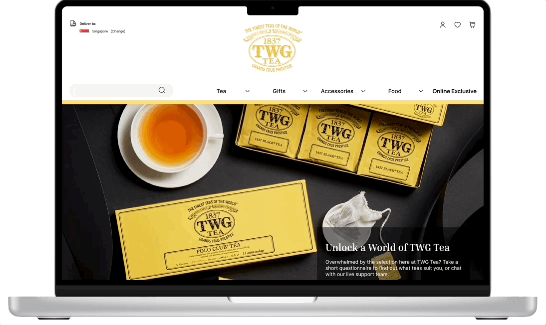
View Current Site
View Presentation
View Prototype
View Feedback
Problem & Context
For specialty tea retailer TWG Tea,
A strong e-commerce presence is increasingly important in driving business, as well as acting as a competitive differentiator.
Nonetheless, my audience analysis indicated an incongruence between the intended value of the TWG website and the real necessities of the users.
What TWG intended:
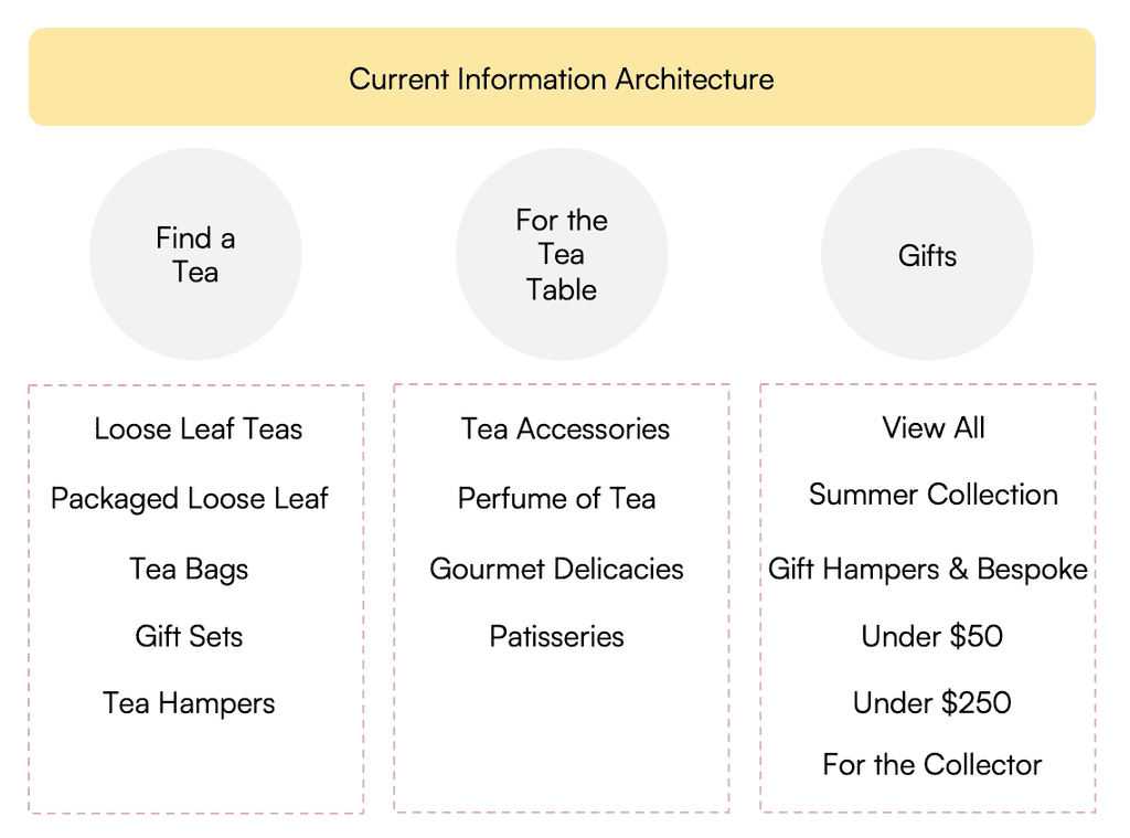
The current website acts as a repository of information on TWG products, giving users easy access to rich content on the full range of TWG products without having to come down to the store.
What users actually need:
Users need straightforward product discovery, clear and intuitive navigation, efficient checkout processes when they visit the TWG website.
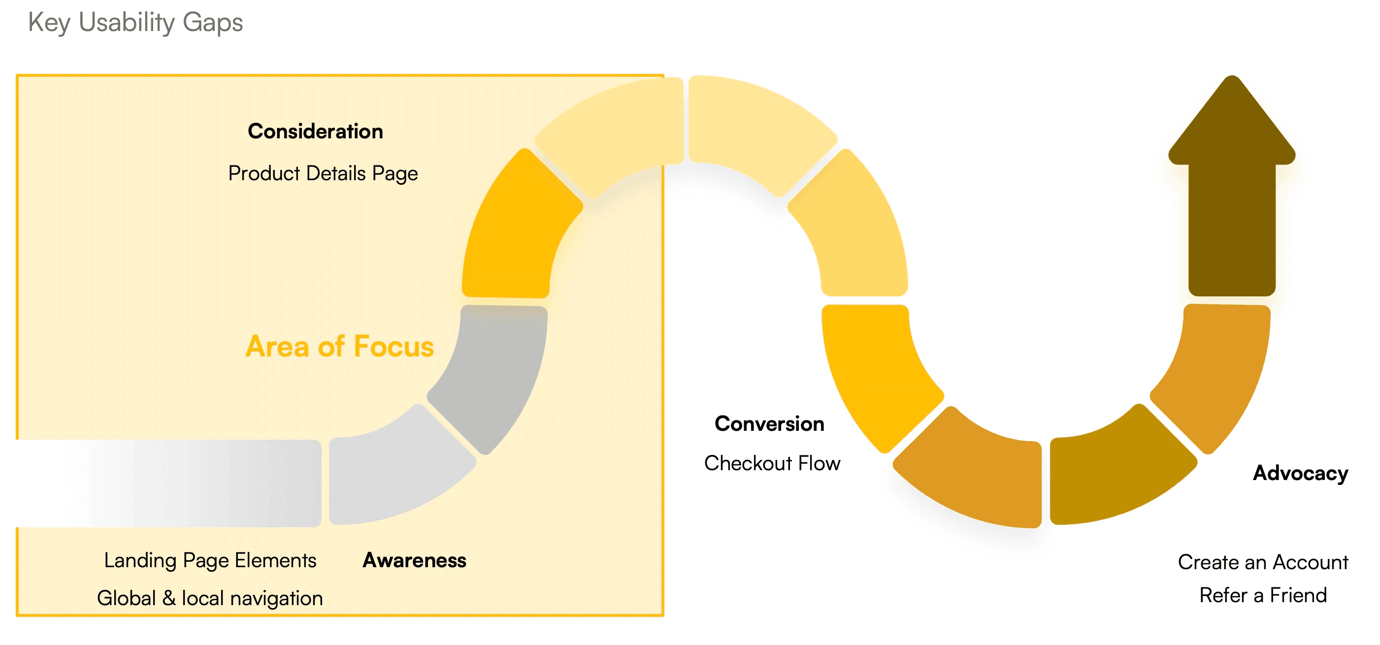
Main Impact
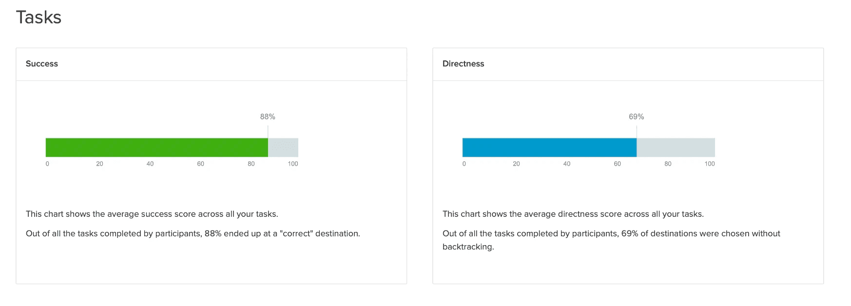
To solve the most critical problem of weak product findability, I proposed a revamp of the existing website's information architecture as a core solution based on insights from my user research. Tree testing with the new sitemap had an 88% success score and 71% directness score which was a marked improvement.
Methodology
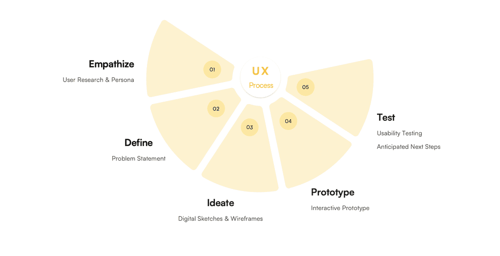
I applied the end-to-end UX process throughout the project, working with my of 3 at General Assembly for the user research while coming up with my problem definition and solution set individually.
Phase 1: Empathize
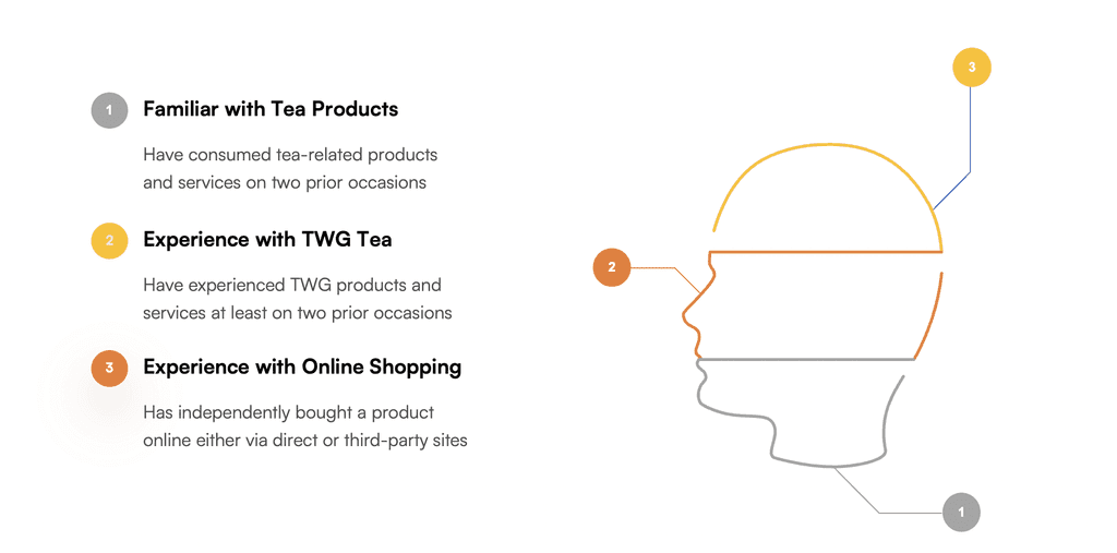
To lay the groundwork for the project, user research was conducted to better understand the needs, motivations and behaviours of potential users of TWG Tea's e-Commerce platform. The base criteria for our interviewees were as follows:
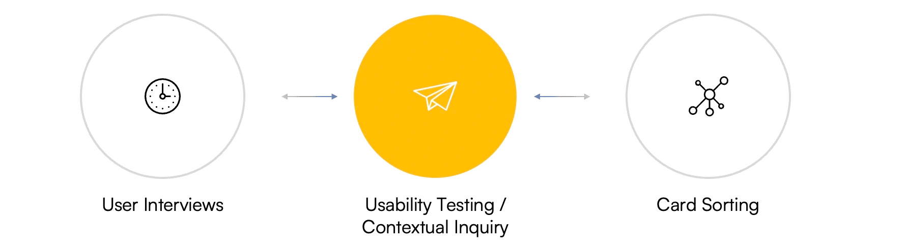
My team conducted a combination of three methods of user research and gleaned valuable insights from all of them:
I find it so much better to go down to the physical outlet for recommendations.
I view TWG as a "date idea" or "cafe" concept, better suited for dining out than home use.
I like to buy tea from platforms like Shopee or Lazada when there are sales.
I prefer to buy tea offline due to the sensory experience, like being able to smell the tea.
I don't know much about tea so I prefer to have descriptions that tell me about the tones of the tea.
I rely a lot on recommendations to decide what is good to buy.
I prefer to gift tea bags or packaged teas instead of loose leaves.
The price and packaging are the factors I look out for the most when shopping for teas.
I was once interested in the origin of tea, but it doesn't influence my current choices.
The top insights from the user research pertained to the below four categories:
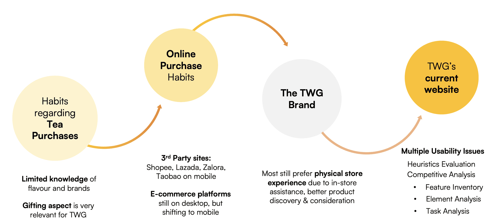
In particular, a critical finding from our card sorting exercise revealed a lot about our user's mental models on tea. It turned out that users typically only recognised tea by two main attributes:
1) Format, such as whether they were packaged in a box, tin or as purchased as loose leaves
2) Variety e.g. earl grey / black tea / green tea
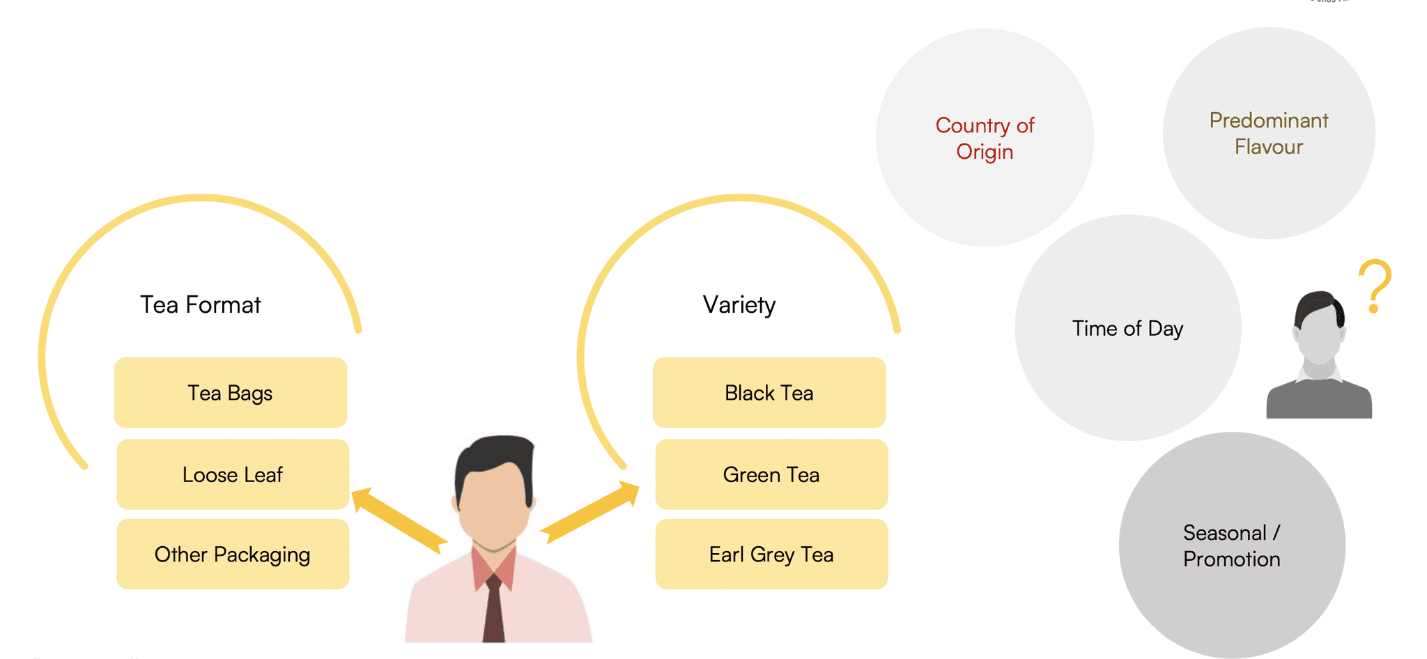
Swipe to see an example of our card sorting conducted on FigJam
This was echoed by the contextual inquiry conducted, which saw multiple users express frustration at the unintuitive navigation and poor findability of products they had in mind.
Available data indicates about TWG Tea's website also seemed to point toward a similar issue:
Bounce Rate
~ 50%
Average Visitor Duration
< 2 minutes
All in all, it would not be surprising if users did not stay on the TWG website long enough to complete any purchases. In other words, by plugging usability gaps in the TWG Tea platform, its role in driving digital sales could be greatly improved.
Phase 2: Define
User Personas
There were 2 distinct user personas that could be derived from the research:
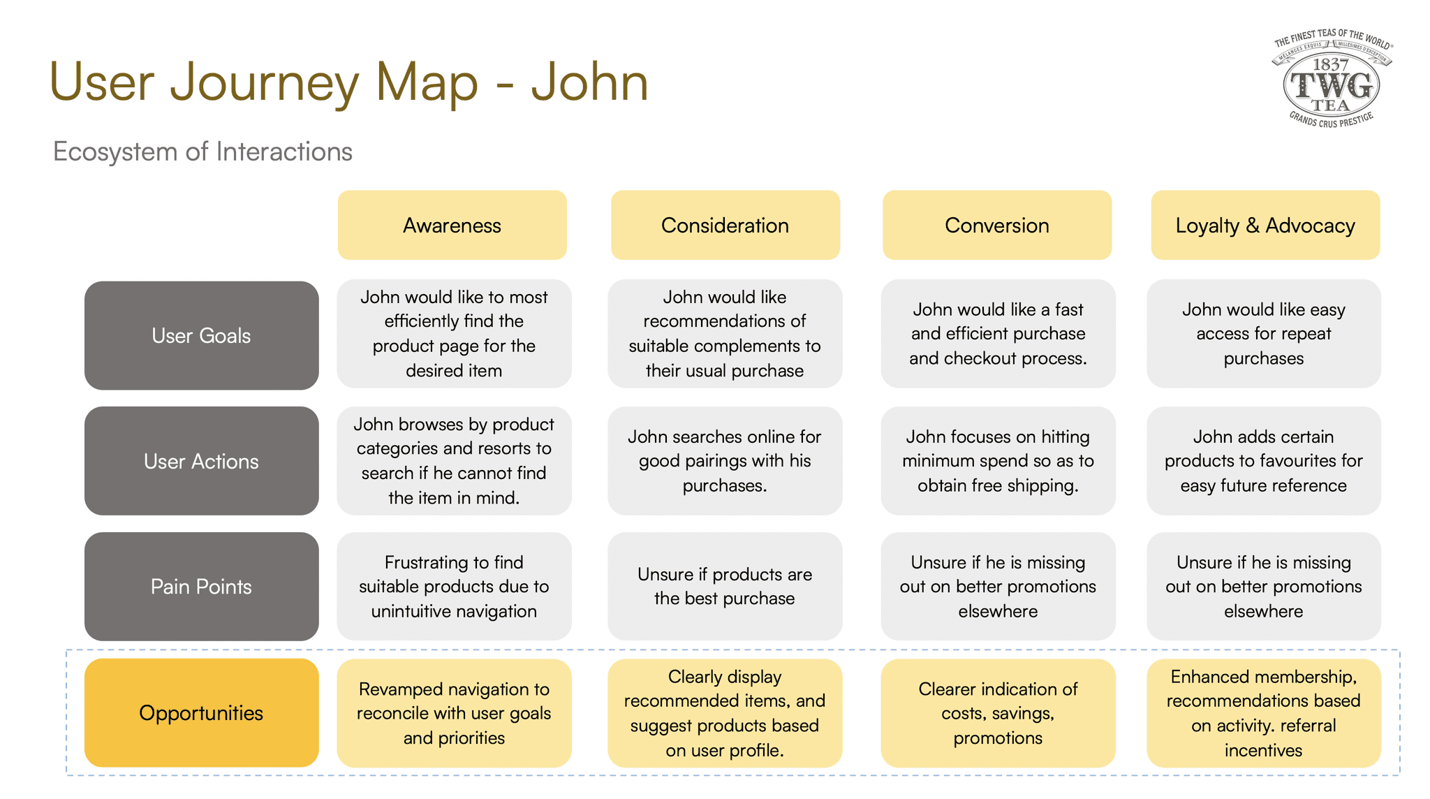
1) John who purchases TWG Tea products for personal consumption
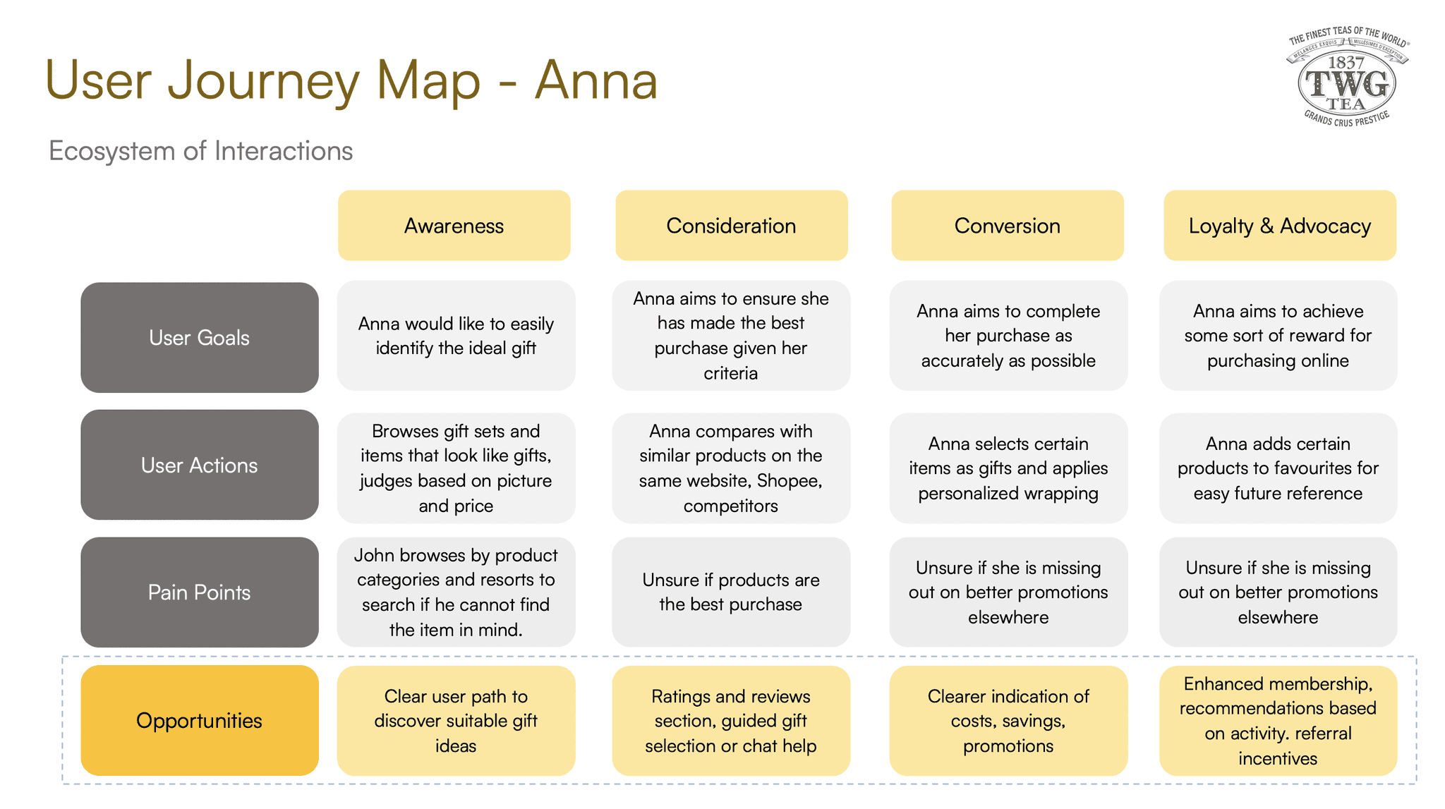
2) Anna who purchases TWG Tea products for gifting purposes.
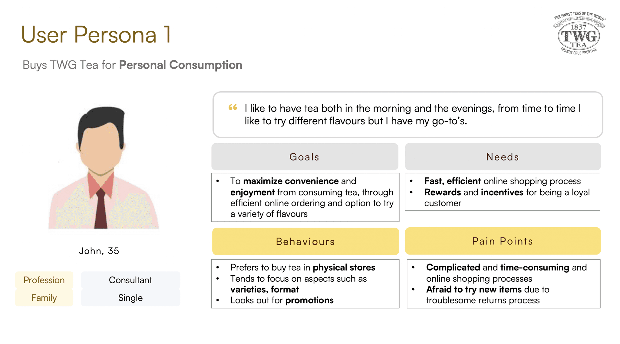
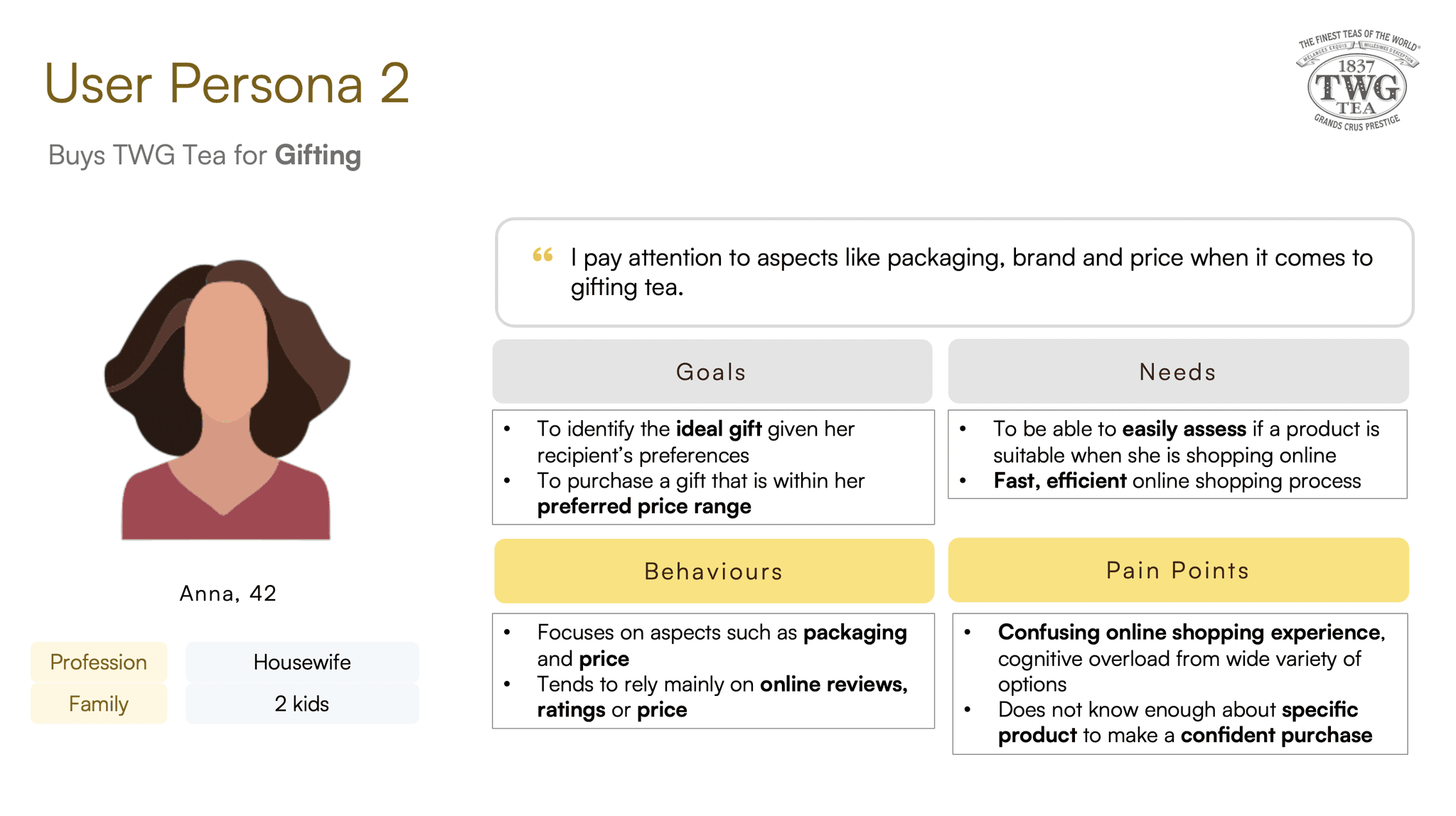
Swipe to see both user personas.
While different in their goals for visiting the TWG Tea website, both faced the same pertinent issue of confusing navigation and poor findability that made for a frustrating experience.
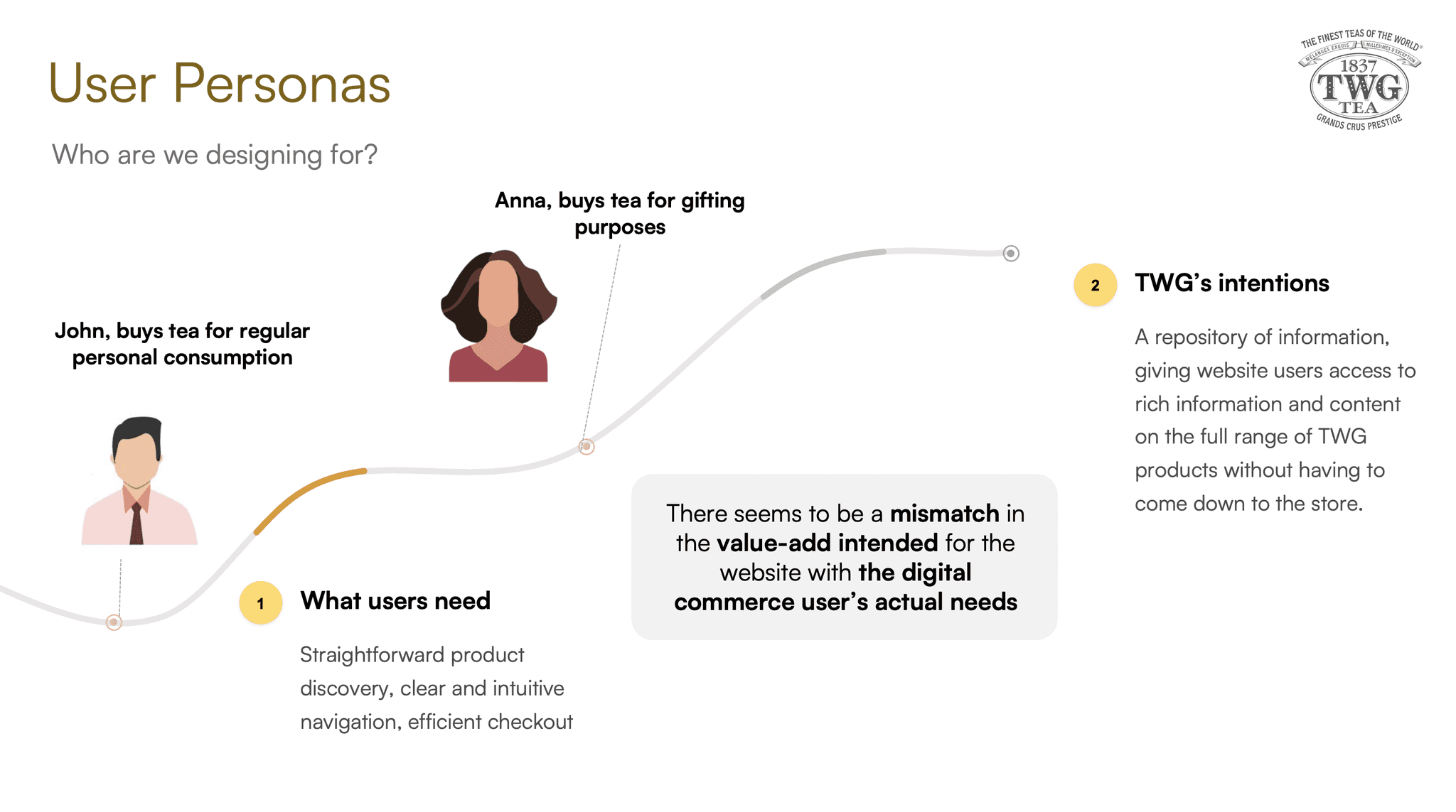
While TWG's current website was designed to provide value to users through the form of rich content and information on the full range of TWG's products, this was not what our users came to the website for. In other words, there was a mismatch between the value-add intended for the website with the user's actual tasks and requirements.
Problem Statement
Users need more effective product discovery and intuitive navigation on the TWG Tea e-commerce platform
Phase 3: Ideation
After identifying the problem space, I constructed a user journey map for both personas to identify opportunities for improvement along the entire journey of engagement with TWG Tea.
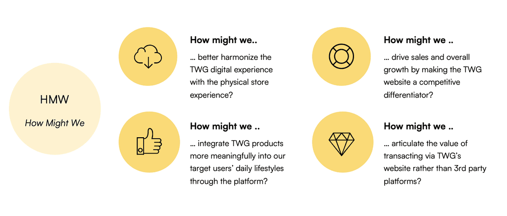
How Might We?
Sketches & Wireframes
Taking the time to draft iterations of each screen of the app on paper ensured that the elements that made it to the digital wireframes would be well-suited to address user pain points. In doing so, competitor screens were also referenced as a benchmark.

Proposed Solutions
Following my ideation process, I arrived at a three-pronged solution set to address the problem space. This involved first solving the critical issue of poor findability by delivering a thorough revamp of the current website's navigation (Solution 1).
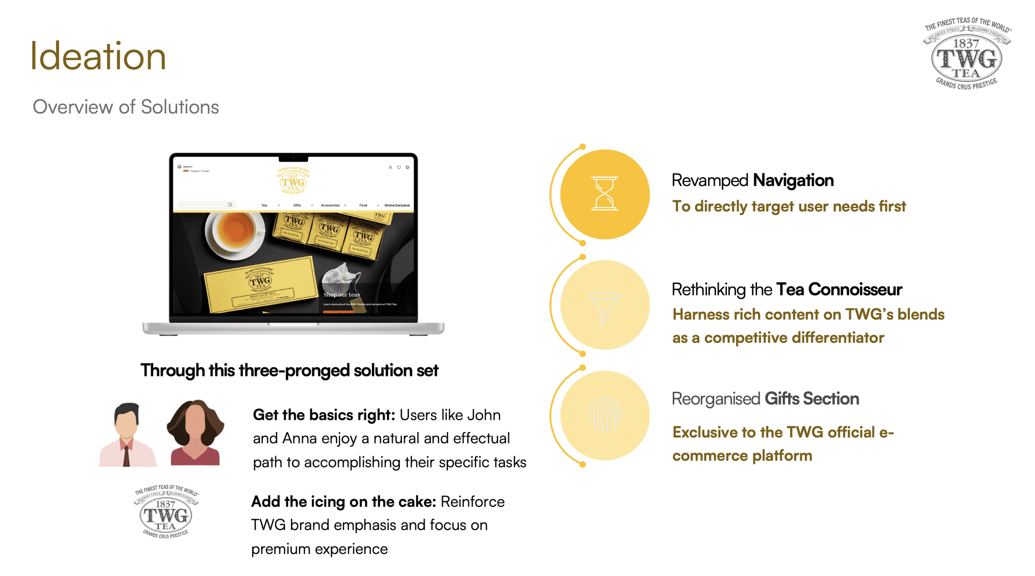
Once this was done, more feature-rich solutions to cater to secondary needs could then be implemented. Namely, better articulation of the wealth of information on TWG's products (Solution 2) as well as improving the user flows for gift purchases (Solution 3).
Phase 4: Prototype
An overview of the proposed solutions as follows:

Click on each of the above to jump straight to the individual solution!
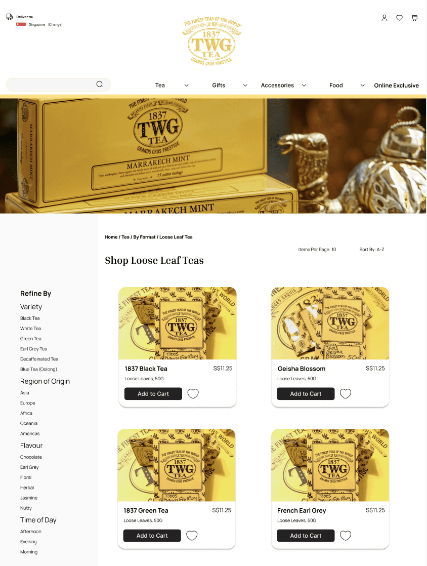
Solution 1: Revamped Navigation
Having established findability and ease of navigation as the top priority, this solution proposes an overhaul of the global and local navigation to better align with user mental models on tea products.
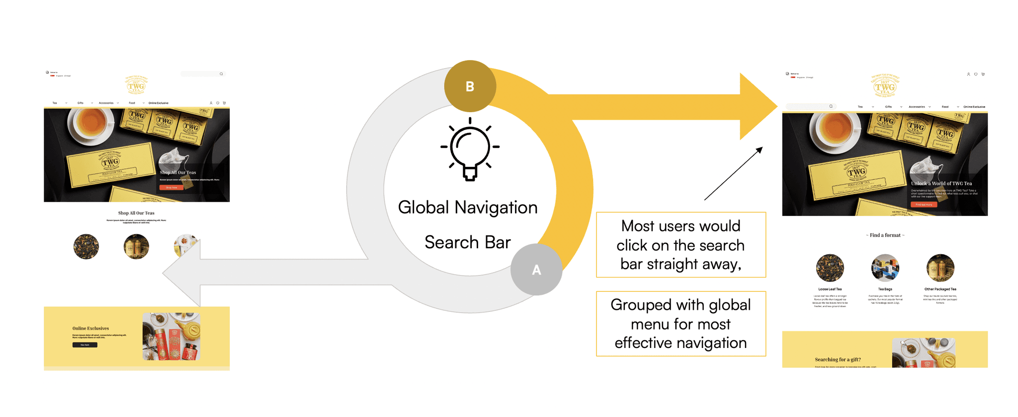
The revamped global navigation consists of these distinct categories: 1) Tea 2) Gifts 3) Accessories 4) Food 5) Online Exclusive.
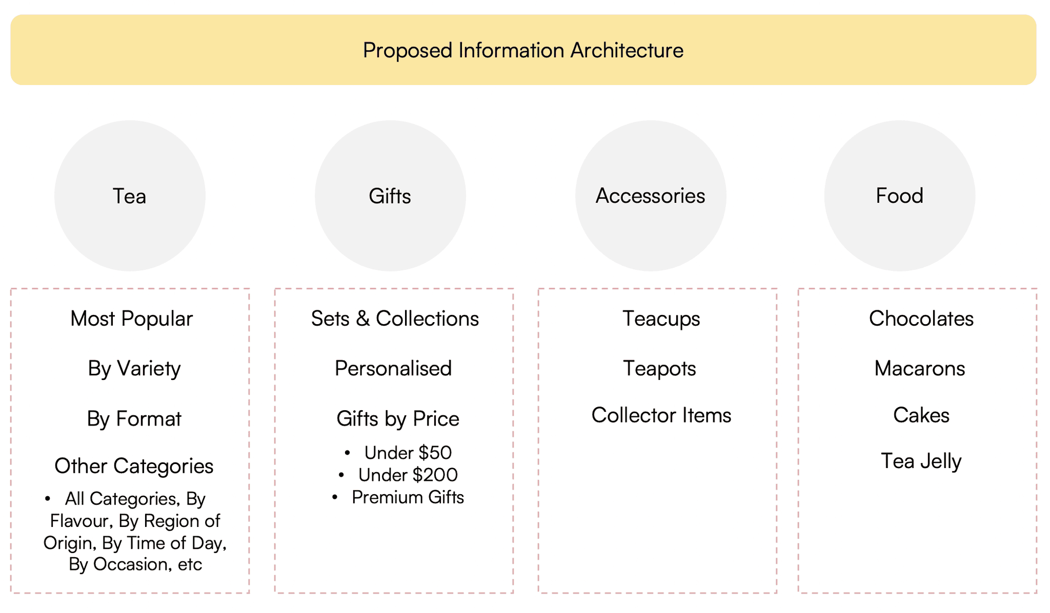
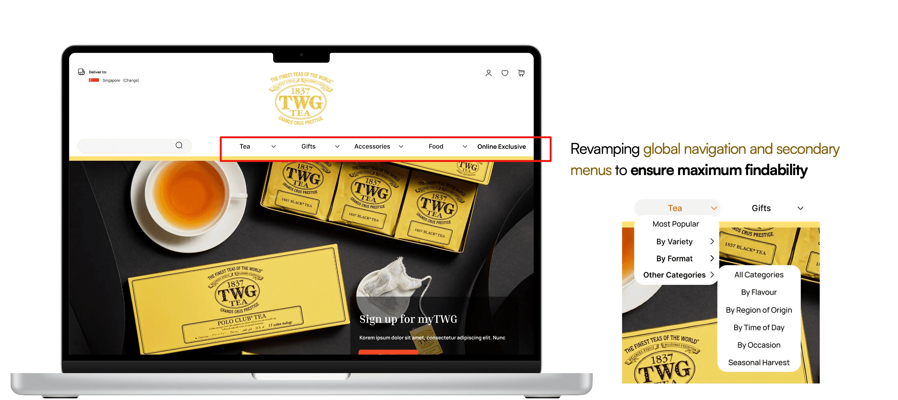
The local navigation for the tea category would be streamlined to include only the following subcategories: 1) Most Popular 2) By Variety 3) By Format 4) Other Categories. To avoid cognitive overload, less well-understood categories such as Region of Origin, Flavour, Time of Day and Occasion would be grouped under "Other Categories".
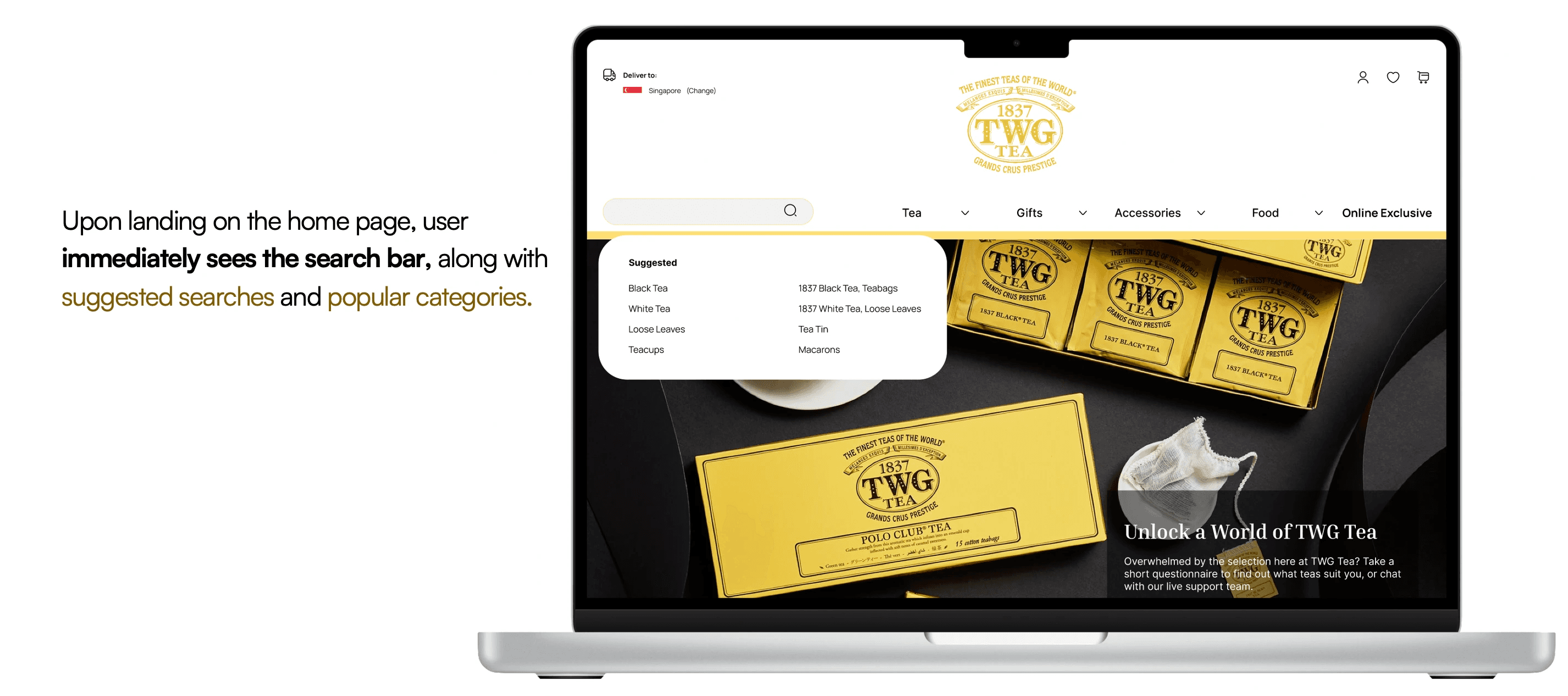
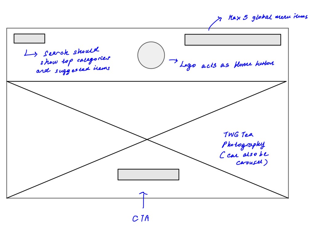
To further facilitate product discovery, the search bar would display suggested searches and popular categories when clicked. Placement of the search bar per the mockup, would be strategic such that users would easily notice it upon landing on the TWG website. This is consistent with the F-pattern for viewing, and was also validated through user testing.
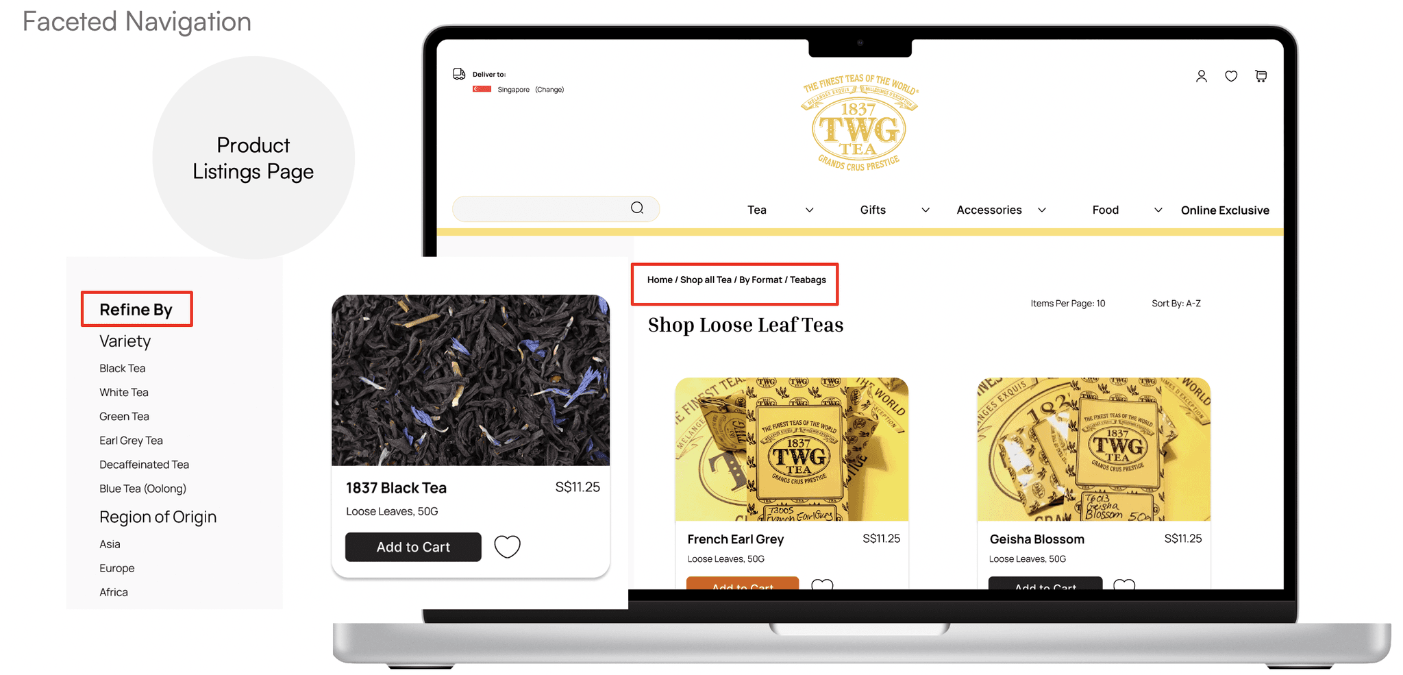
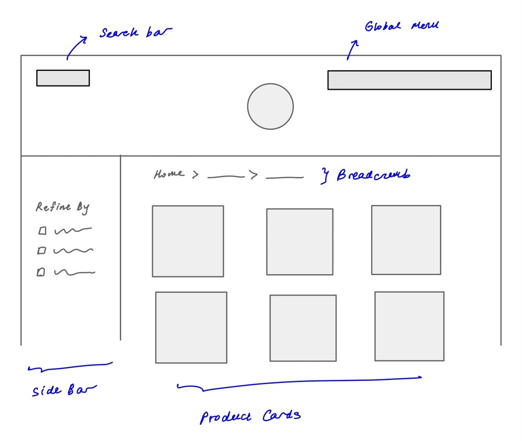
On the product listings page, contextual and faceted navigation were also enhanced using insights from competitive analysis. For instance, the solution proposes a permanent side bar where the user can toggle settings to further refine the search results, similar to practices by other players in the industry, while breadcrumbs at the top of each page enable the user to keep track of where they are within the website.
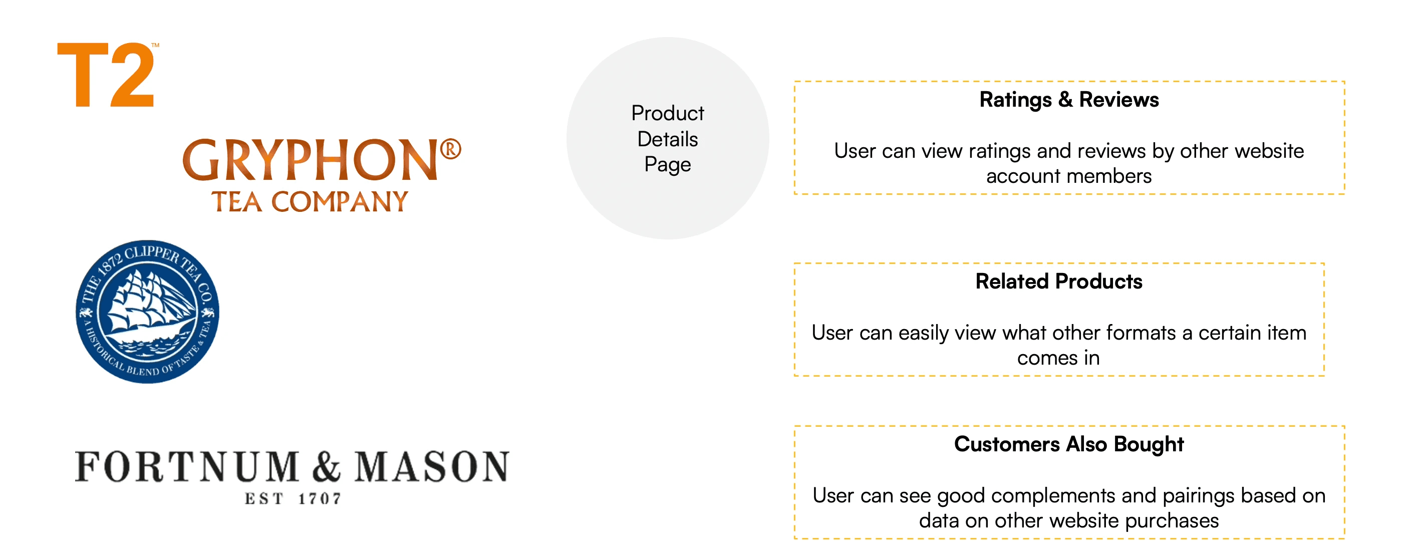
Similarly, using common practices among competitors as a benchmark and inspiration, the product details page was also redesigned to include sections such as 1) ratings and reviews 2) related products, to display variations of the same tea type 3) products bought by other customers, for the user to find good complements and pairings. Altogether, these aim to further enhance the product discovery process.
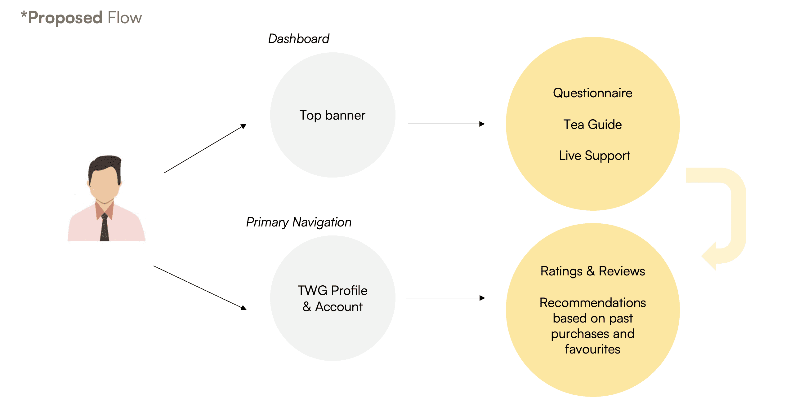
Solution 2: Rethinking the Tea Connoisseur
In the current website, we found that the supposed "Interactive Tea Connoisseur" feature had very low discoverability because the old flow only had one entry point that was easily missed. The original website also only had a questionnaire consisting of two questions before the user would be led to what appeared to be a search results page with certain filters applied. In the proposed flow, we produced two new entry points to tapping the "Interactive Tea Connoisseur" functionality.
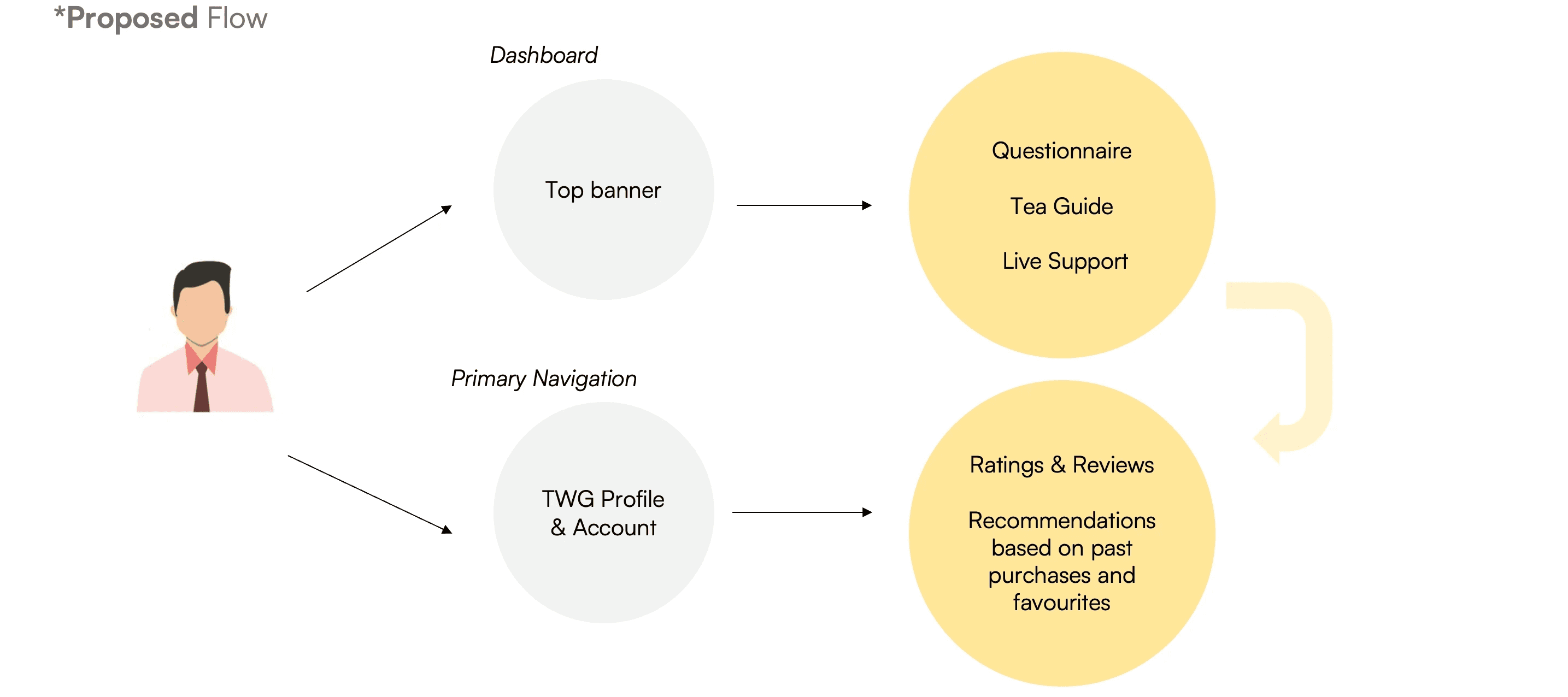
A user would be able to get generic recommendations right upon clicking the top banner CTA on the home page, which would lead him to resources such as the questionnaire, tea guide and live support. Alternatively, the user could login to his TWG profile and get more targeted recommendations given his purchase history and past interactions on the website.
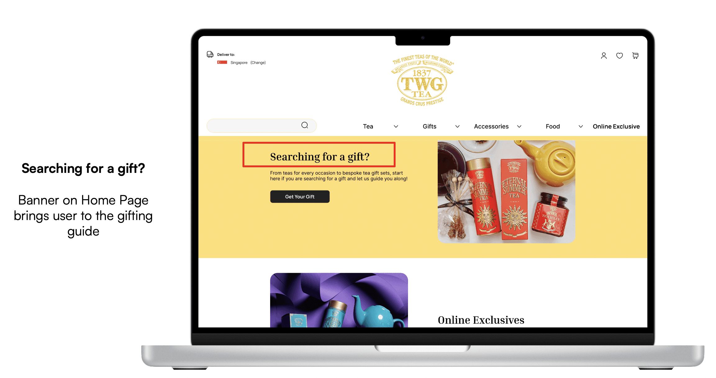
Solution 3: Repackaging the Gifting User Flow
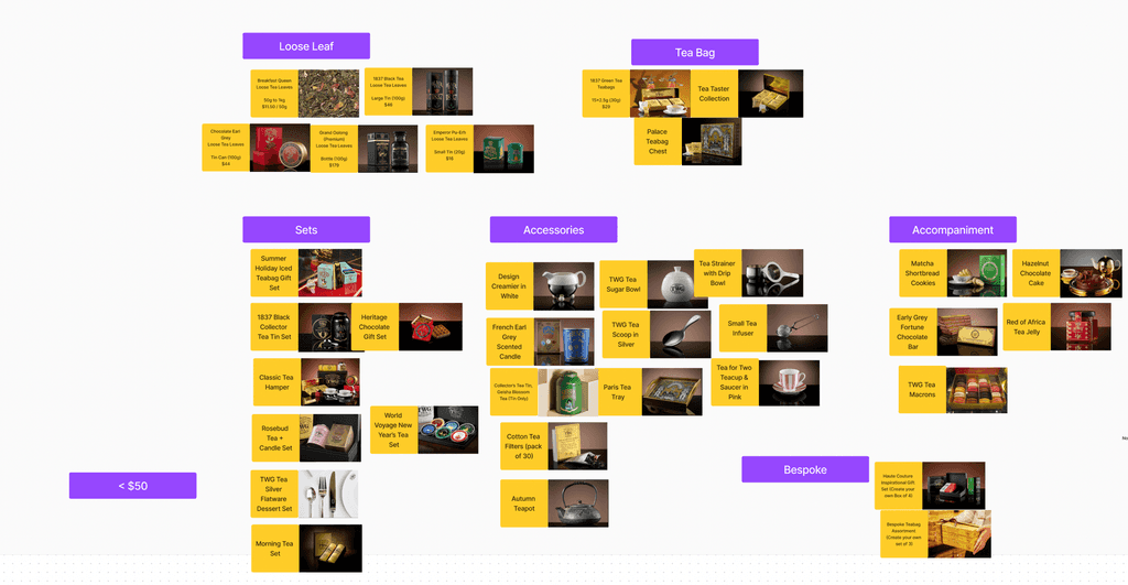
In the current website, most of TWG's regular items tend to already be bought as gifts and as such can appear in multiple categories. In other words, a website user could find a product such as Silver Moon Tea under both "Find a Tea" and "Gifts".
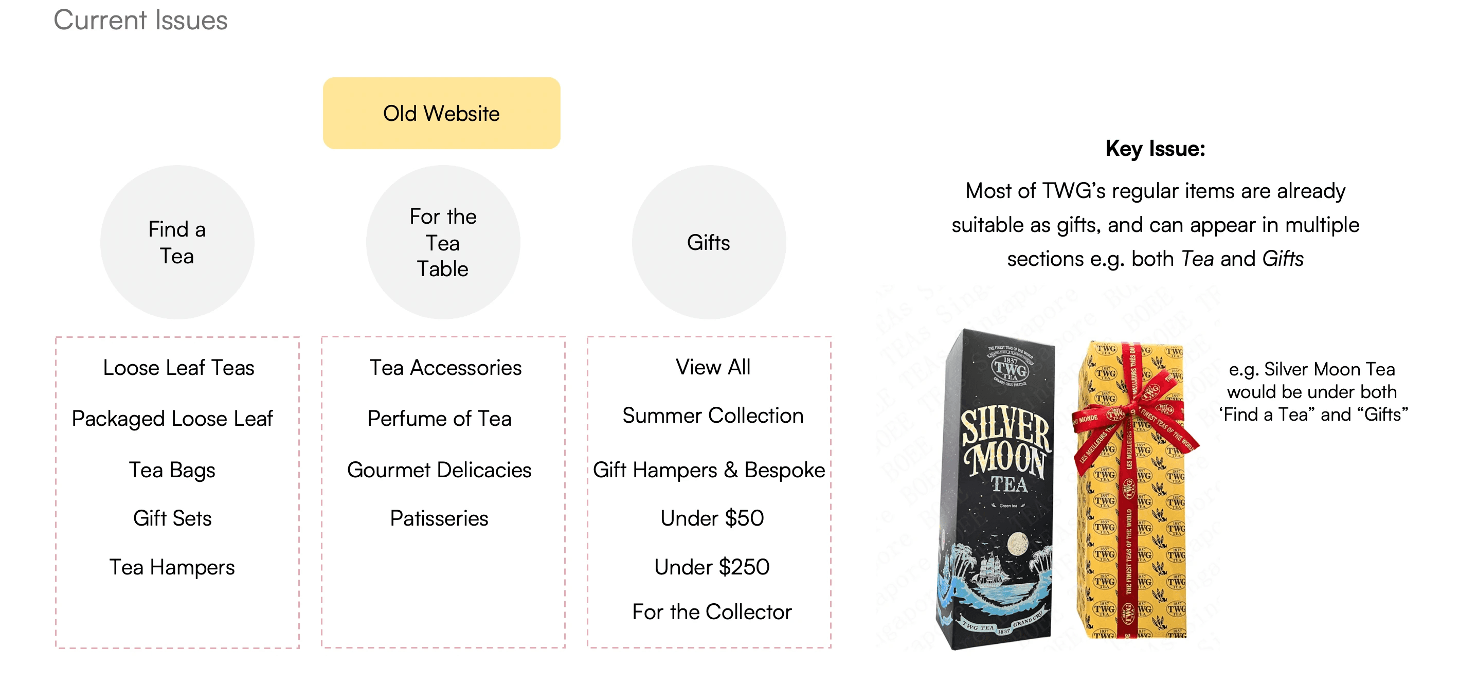
Our research also indicated that users who purchased tea products mainly for gifting were more conscious of aspects such as price, packaging and personalisation. While there was some degree of categorisation by price on the existing website ("Under $50" and "Under $200"), users were often confused by the number of subcategories under the Gifts section, such as "For the Collector" and "Summer Collection".
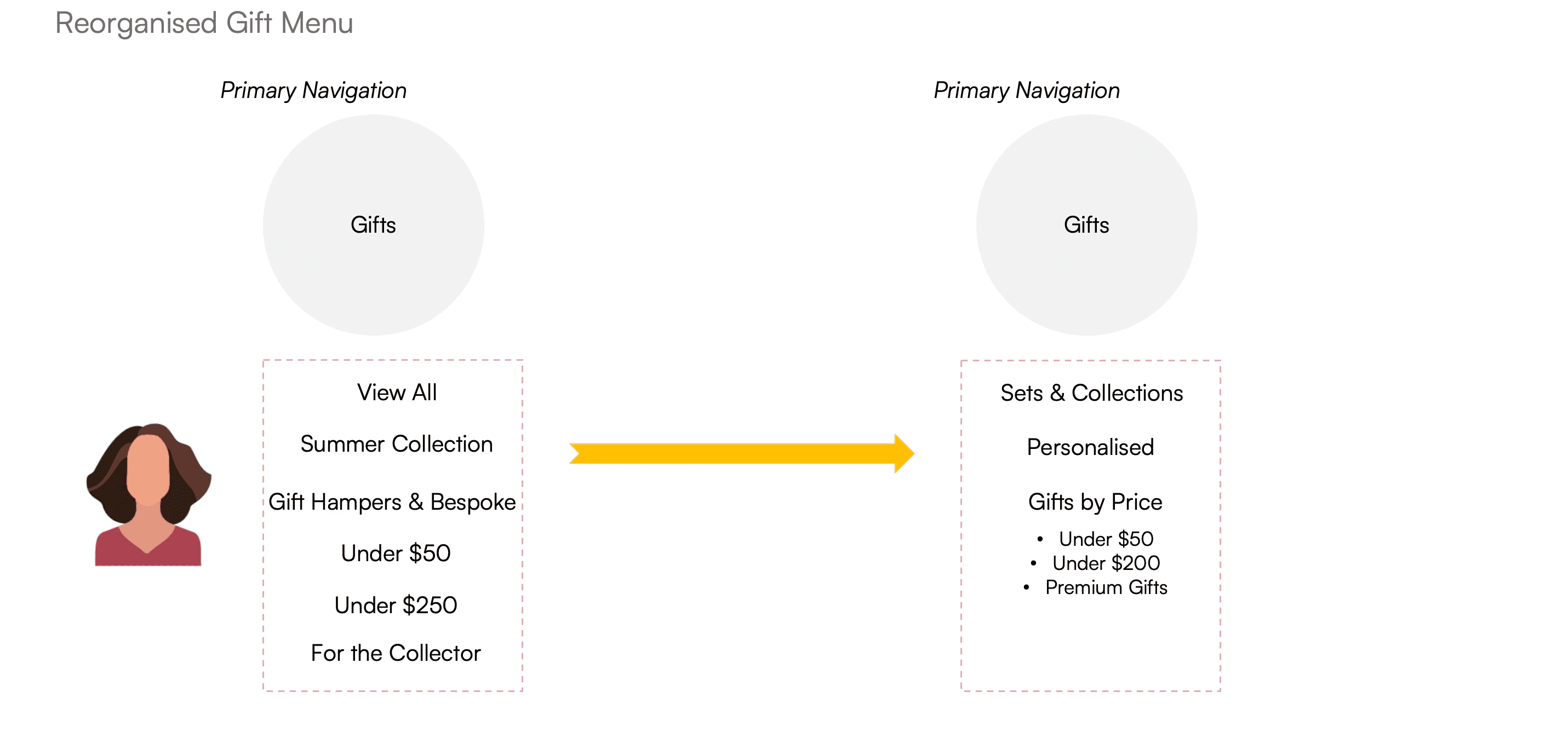
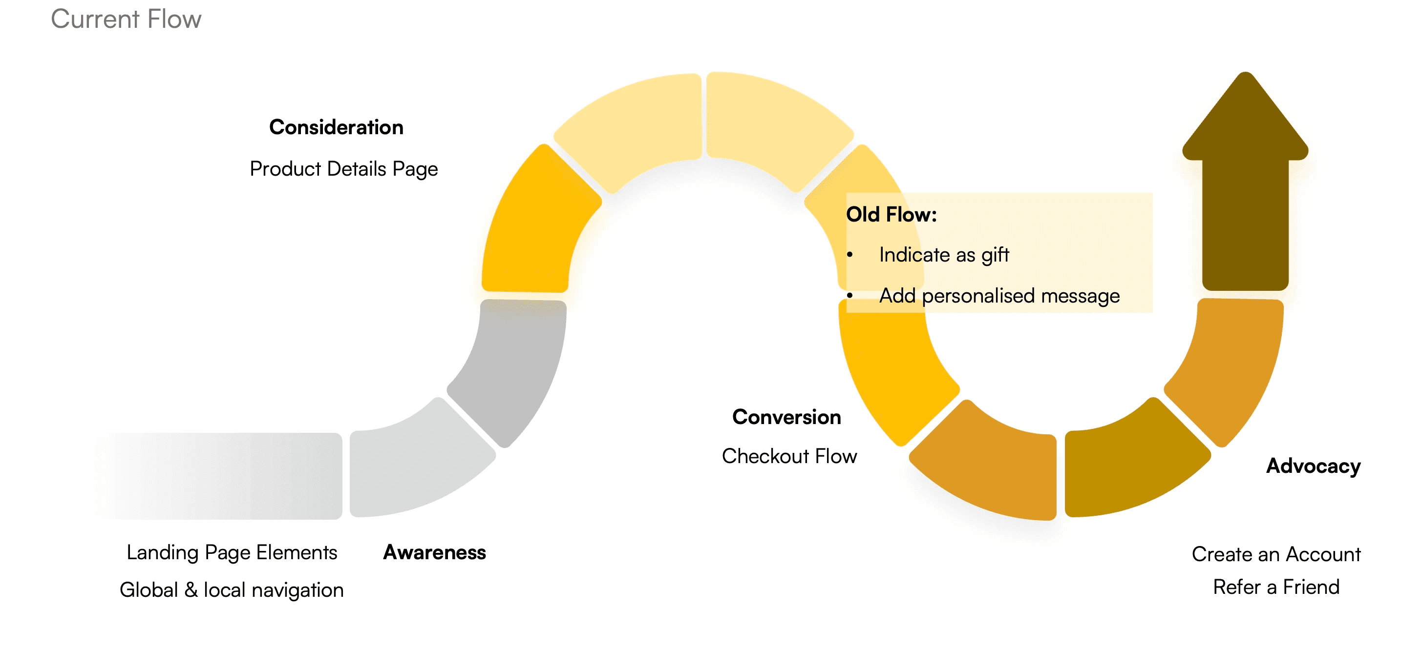
In the current user flow, it is only during the checkout process that the user can indicate a particular item as a gift and add a personalised message.
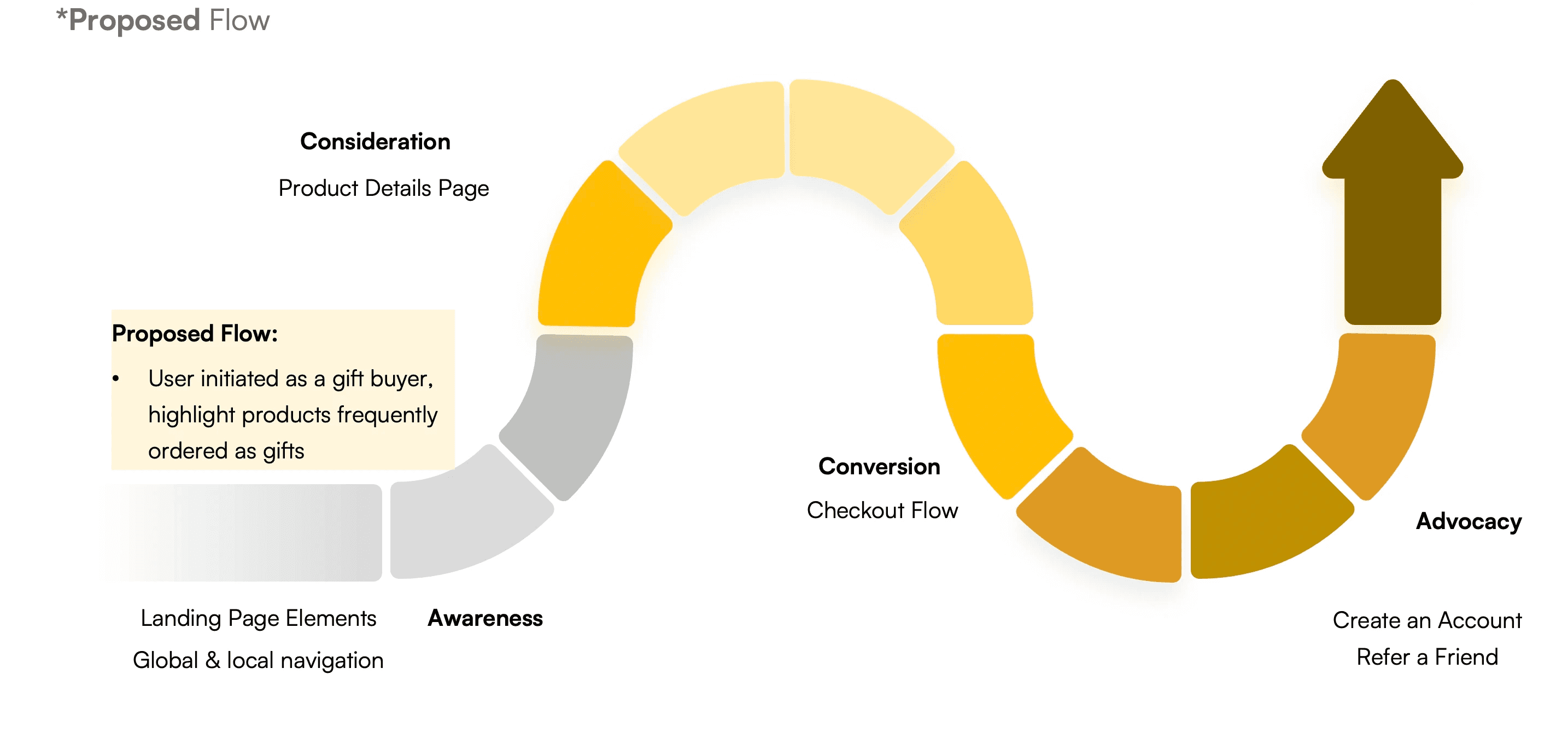
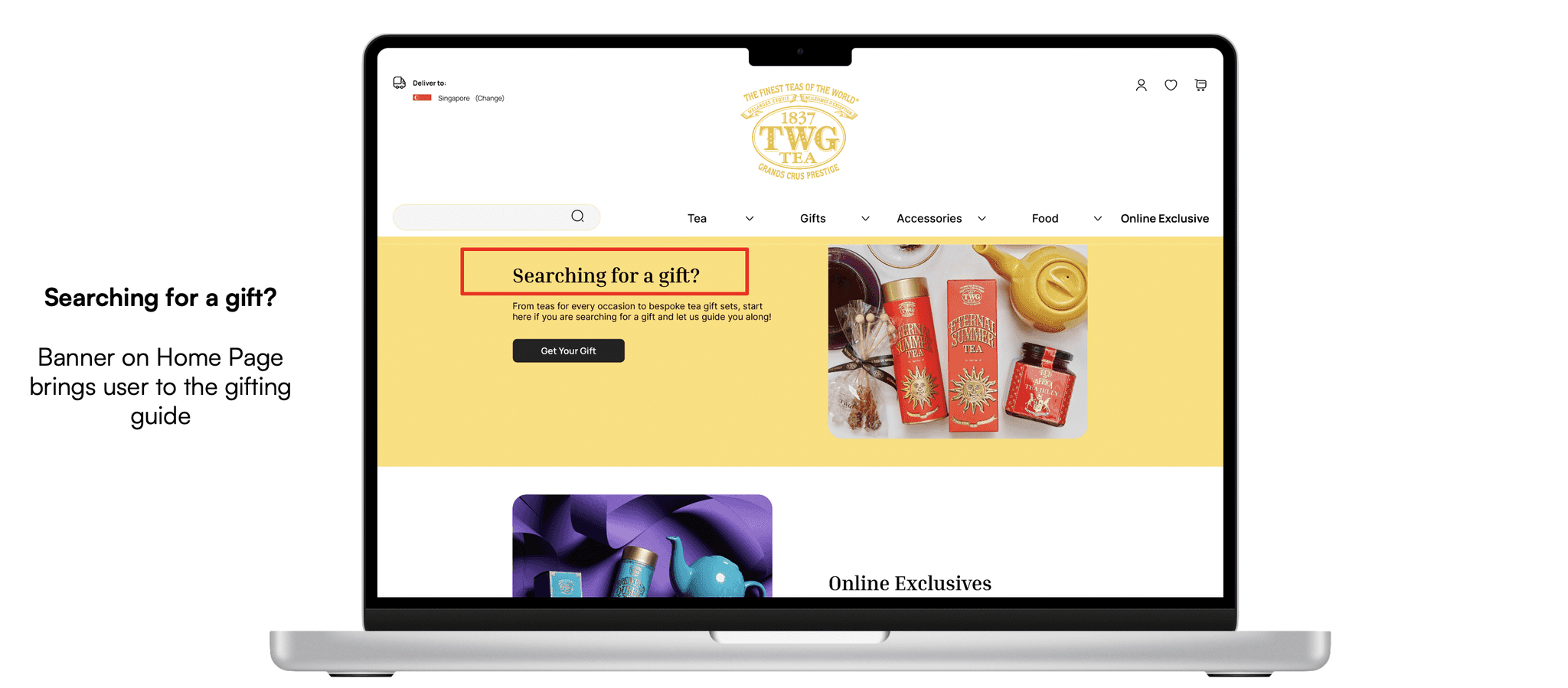
Swipe to see the proposed entry point for the new gifting flow.
In the proposed user flow, the entry point is brought forward along the user journey. A gift shopper is inducted into gift-shopping journey right from the start at the awareness stage, by having a gifting guide and questionnaire for the user to fill in for easier product discovery.
Phase 5: Testing
Usability testing was imperative to validate the design decisions, and insights from users were incorporate at various stages of the prototyping process.
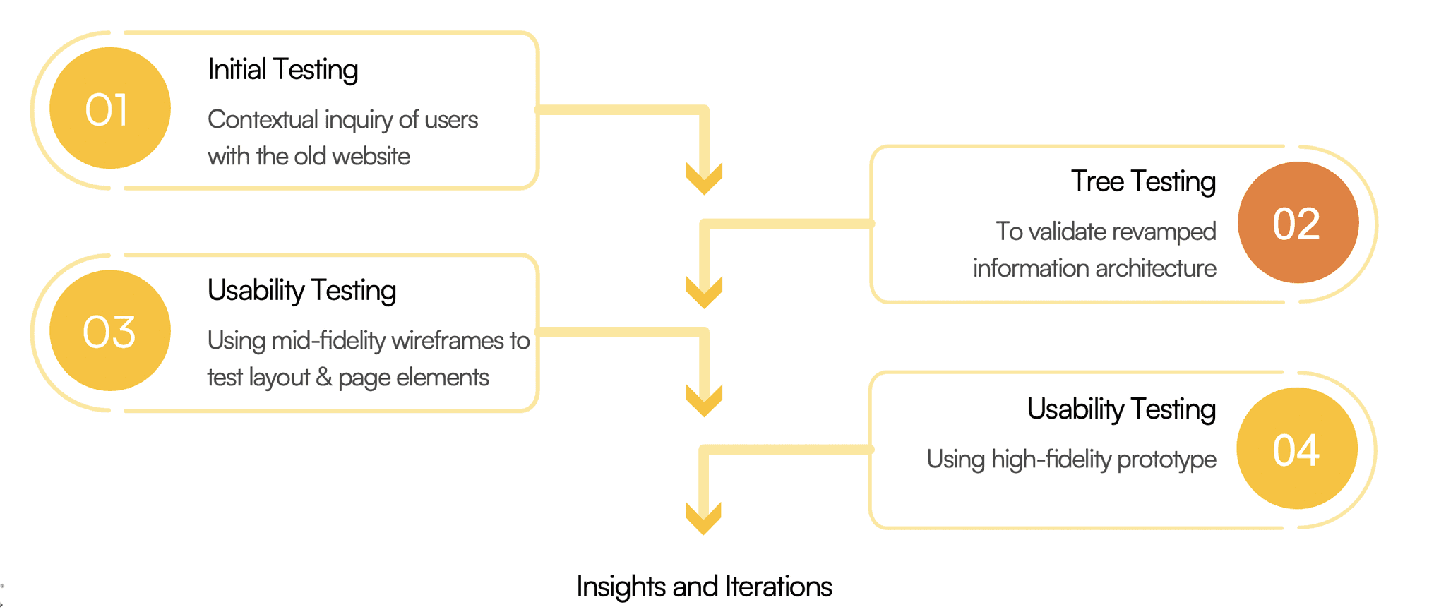
Tree testing was done at the lowest fidelity after the new sitemap was created, to validate that the new information architecture was indeed more intuitive for users.
Usability testing with the mid-fidelity wireframe was done mainly to test the logical flow, page layout and position of key elements.
Usability testing with the high-fidelity prototype was done to test more specific UI elements, including animations and micro-interactions.
Tree Testing
After initial testing with the original website, tree testing was done with five users using Optimal Workshop to test the findability of products given the new information architecture. This was done prior to any prototyping with the main purpose of testing the new organisation of website categories.
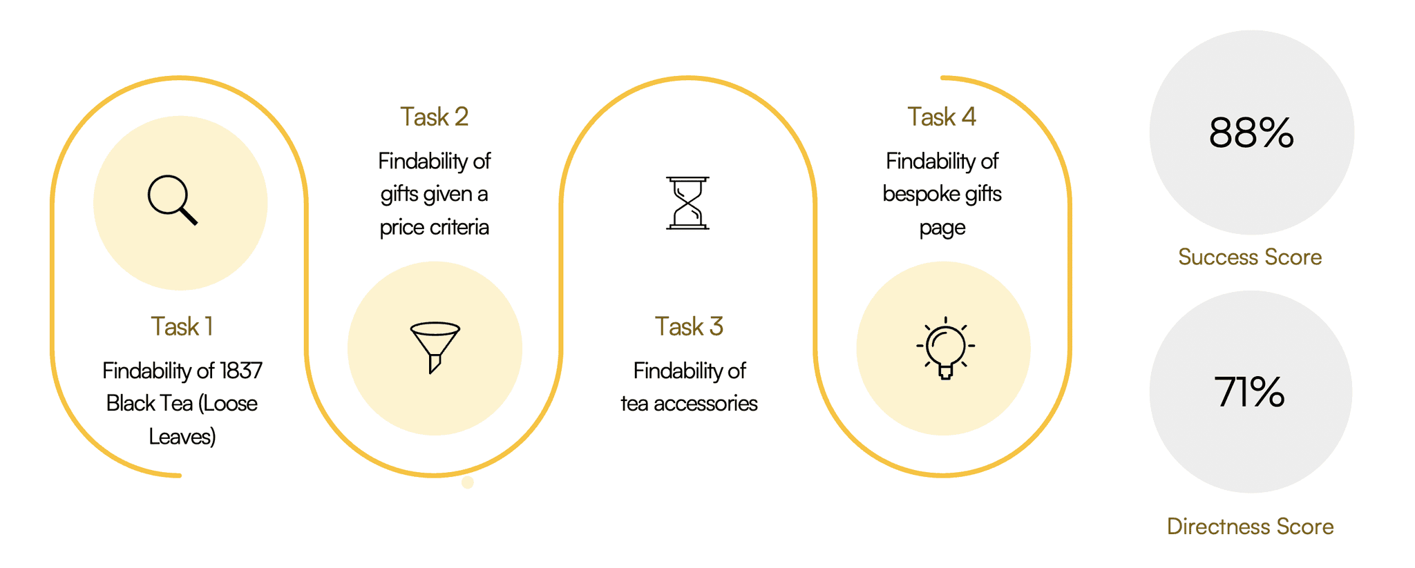
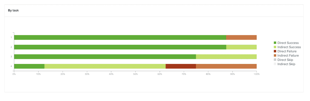
Swipe to see a summary of insights from Optimal Workshop on the tree testing conducted.
Usability Testing with Prototype
With the high fidelity prototype, I was able to test 3 user flows identified as critical tasks which were problematic in the original website.
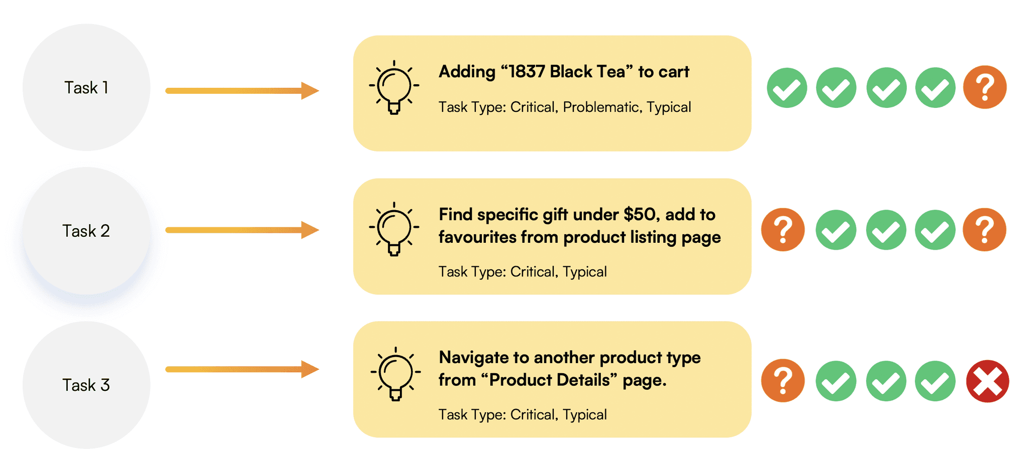
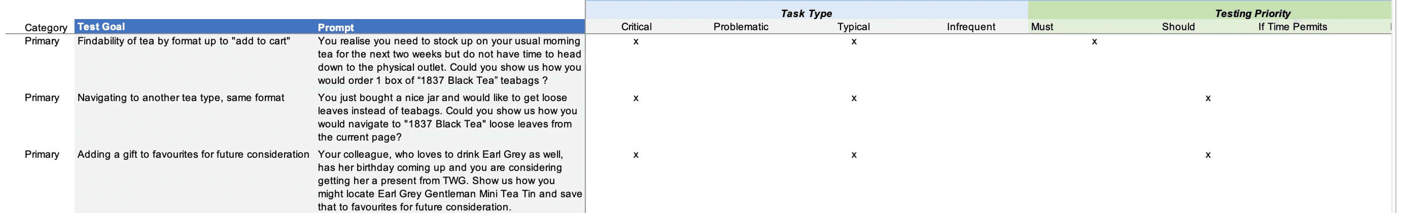
Swipe to see more details of the primary tasks used for testing.
Preference Testing
Additionally, I also conducted a quick preference test for important pages such as the Home Page, to gain an understanding of how to optimally position key page elements.
Selected Iterations
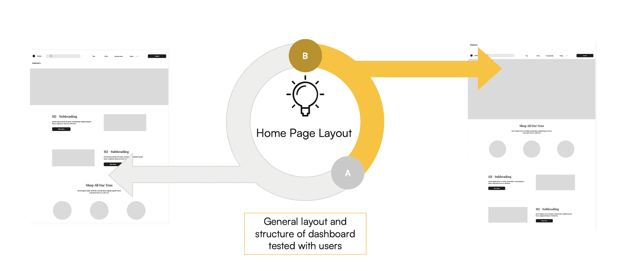
Home Page
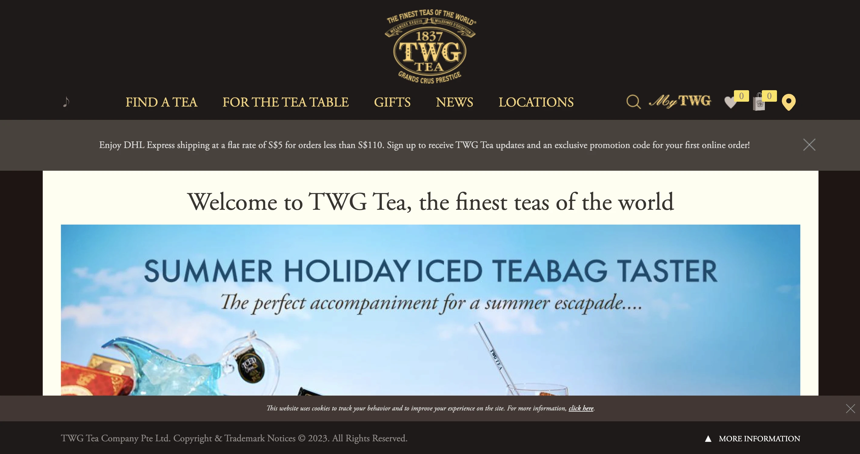
As-Is
Original website with 5 categories on the global menu.
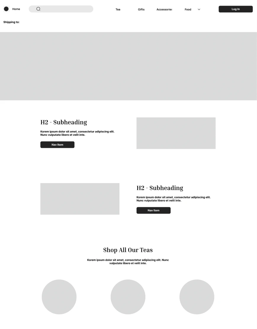
Mid-Fidelity Prototype
Content structure, navigation and layout tested with users.
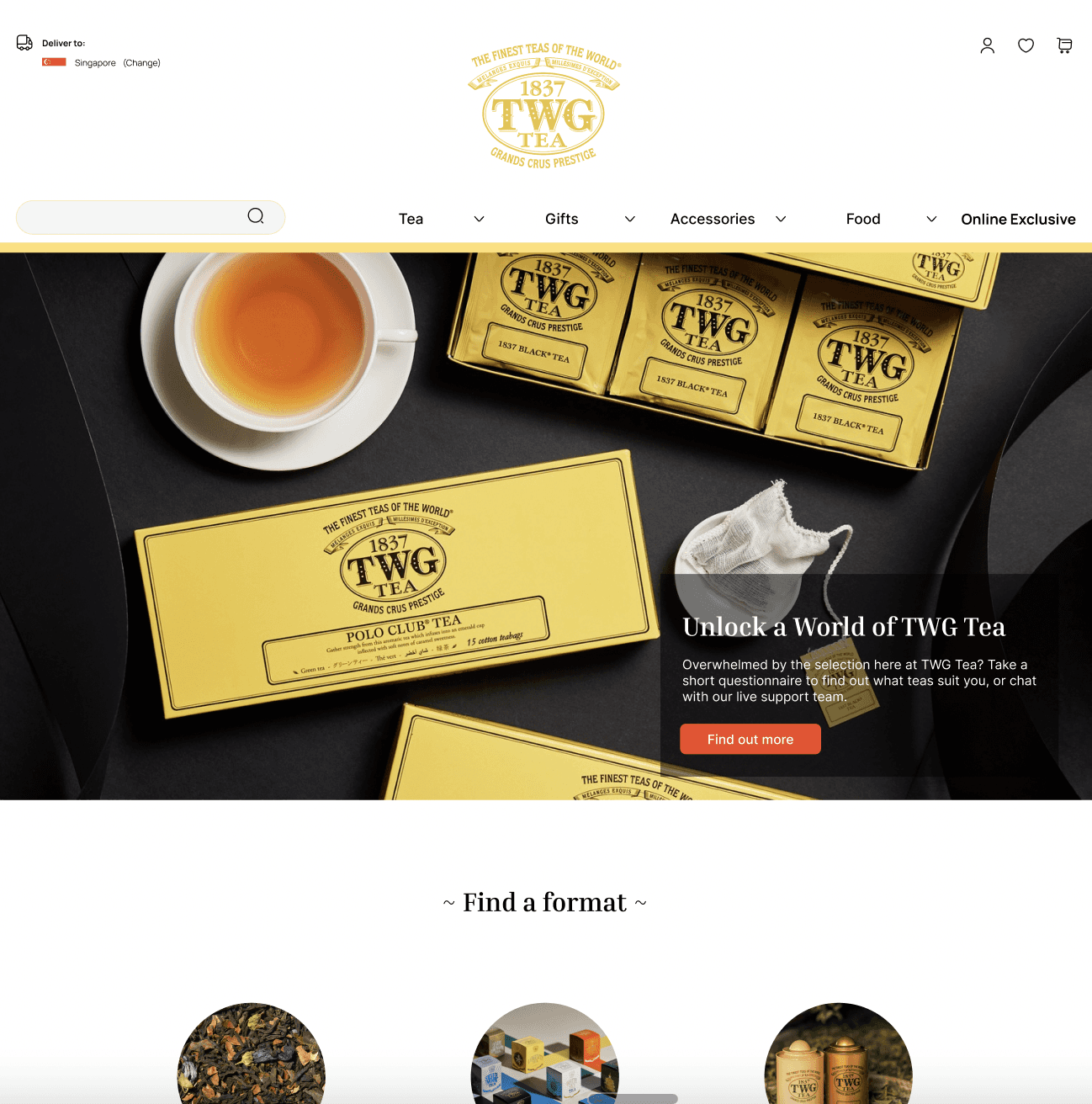
High-Fidelity Prototype
Specific UI elements tested with users.
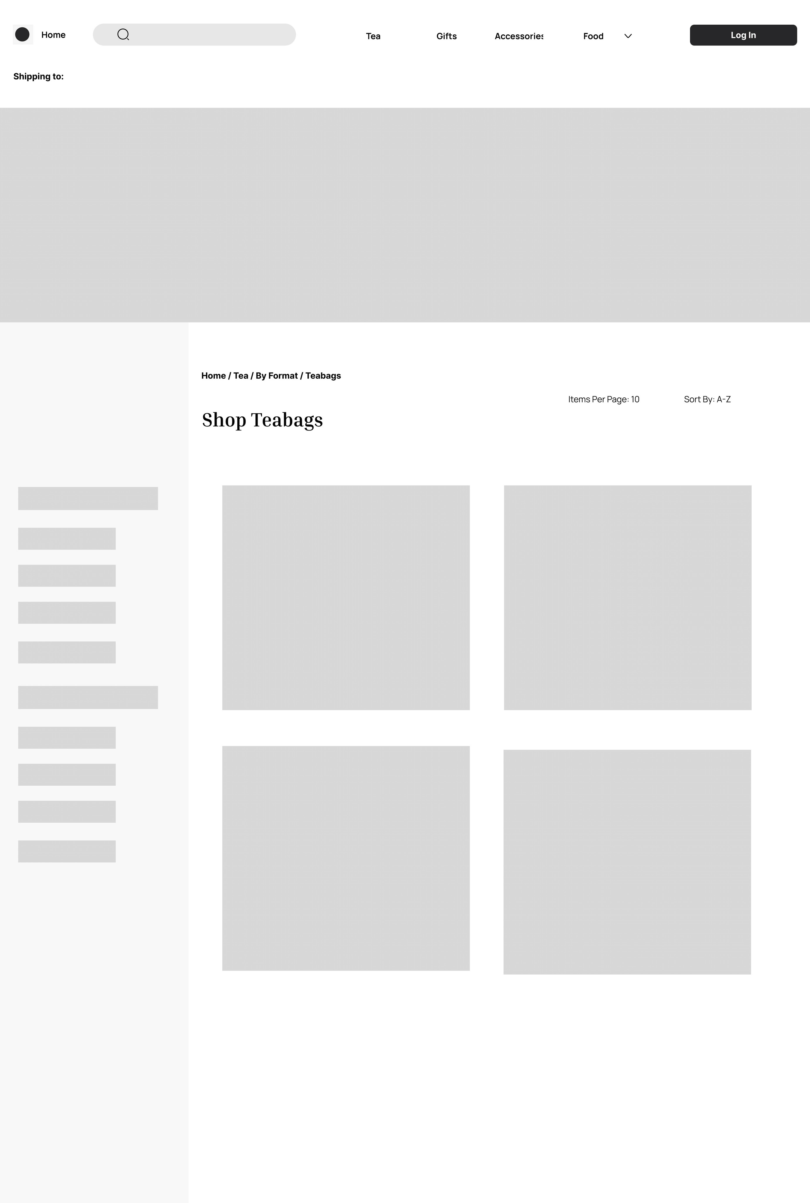
Product Listings Page
Competitor screens and user inputs helped to arrive at the final iteration of the product listings page, particularly the inclusion of the sidebar with the faceted navigation (refined categories and sort features), the use of breadcrumbs, as well as the number of products to display per page and row.
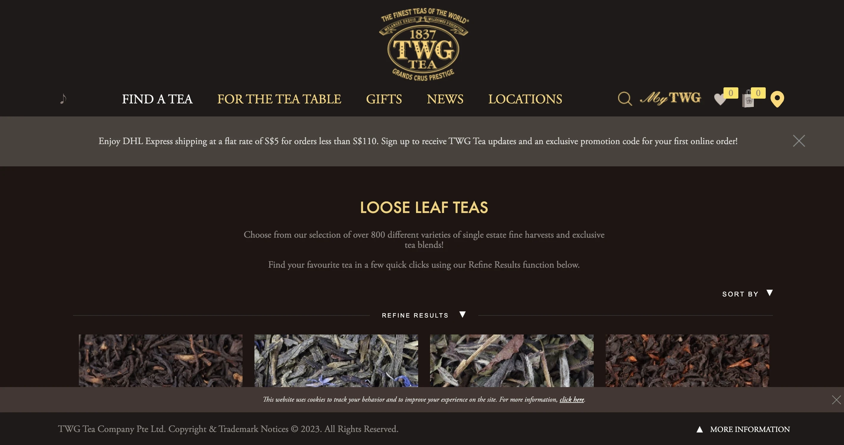
As-Is
Original product listings page layout.
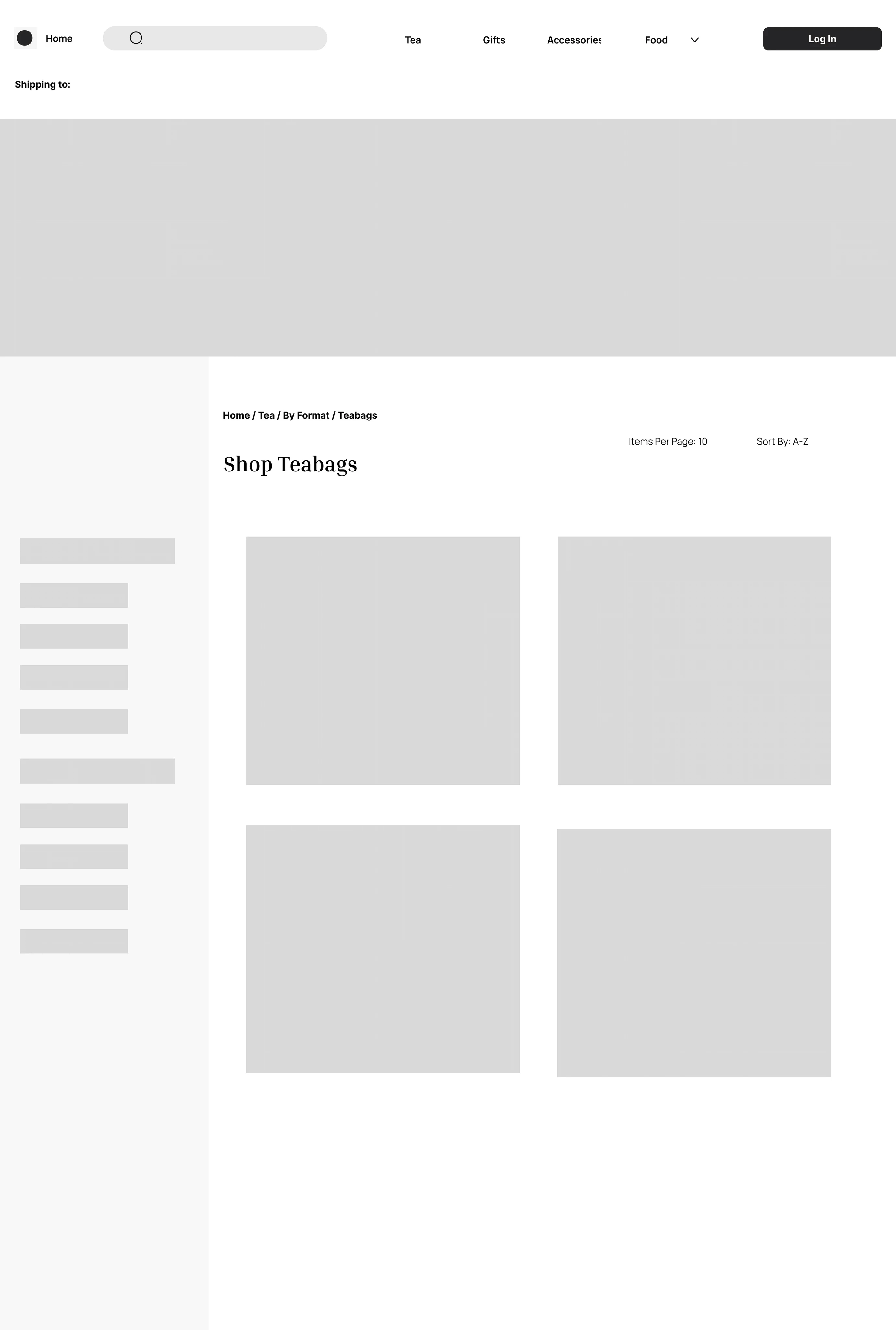
Mid-Fidelity Prototype
Content structure, navigation and layout tested with users.
High-Fidelity Prototype
Specific UI elements tested with users.
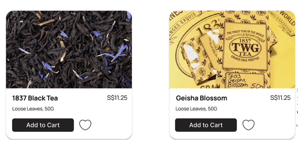
Product Details Card
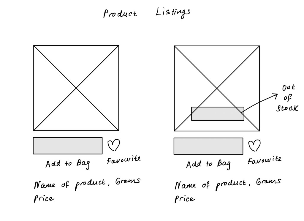
One of the main iterations for the product details card included adding a hover effect where a user could view the loose leaves (left image) but also the default packaging for the item (right image).
What's next?