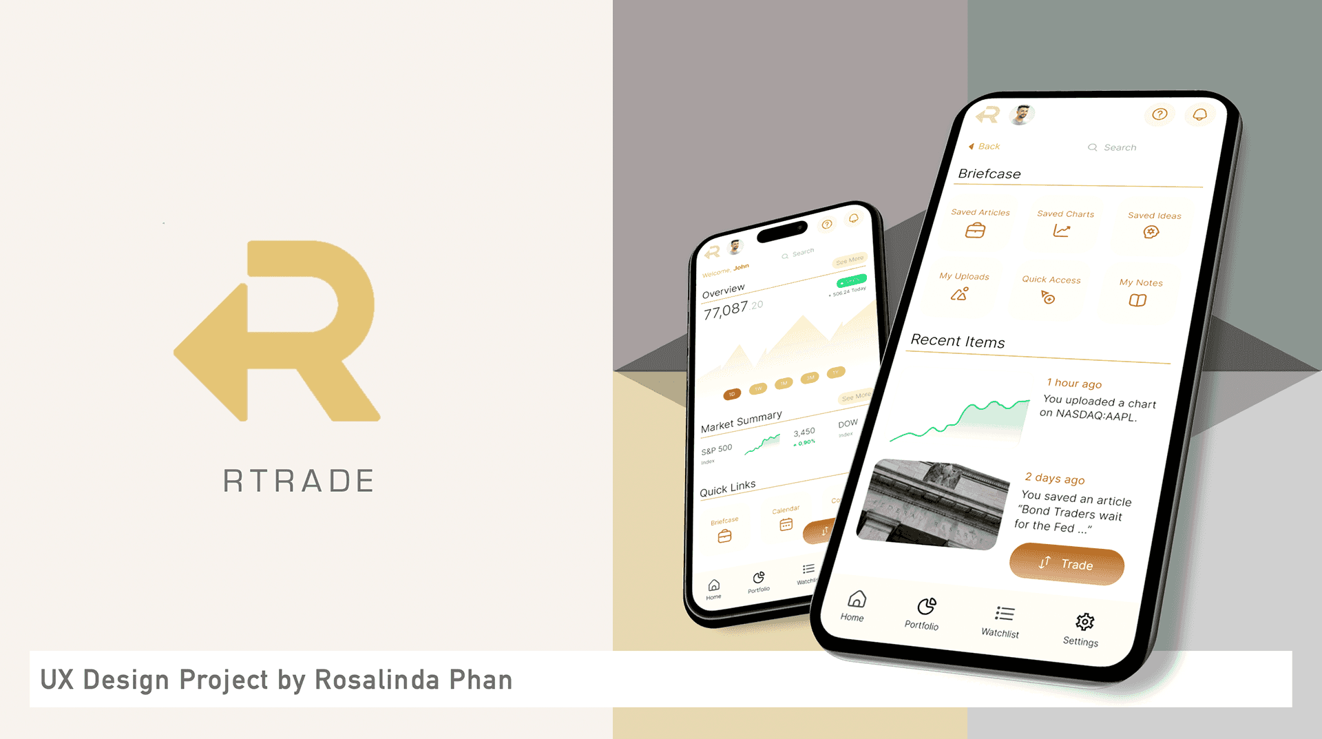
rTrade
Introducing features to deal with unnecessary complexity and app-switching
In a nutshell
Key Themes
Fintech, Product Design, UI Design, HiFi Mobile Prototyping (Figma)
Project Summary
Project Summary
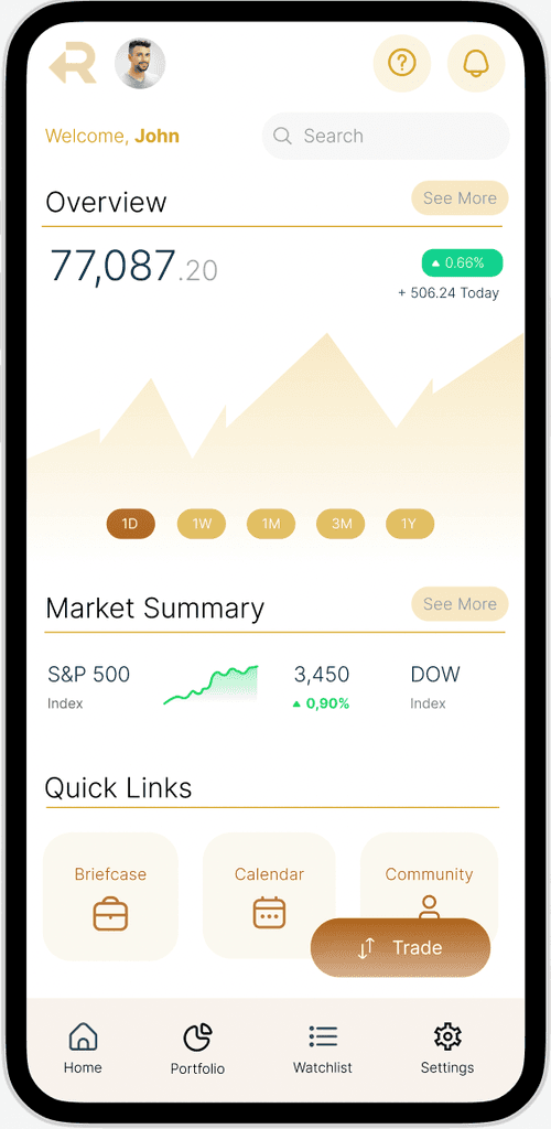
A conceptual mobile application for trading & investment that is optimised to focus on users' most frequent mobile activities
Role
End-to-end UX designer
UX Methodologies
User Interviews
Affinity Mapping
Card Sorting
MoSCoW Feature Prioritisation
Wireframing & Prototyping
Usability Testing
Tools
Figma
Trello
Miro
Problem & Context
There is no shortage of options for retail traders and investors when it comes to mobile applications, with some catered to beginners and some catered to more sophisticated users. Nonetheless, my user research indicated that existing products on the market seem to fall short of addressing key pain points which directly impact users' most frequent mobile activities.
Certain sections and details were omitted from the case study presented on this webpage, which focuses on displaying the final UI and visual design choices.
What users said

Trader 1
It just feels like a website squeezed into an app.

Trader 2
It's annoying when I have to keep switching apps to get things done.

Trader 3
Logging in is already so troublesome!
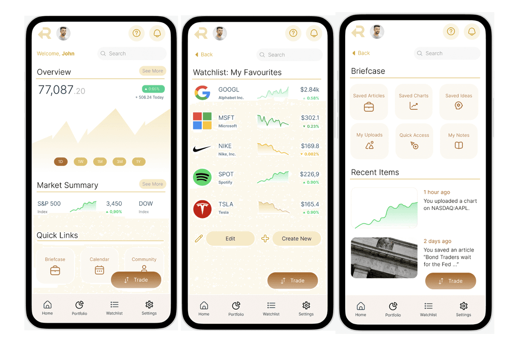
rTrade's Highlights
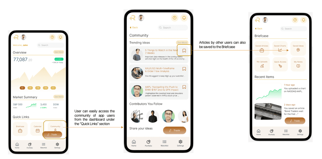
Briefcase Feature
To solve excessive app switching, a common issue exacerbated by friction in the login and authentication processes.
Explore Mode
User can check market updates without going through login and authentication
Methodology
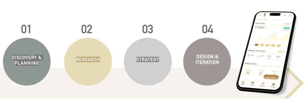
Research
Please request for a copy of the full case study for the details of the project.
Problem Definition & Ideation
Please request for a copy of the full case study for the details of the project.
Problem Statement
Users need a better optimized trading & investment app focused on their most frequent mobile activities
UI & Design Process
This section details the UI design process, from the low-fidelity sketches to the wireframes and UI components. The final prototype can be accessed below:
View Prototype
Sketching and Wireframes
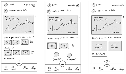
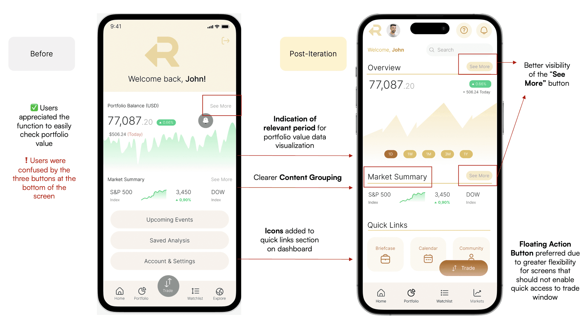
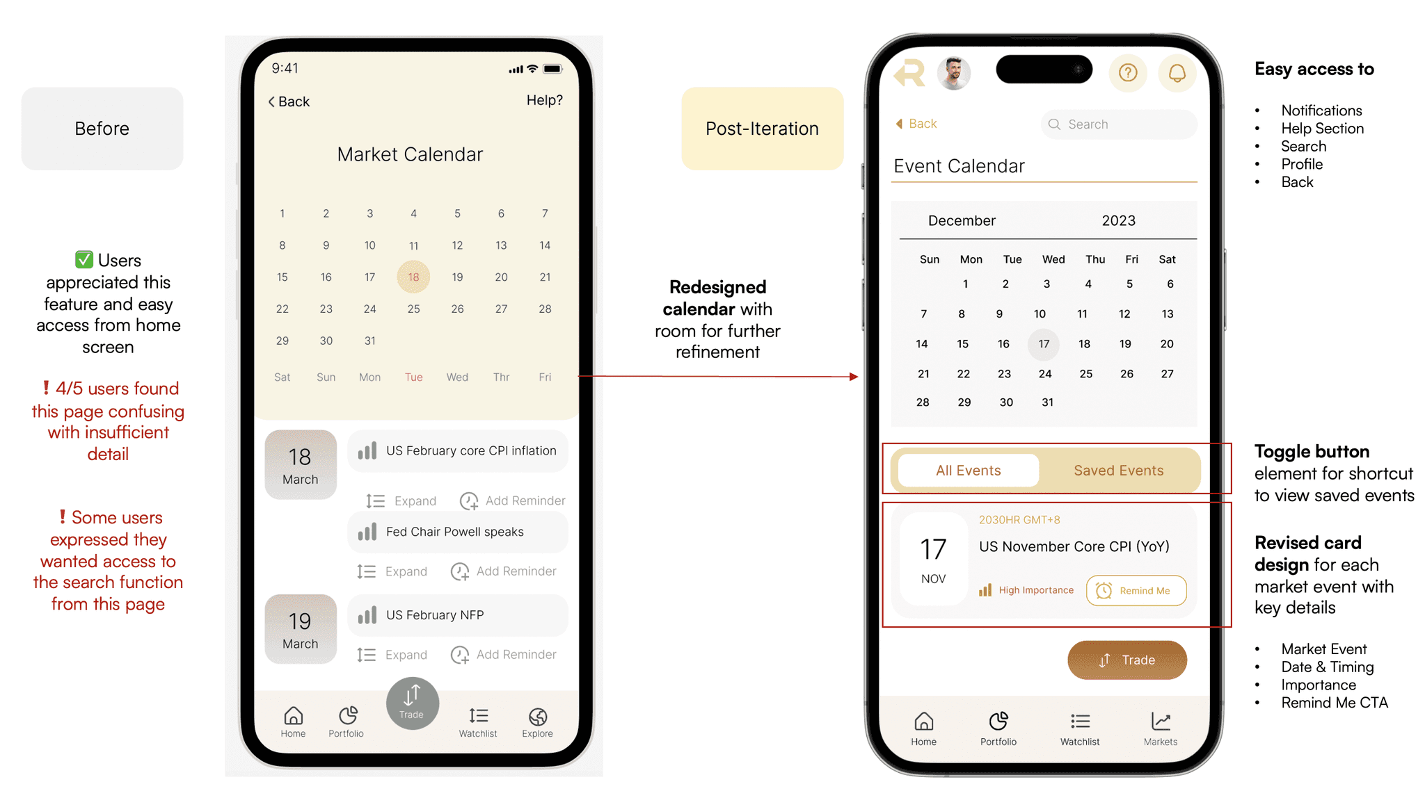
As the initial design phase continued, I made sure to base subsequent designs on feedback and findings from user research. The following mid-fidelity wireframes more clearly convey the layout and functionality of key pages in the app.
Mid-Fidelity Prototype
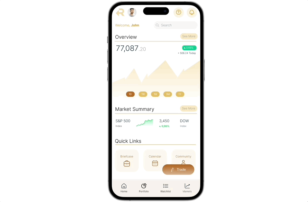
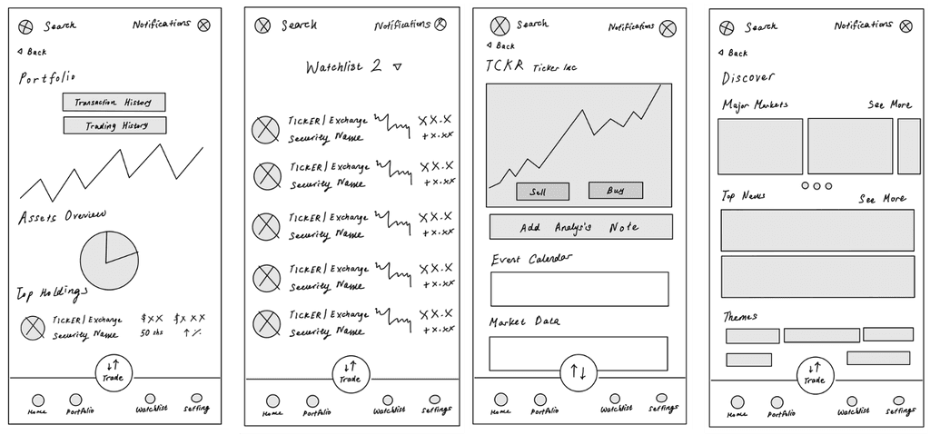
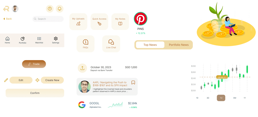
The final high-fidelity prototype, which incorporated the visual design and UI elements, such as typography, colour and iconography, demonstrated a cohesive flow between one artboard or screen to the next. The clickable prototype can be accessed here.
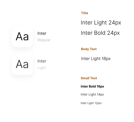
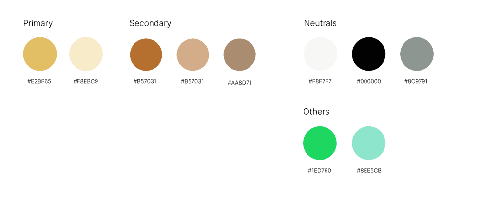
For the visual design considerations, I wanted to convey a more elegant and sophisticated feel with the colour palette, eventually deciding on colours that were reminiscent of gold. The main typeface that was chosen was Inter due to its clear readability and no-frills presentation. Iconography was also kept consistent to ensure an overall cohesive look and feel.
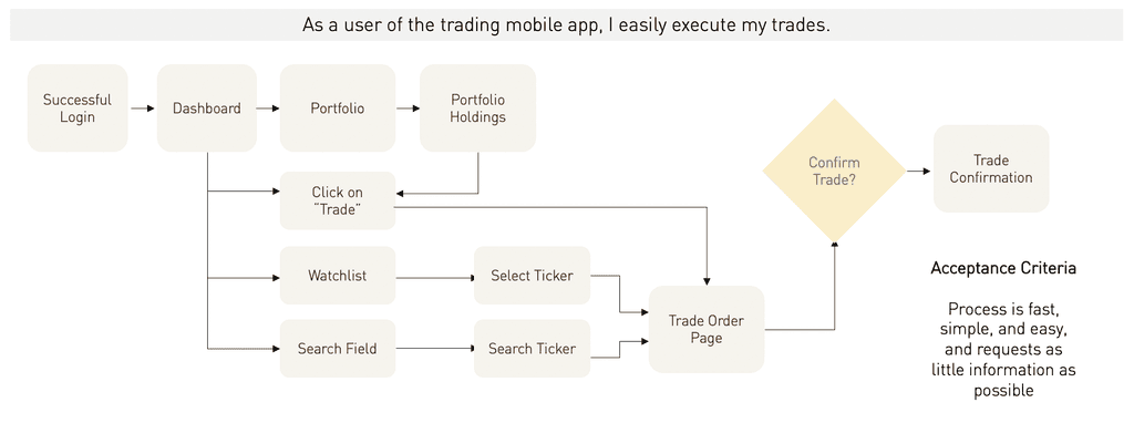
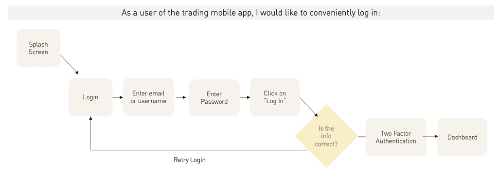
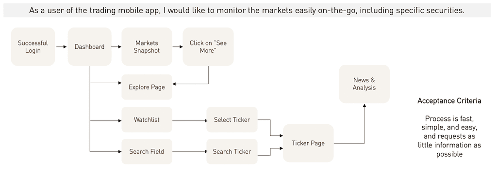
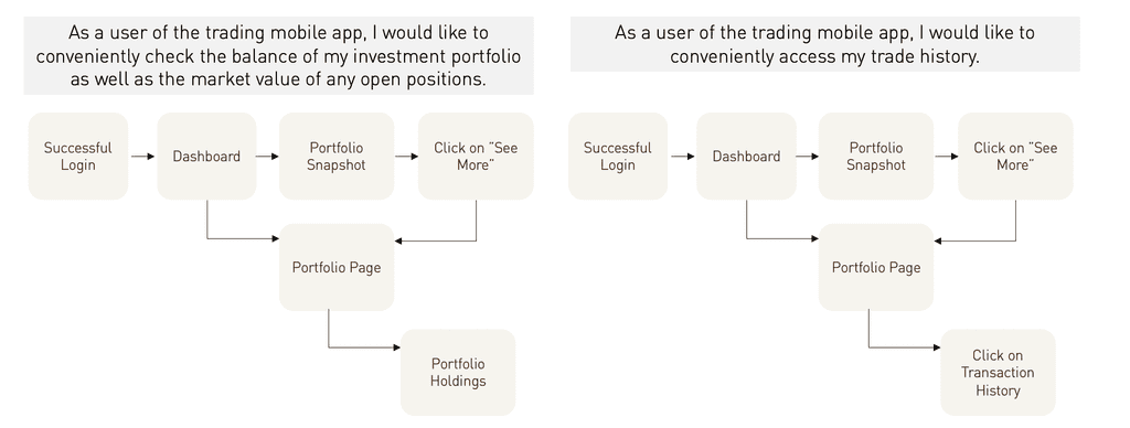
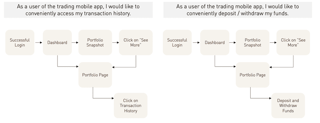
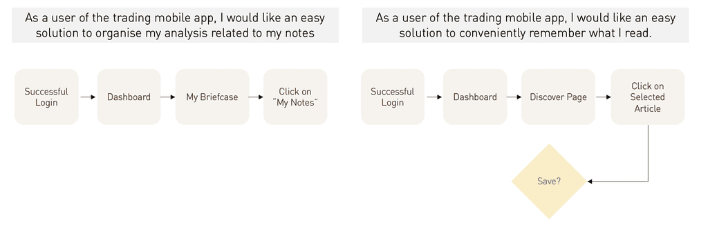
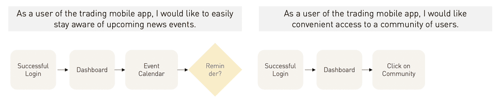
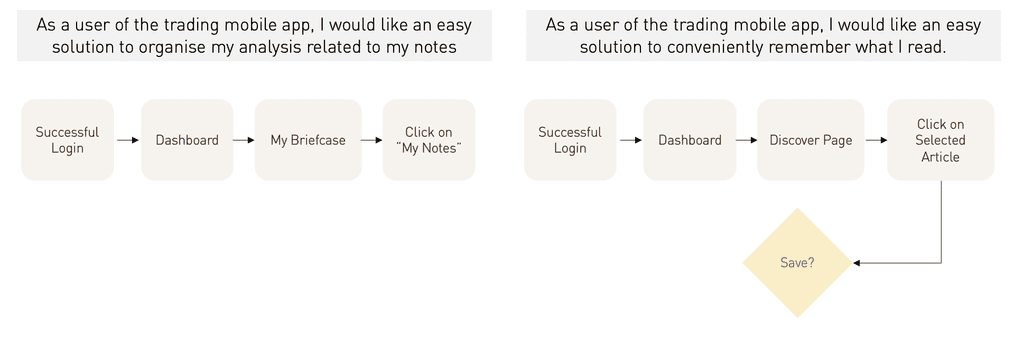
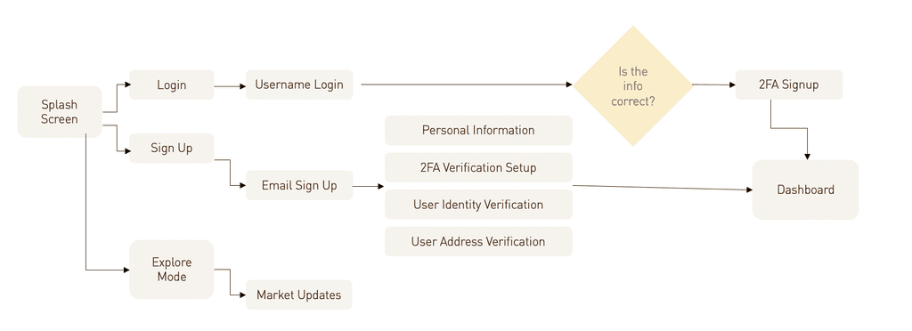
User Flows
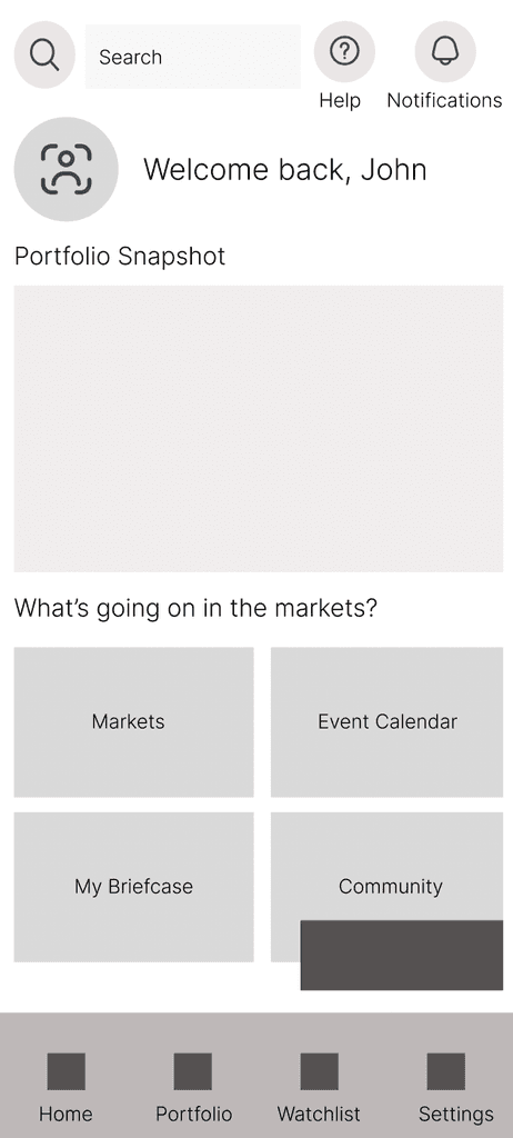
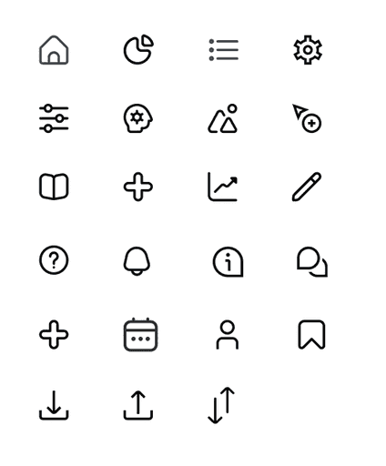
Main UI Elements
Colours, Typography and Iconography
Prototype Walkthrough
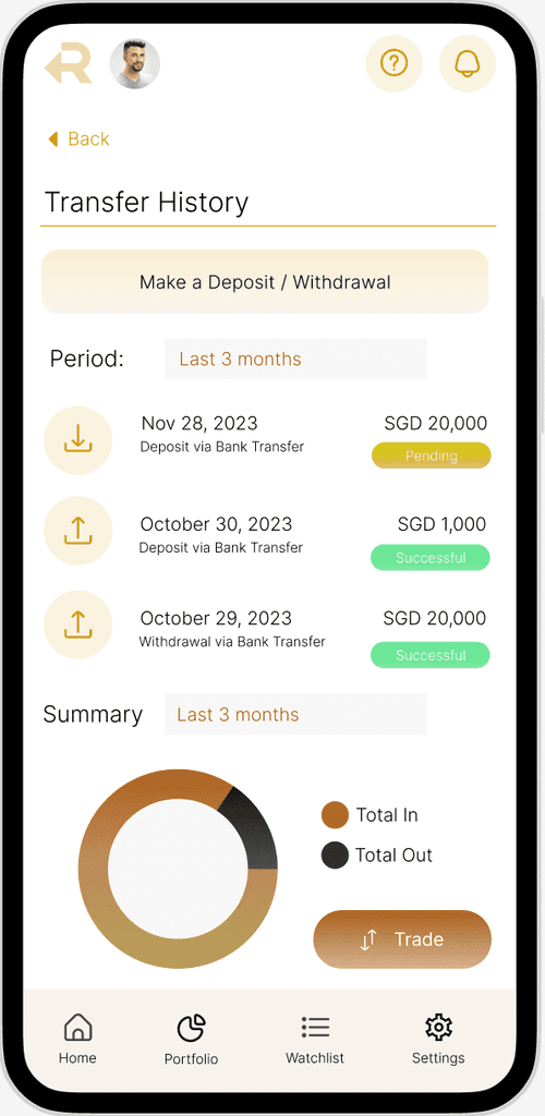
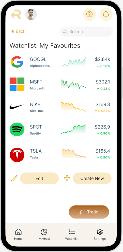
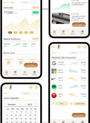
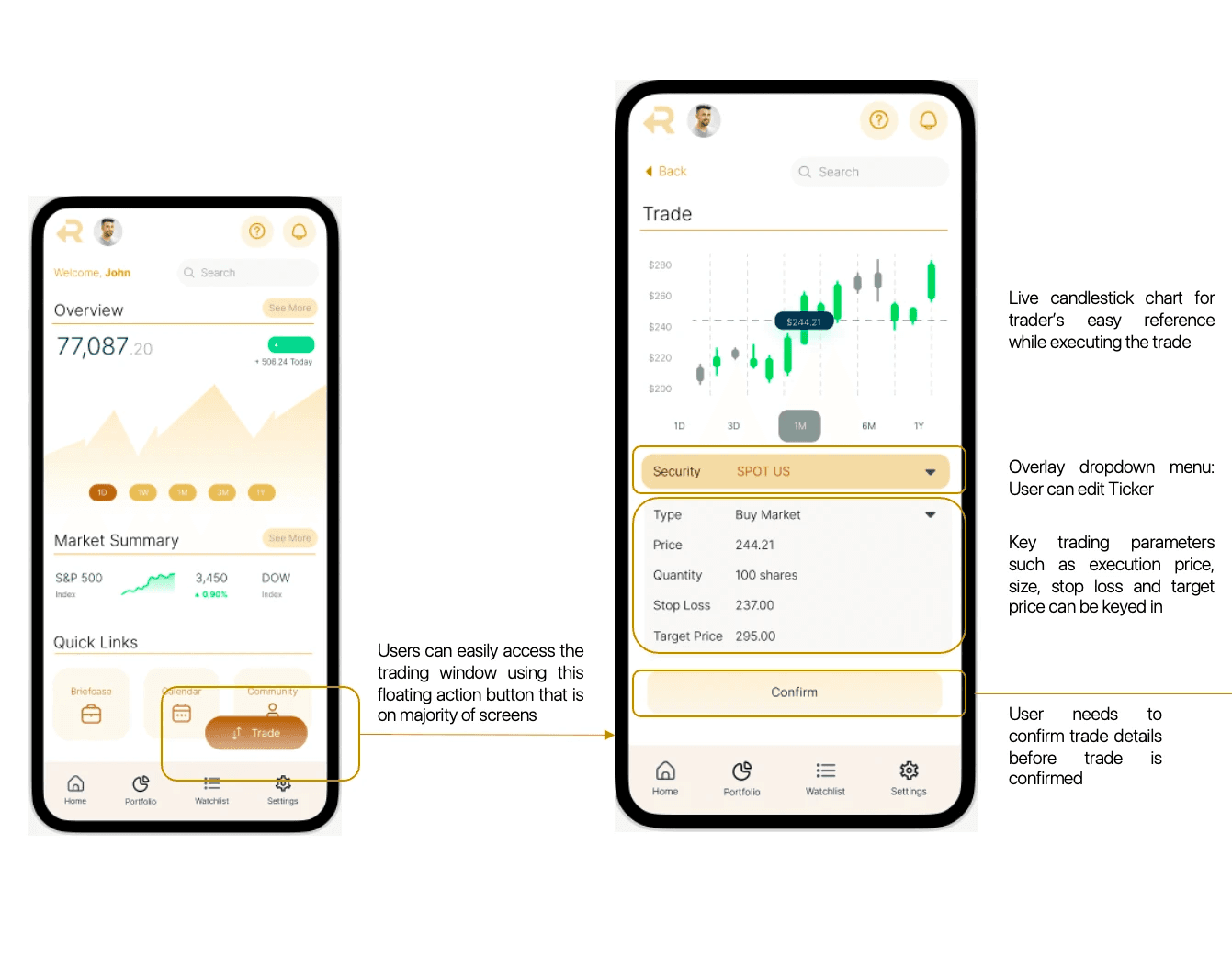
Key Mockup: Portfolio Screen

Key Mockup: Trade Entry & Execution
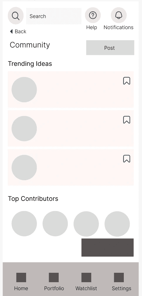
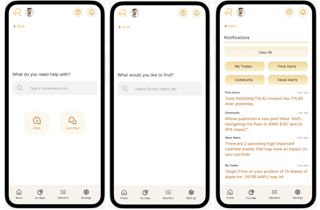
Key Mockup: Community & Briefcase Features
Key Mockup: Top Navigation Elements
Deep Dive: Briefcase Feature
Problem: Users often refer to external news and analysis before making trading decisions. When a user is only relying on his mobile phone, this often means significant app-switching.
Briefcase Feature
To solve excessive app switching, a common issue exacerbated by friction in the login and authentication processes
Deep Dive: Explore Mode
Problem: Users would rather not go through the hassle of logging into a trading app simply to catch up on the latest market news due to the authentication processes.
Explore Mode
User can check market updates without going through login and authentication.
User Testing
User testing for rTrade consisted of two main portions. This section provides an excerpt of the insights and iterations conducted for rTrade.
Usability Testing
Scenario-based testing to learn if users can figure out how to use the app for key tasks.
Concept Testing
For the "Briefcase" feature as well as the "Explore Mode"
Task 1
Portfolio Check: You noticed there was a major news event overnight and would like to check how your portfolio was affected.
Task 2
Markets Check: You are on the commute to work and want to quickly catch up on how the market moved overnight.
Task 3
Navigating to Stock Page: You would like to check the current performance of the stock Spotify, given its recent earnings release.
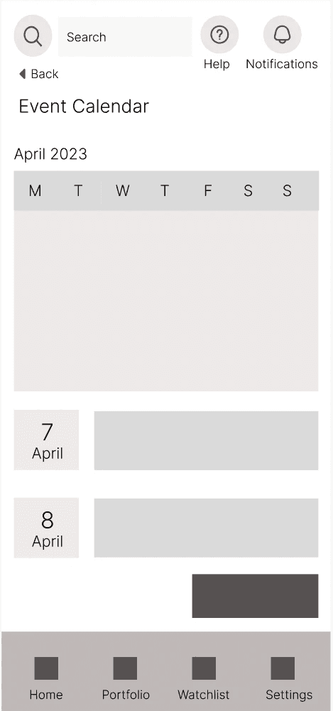
Task 4
Event Calendar: You would like to check the market calendar for upcoming risk events.
Task 5
Execute Trade: You would like to place a trade (buy market order) on Spotify given its recent bullish earnings release.
Scenario-Based Tasks
Scenario-based testing to learn if users can figure out how to use the app for key tasks.
Concept Testing
For the "Briefcase" feature as well as the "Explore Mode"
Explore Mode
Q. Content: What elements and content would you expect to see if you could explore the app without logging in?
Q. General Appeal: To what extent do you find this feature useful and appealing?
Briefcase Feature
Q. Mechanics & Comparative References: How did you expect this feature to work? Does this remind you of any other similar applications e.g. LinkedIn's Saved Posts, Twitter Bookmarks
Q. Preference Testing: To identify ideal functionality of feature
Other Features
Q. Community Section: What are you favourite examples of apps that offer community features? (e.g. TradingView, Discord)
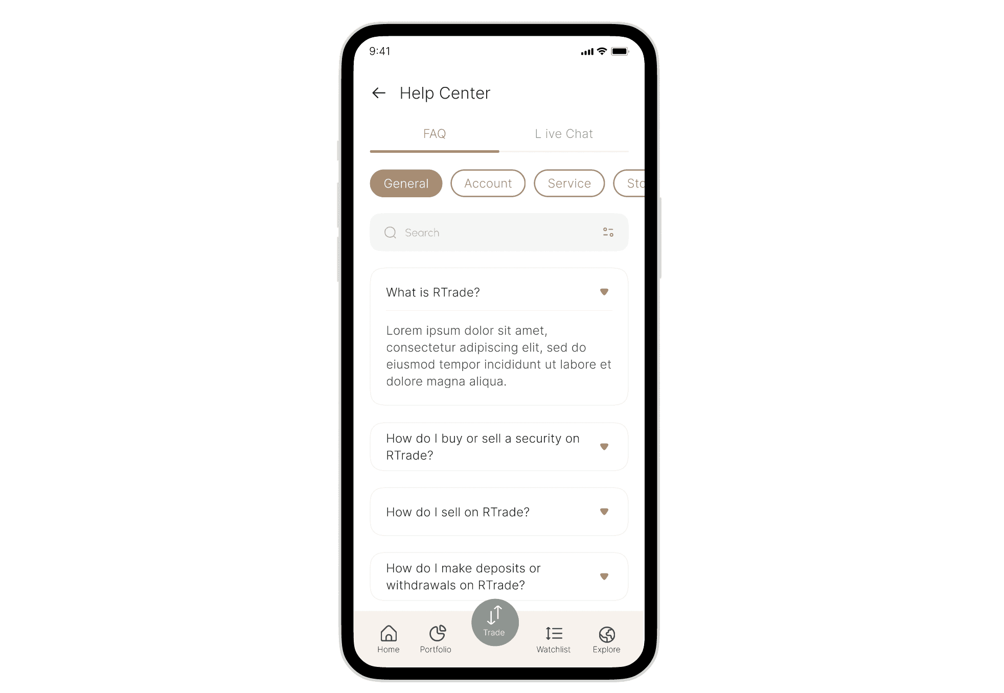
Q. Help Section: What would you expect from help or support feature in a trading/investing app? What would make a robust self-service help section?
Insights & Iterations
4/5
Most users expressed positive sentiments on the Explore Mode feature.
"I think I would use the app more often if I can use it just to check for market updates."
"From the mockup it's not clear what's the difference between logged in and not."
5/5
User feedback validated the concept of the Briefcase feature, with some improvements.
"This is cool, reminds me of the Saved Posts feature in Instagram."
"Maybe there can be tutorials, or make it simpler as a lot of icons on the screen."
What's Next?
Expand on Help Centre
An entire sprint can be dedicated to a deeper expansion of the Help Centre feature, given the importance of in-app support in a trading & investing application.
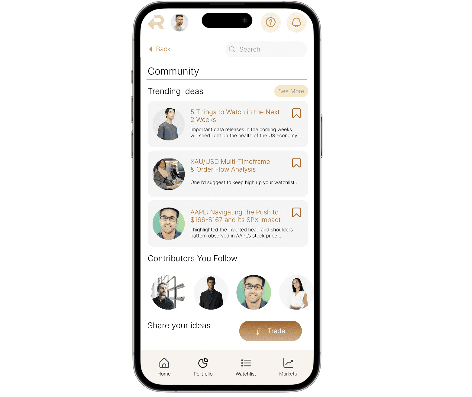
Expand on Community Features
Similarly, more work can be done to fully explore the potential of the community features, taking inspiration from competitors and comparative references and validated by rounds of usability testing and research.