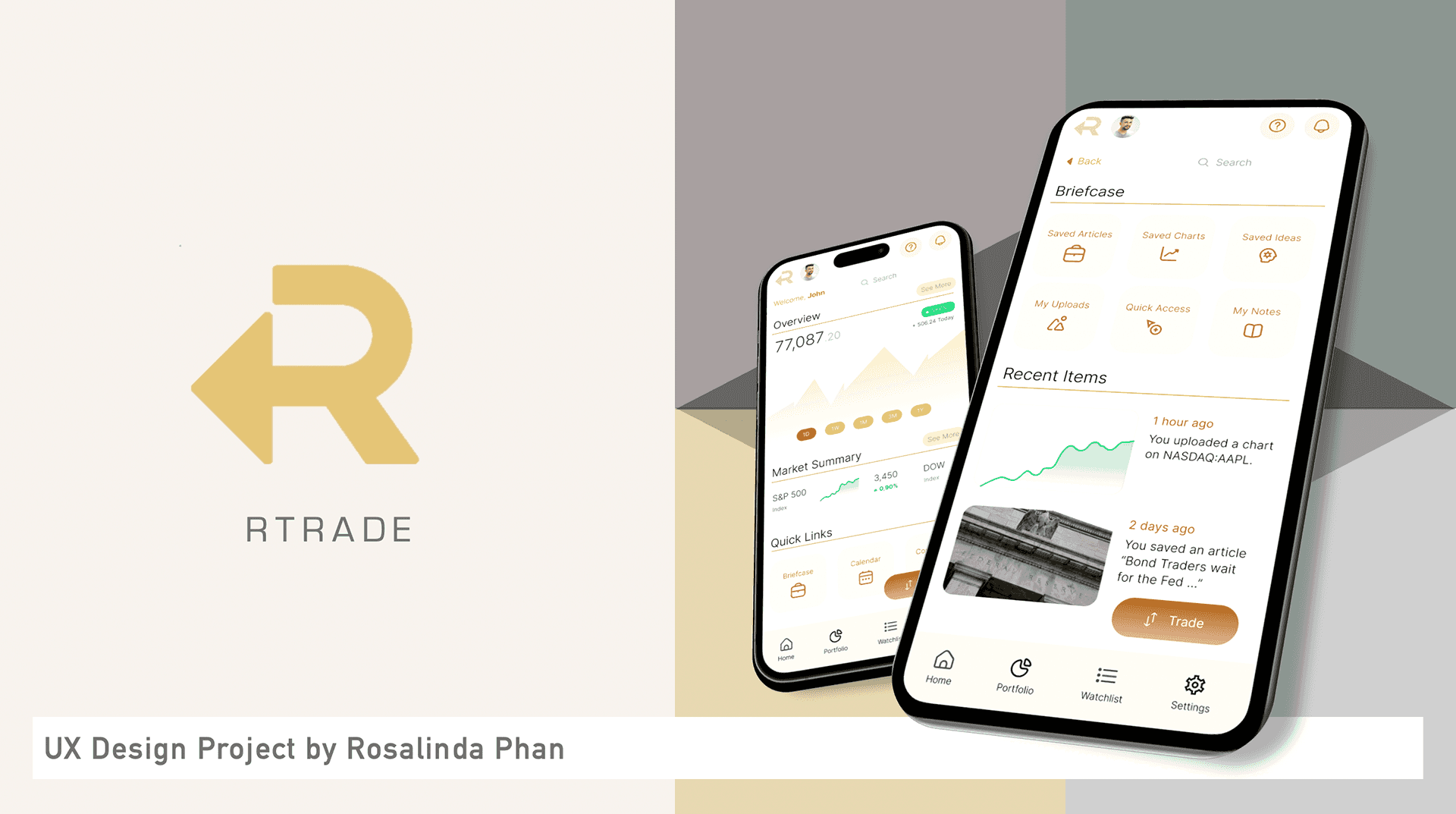
rTrade
Introducing features to deal with unnecessary complexity and app-switching
In a nutshell
Key Themes
Fintech, Product Design, UI Design, HiFi Mobile Prototyping (Figma)
Project Summary
Project Summary
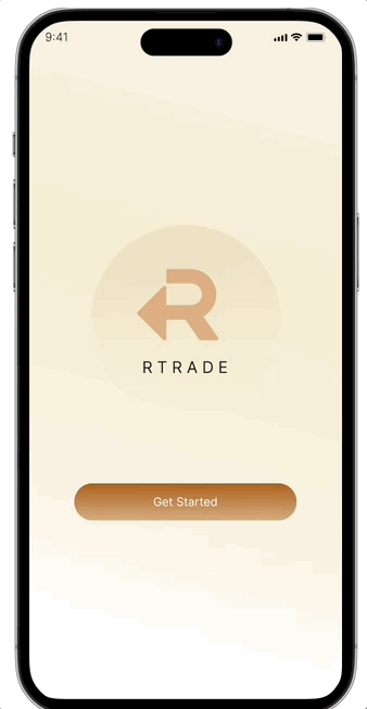
A conceptual mobile application for trading & investment.
Role
Product Designer
UX Researcher
UX Methodologies
Heuristic Evaluation
Card Sorting & Tree Testing
User Journey Map
Wireframing & Prototyping
Usability Testing
Tools
Figma
Trello
Problem & Context
Users need a better optimized trading & investment app focused on their most frequent mobile activities
Methodology
Feature Highlights

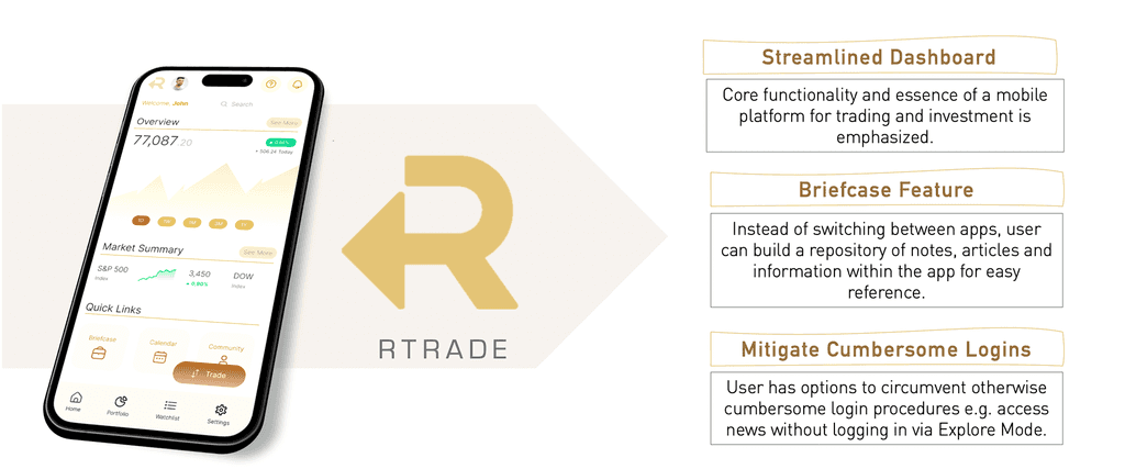
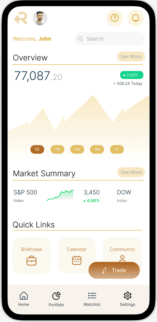
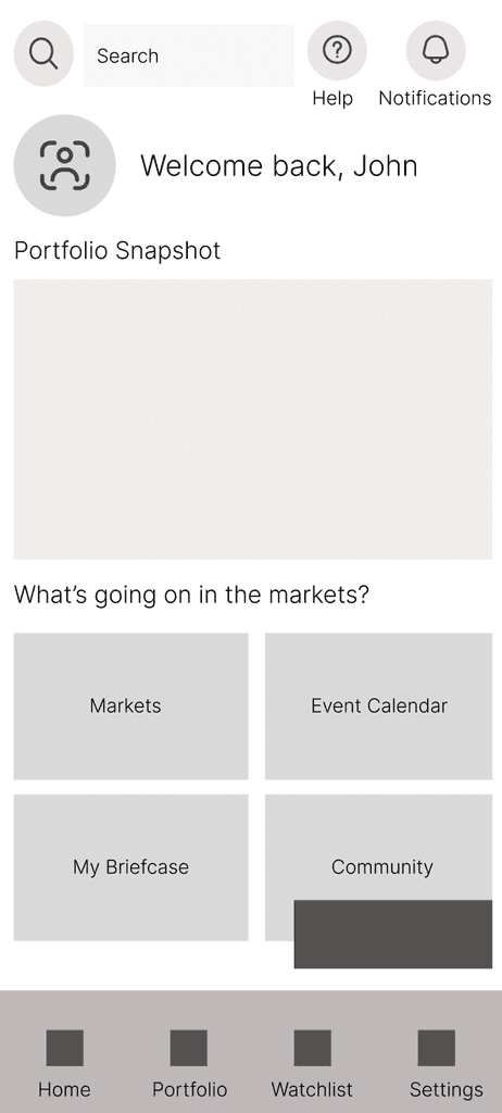
Improved Navigation
To emphasise the core functionality of a mobile trading & investment application
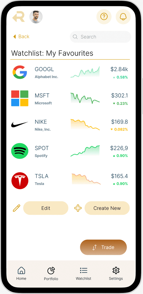
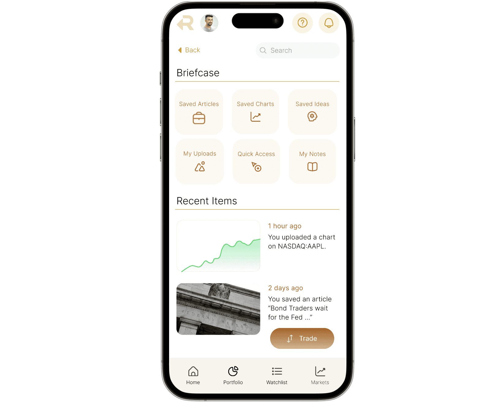
Briefcase Feature
To solve excessive app switching that exacerbated by friction in the login and authentication processes
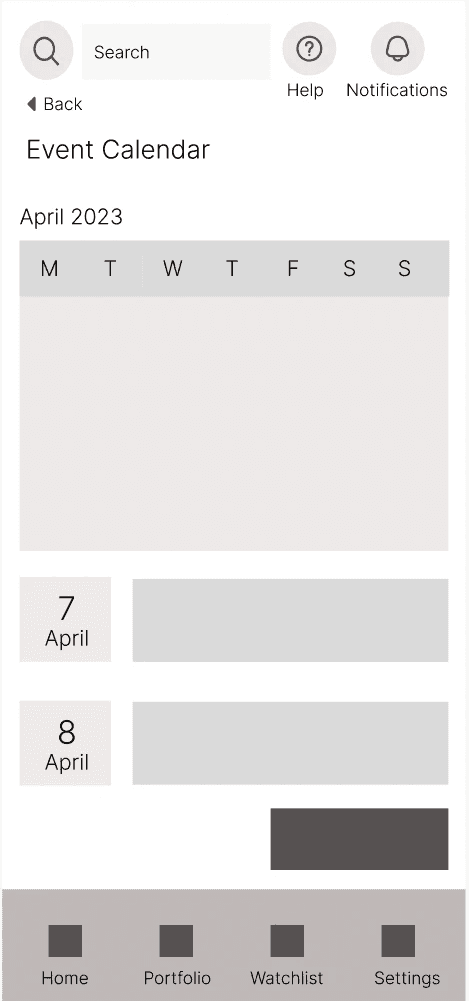
Explore Mode
User can check market updates without going through login and authentication
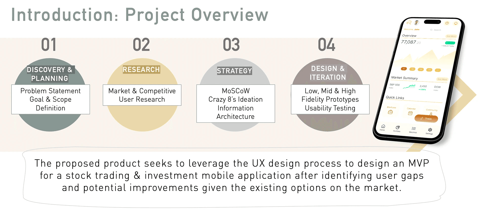
Introduction
rTrade is a conceptual mobile application for trading and investing that aims to plug usability gaps among existing digital product offerings which do not adequately cater to user needs.
Research
As I was coming up with my own cocneptual ,mobile application, I first conducted some secondary research before conducting user research.
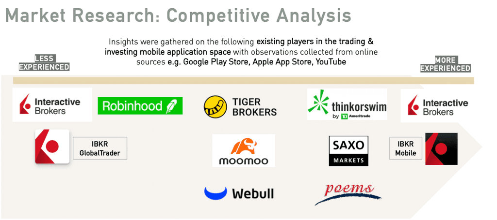
To better inform design strategy and decisions, I conducted research on the competitive landscape where rTrade was benchmarked against best-in-class competitors to discern key trends. These included peers such as Interactive Brokers, Robinhood, Tiger Brokers and Moomoo among others.
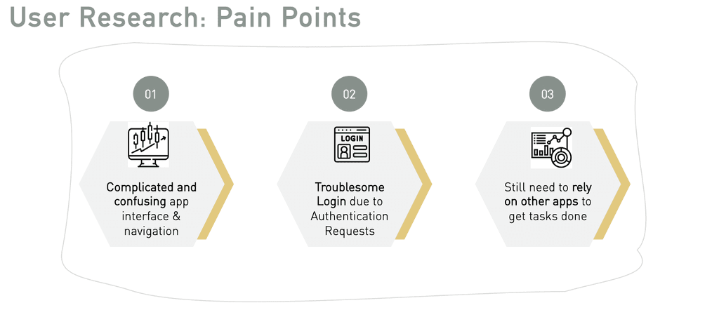
After collecting insights from online sources such as Google Play Store, Apple App Store, it was clear that different apps catered disproportionately to different trading experience levels of its users. Interactive Brokers was a case-in-point with two mobile applications on opposite ends of the spectrum, 1) IBKR Mobile which catered to more sophisticated investors and 2) IBKR GlobalTrader which was most suited for beginners. Notably, the most common feedback across all trading apps pertained to the complexity of navigation, functionality and terminology.
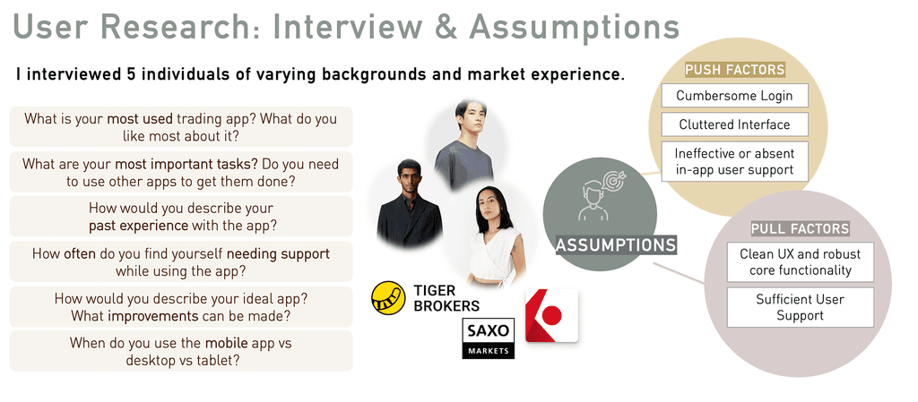
After gaining an understanding of the competitive landscape, I conducted user interviews to gain an in-depth understanding of the problem space.
5 users were interviewed for this case study, with the following requirements:
1) Each user had at least some (minimally one month's) experience in retail trading or investing
2) Each user had to be familiar with using at least 1 trading or investment app on mobile
My goal was to obtain a range in experience levels and from there, validate my assumptions generated from secondary research regarding their needs, behaviours and motivations.
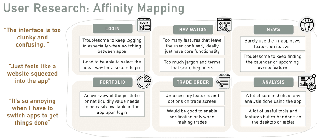
The insights from users were immensely helpful in arriving at
Defining the Problem
From my research, I was able to come up with two user personas, with the main difference being their market experience.
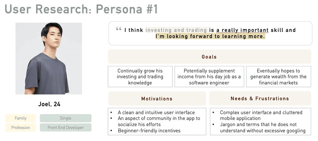
1. The primary user persona, Joel is the beginner retail investor and trader that is keen to learn and discover more about participating in the financial markets, as his profile is likely to represent the dominant market opportunity.
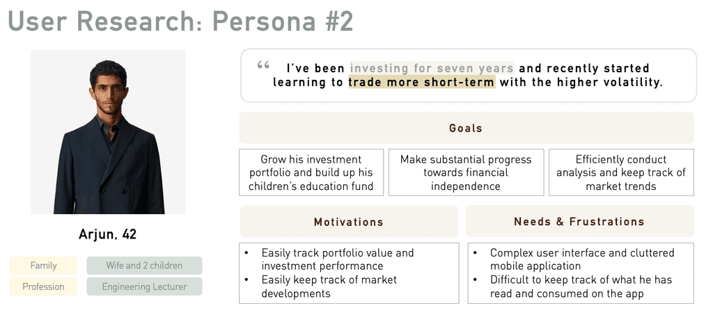
2. The secondary user persona is more experienced in terms of trading and investing and has clearer expectations from his use of a trading and investing mobile application.
Despite the differences in their purposes and manner of engaging with the mobile application, the two personas share the same pain points. As such, it would be possible to deliver a solution that could cater to both user profiles.
Problem Statement
Users need a better optimized trading & investment app focused on their most frequent mobile activities
HMW Statement
1) How might we design an app that prioritises the main user flows in the mobile experience, and the most intuitive navigation for that?
2) How might we design an app that caters effectively to traders of various experience levels?
3) How might we design navigation that is intuitive for both beginner and expert traders?
Ideation
Crazy Eights Exercise
Armed with insights from the market and user research conducted, I used the Crazy Eights method for ideation purposes. This involved sketching ideas for eight different designs, each with a new idea for solving the user's problem. In doing so, I articulated the user stories and jobs-to-be-done (JTBD) and used the "how might we" framework to guide the ideation process.
Key takeaways from the exercise included the following:
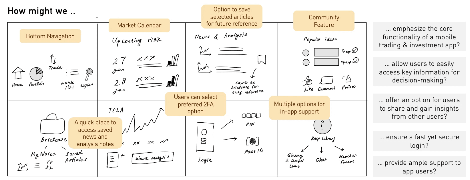
1) A bottom navigation panel that displayed key screens such as portfolio information, watchlist, and trade entry.
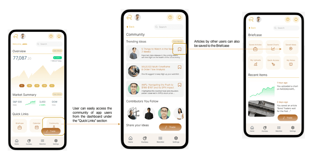
2) A "briefcase" feature for the user to save selected articles and charts for future reference and easy retrieval, ideally through the dashboard.
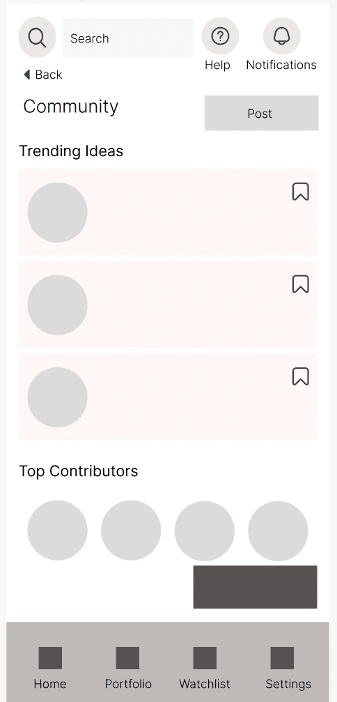
3) A social feature, where less experienced users could learn from crowdsourced insights or obtain a sense of community within the app.
Card Sorting
I used the MoSCoW approach to identify the key features to include for the purposes of this project. This was conducted using a Trello board where JTBDs were organised into "must have", "could should have", "could have" and "won't have". Open card sorting was then conducted using the items in the "Must Have" column on the Trello board, so as to compare the mental models between the two user groups and to learn how they perceive the content.
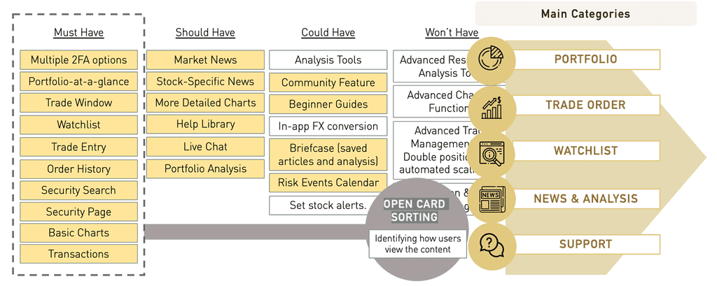
Following the card sorting exercise, the main categories of content that were arrived at, which were 1) Portfolio 2) Trade Order 3) Watchlist 4) News and Analysis 5) Support.
Sketching and Wireframes
Taking the time to draft iterations of each screen of the app on paper ensured that the elements that made it to the digital wireframes would be well-suited to address user pain points. Multiple versions created for dashboard given that it is one of the most important screens for the app. Competitor screens were referenced to get a gauge of the best practices and features most valued by users.
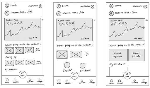
As the initial design phase continued, I made sure to base subsequent designs on feedback and findings from user research. The following mid-fidelity wireframes more clearly convey the layout and functionality of key pages in the app.
Mid-Fidelity Prototype
Design & Iteration
The final high-fidelity prototype, which incorporated the visual design and UI elements, such as typography, colour and iconography, demonstrated a cohesive flow between one artboard or screen to the next. The clickable prototype can be accessed here.
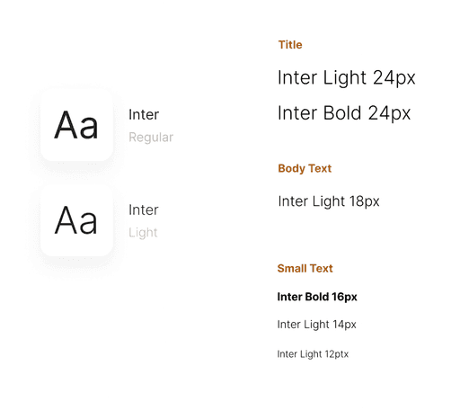
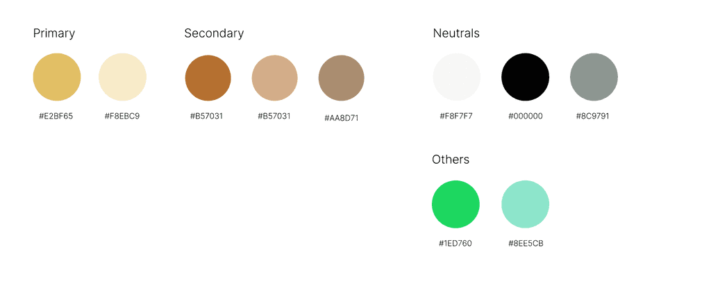
For the visual design considerations, I wanted to convey a more elegant and sophisticated feel with the colour palette, eventually deciding on colours that were reminiscent of gold. The main typeface that was chosen was Inter due to its clear readability and no-frills presentation. Iconography was also kept consistent to ensure an overall cohesive look and feel.
Main UI Elements
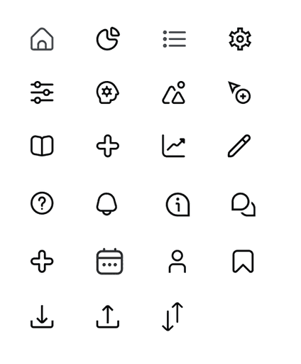
Colours, Typography and Iconography
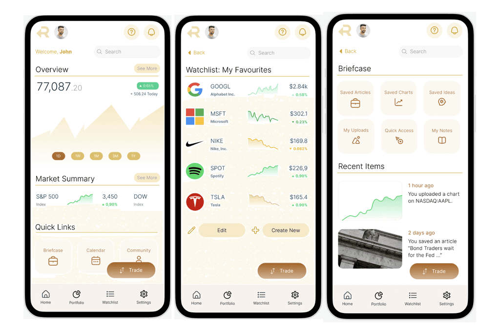
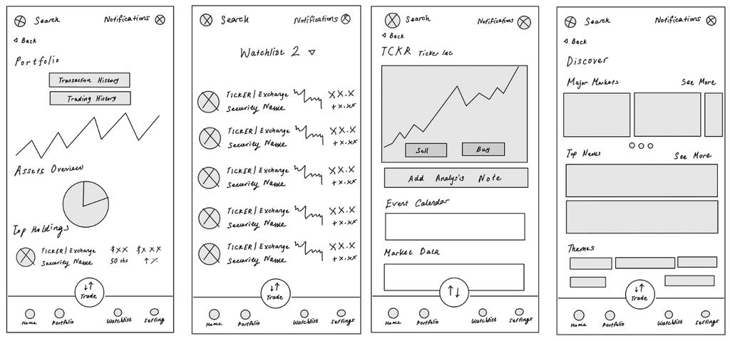
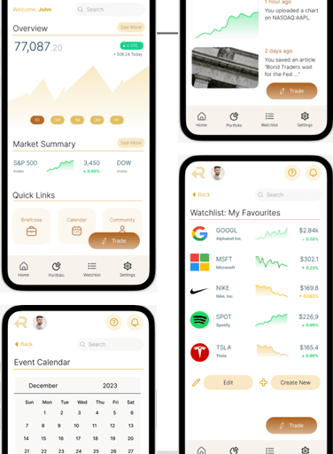
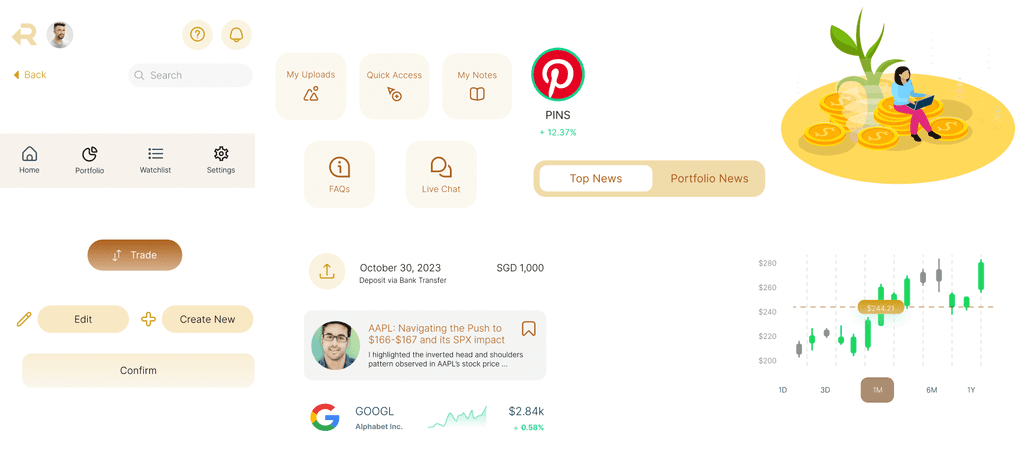
Key Mockup: Portfolio Screen

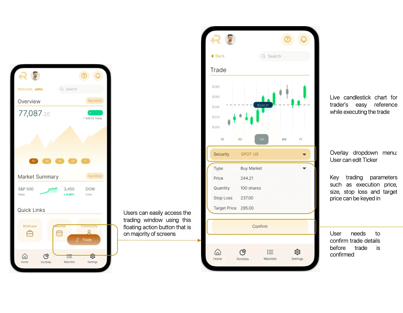
Key Mockup: Trade Entry & Execution
Key Mockup: Community & Briefcase Features
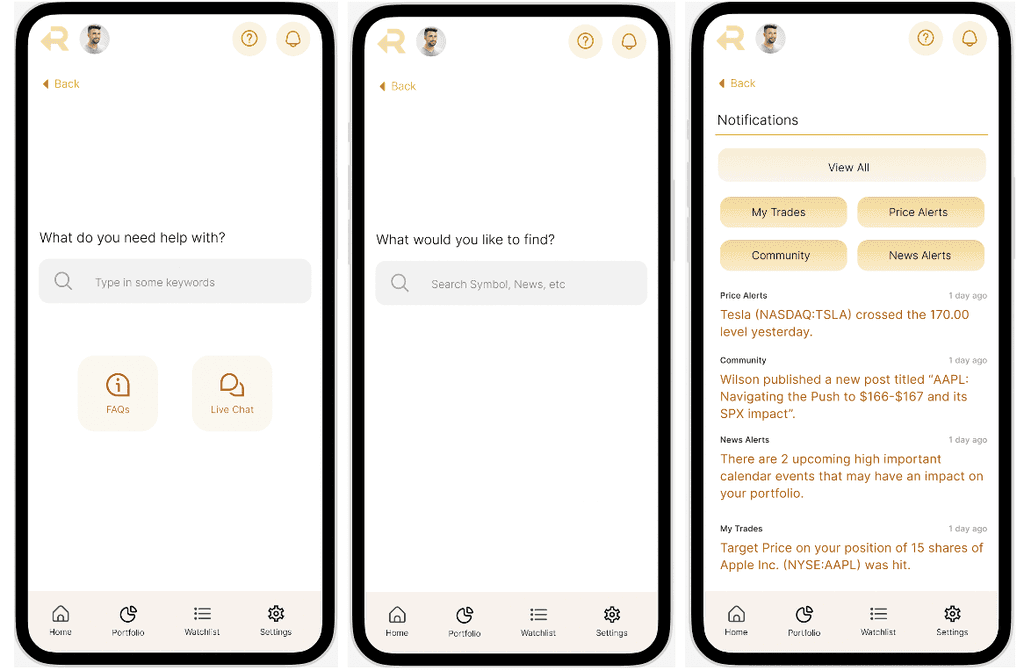
Key Mockup: Top Navigation Elements
Usability Testing
I presented my prototype to my same five users to conduct some usability studies.
The focus of the testing was on the most important tasks identified during the user research stage, to identify potential unaddressed friction or edge cases while attempting to complete these tasks. t
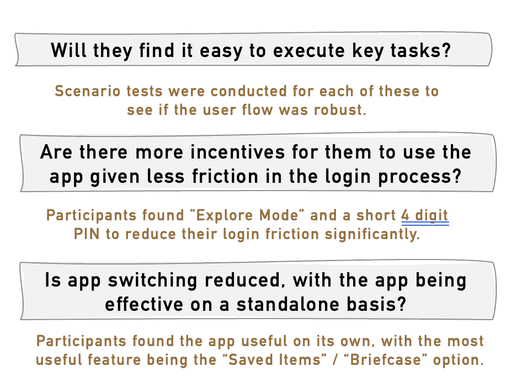
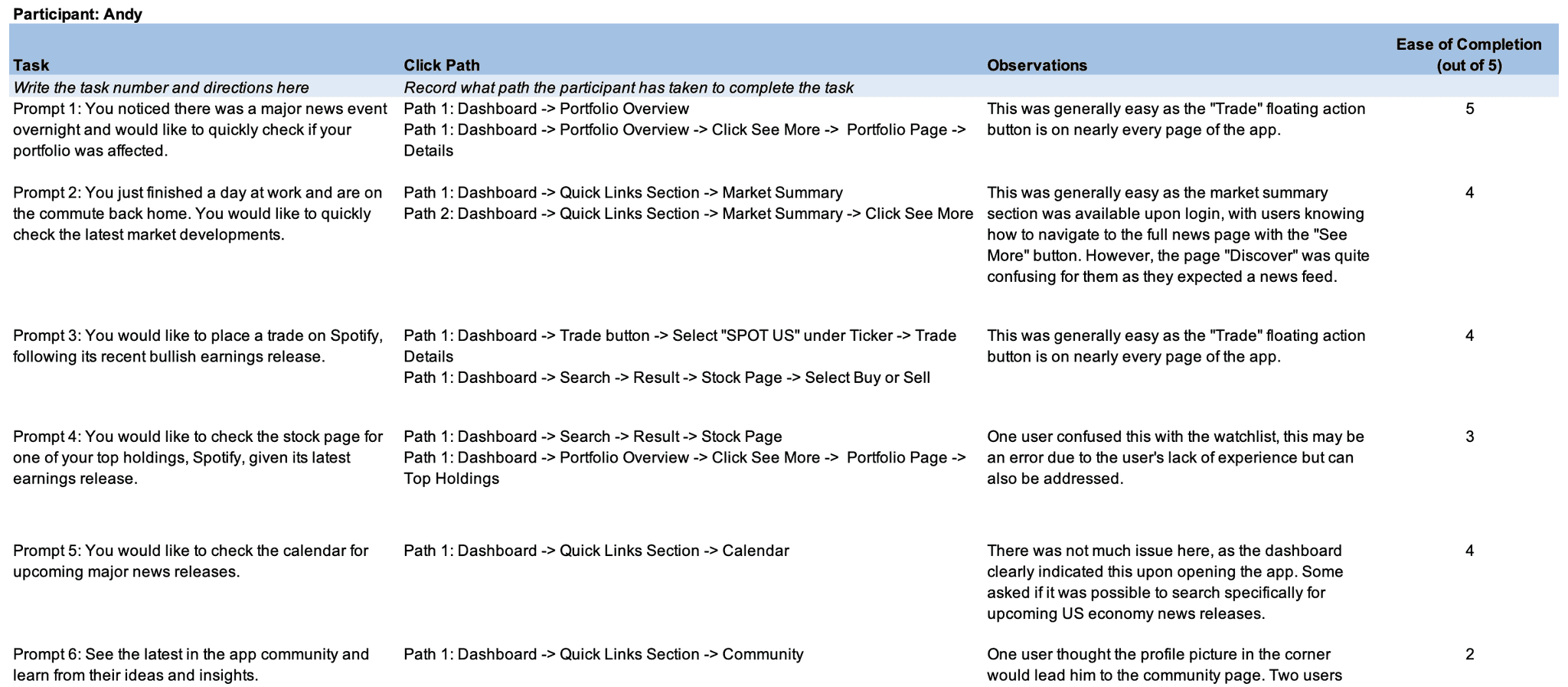
Main Iterations
Conclusion & Takeaways
As my first UX project, this was a thoroughly enriching experience where I got to apply the end-to-end UX design process and in doing so, appreciate in intricacies of uncovering and reconciling user pain points with elegant product solutions.
I also began to appreciate that design is necessarily an iterative process as I went through multiple revisions at various stages of the project as rTrade continued to mature through the different design stages. It was through this project that I began to understand the value of intermediate steps such as feature prioritisation and developing lower-fidelity prototypes to optimise resources, efforts and time throughout the project.
Subsequent Plans
1. Develop Help Centre
2. Develop Community Features